We! Technology
Interaction design
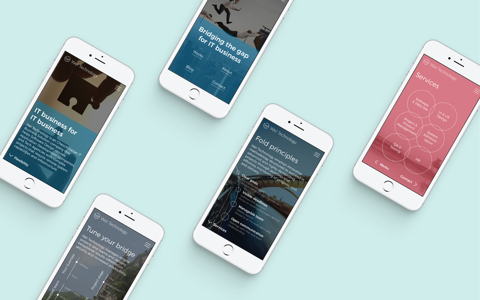
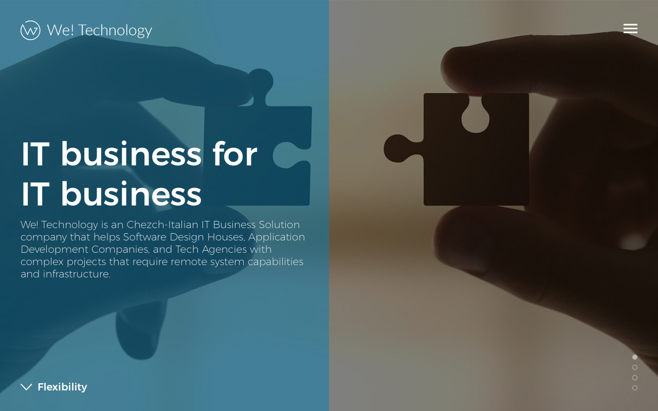
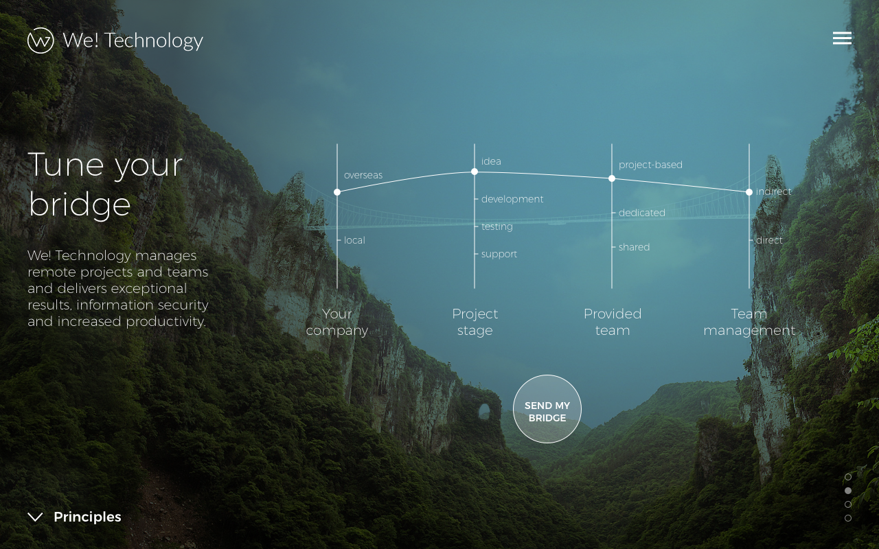
Redesign concept for B2B service provider We! Technology.
Format: Responsive website
Challenge: Free redesign based on main content blocks
Result:
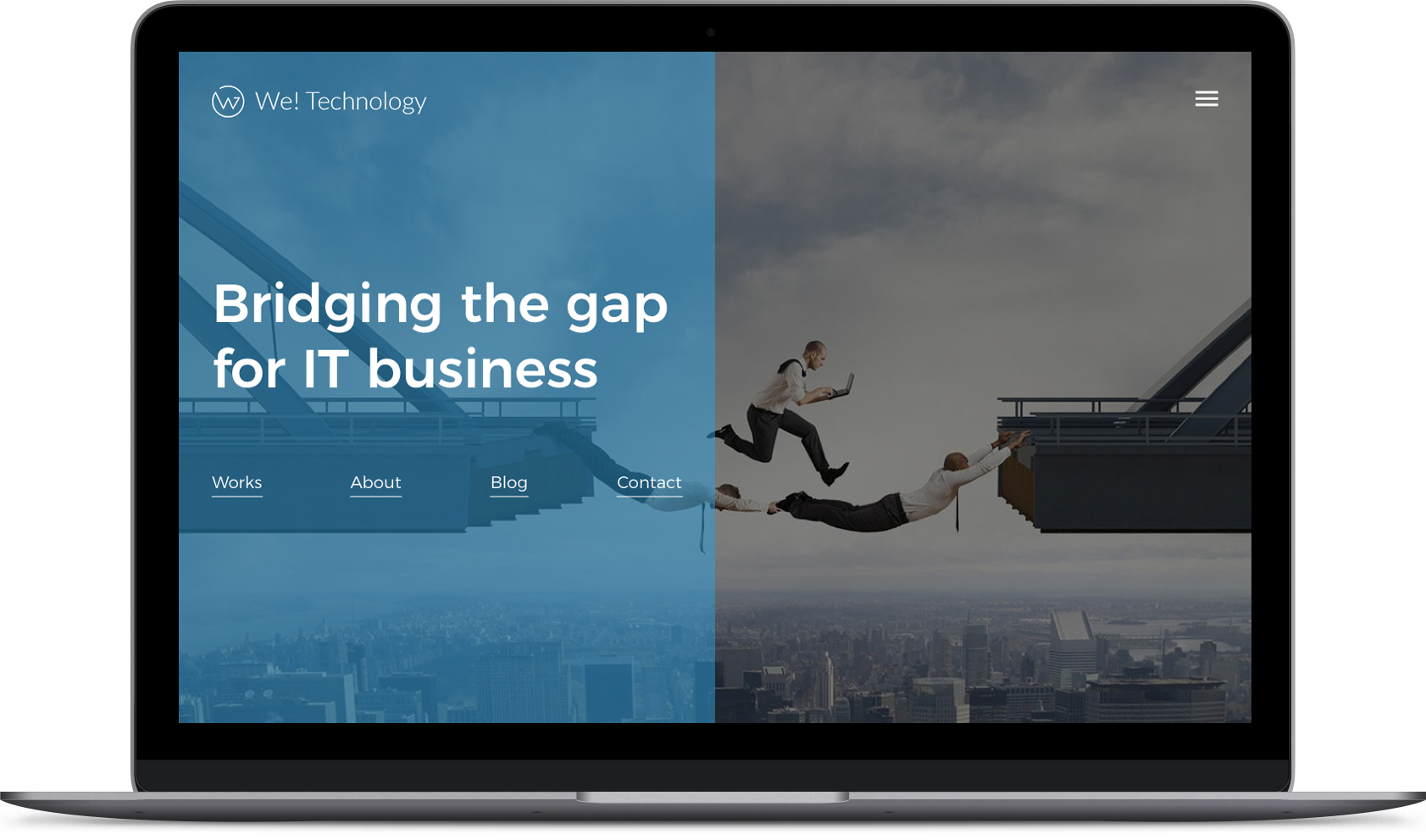
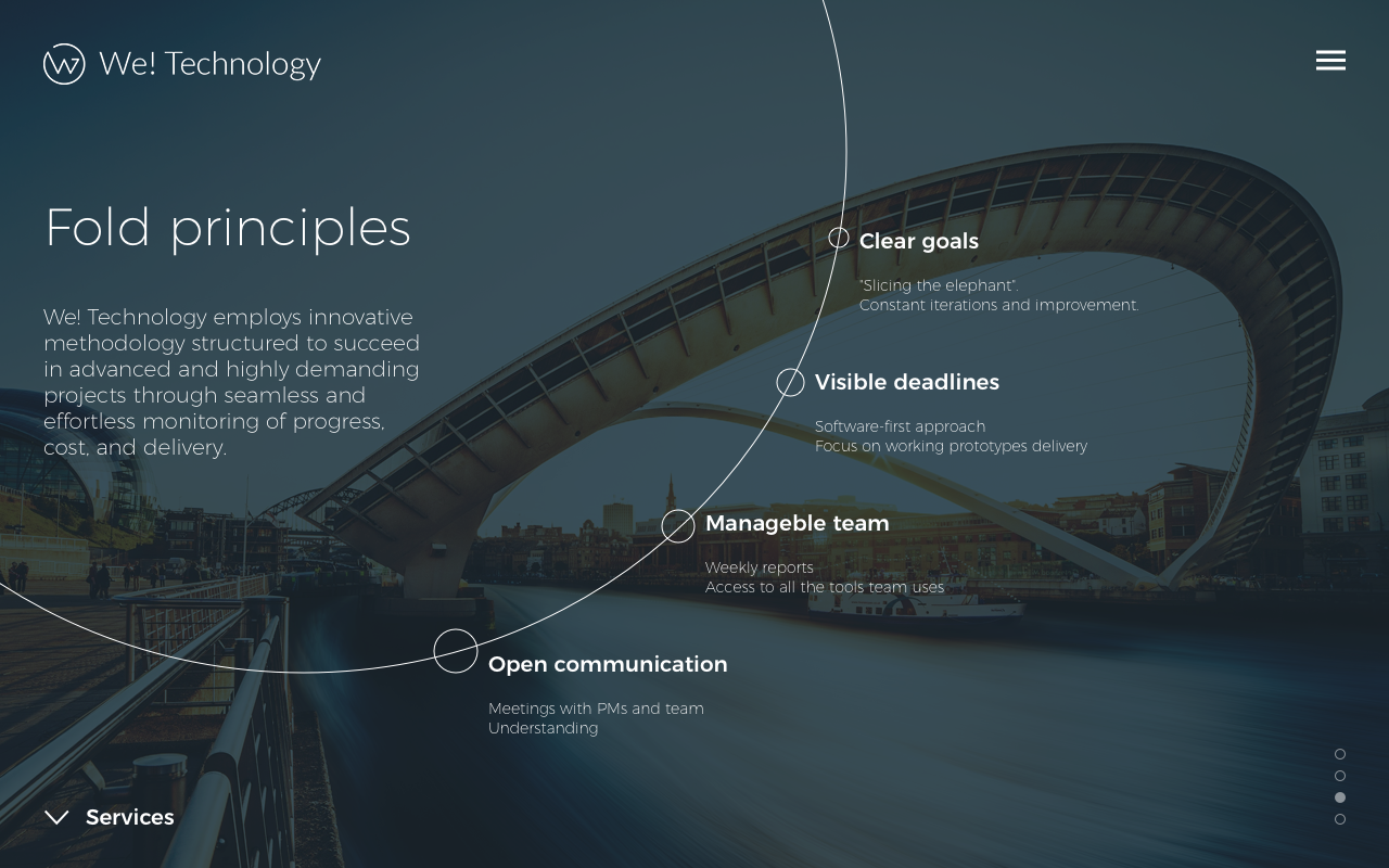
- Clear message right above the fold
- User control on reading order
- Reduced text. "Less is more. When everything is important, nothing is important"
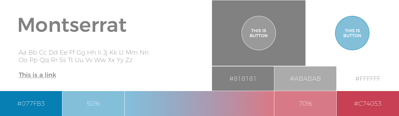
- Reduced "font zoo"
- Visual suppot for "bridging methodology" metaphor
Disclaimer: I have no control on implementation of my designs presented here. All texts are not the final copy, just some sence-making extractions from the original page. Background photos are from free sources. All rights belongs to the owners.
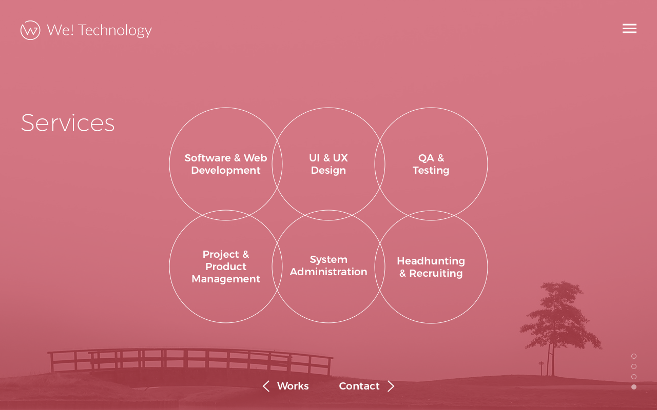
Ingredients
Structure
It would be good to showcase previous projects. New structure proposes to create Works section for that.
Proposed structure
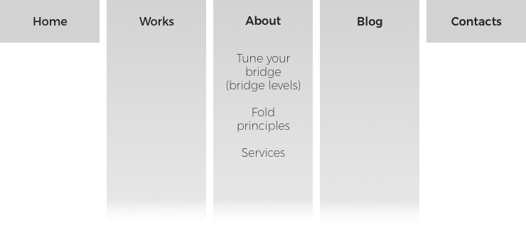
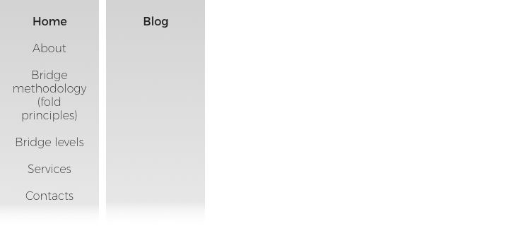
About
4 pages instead of "endless landing". Each covers full screen with navigation in the bottom.
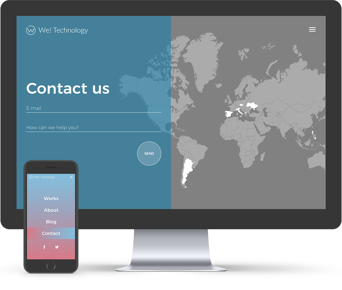
Contacts
Map may provide some details on click/hover.