Building Insight [1.0]
Interaction design
The digital face of Unica's solution for built environment management. Aims to make buildings and other facilities more cost-efficient, sustainable and comfortable. Long read. Further product stages in this portfolio: [2.0], [3.0].
What is Building Insight
Building Insight is a complex B2B solution for building managers by Unica Innovation Center. The goal is to create more cost-efficient, sustainable and comfortable built environment by collecting and analyzing various data, mostly in real time. Built environment concerns not just buildings, but e.g. parkings, park benches, trash cans, bus stops… anything we manage in urban context. Given the variety of possible needs, Bulding Insight is modular: clients may order only the parts of the solution they need (modules). The full B2B solution includes:
- Installation of physical components – sensors and meters required for the selected modules.
- Collection and processing of the data from (freshly installed and pre-existing) meters, sensors, access systems, other building management systems, as well as weather data and satisfaction studies.
- Building Insight platform where building managers can access statistics, potential issues and predictions based on the collected data.
- Individual support via a dedicated Unica manager who cares.
I designed — and hereafter refer as ‘Building Insight’ — specifically the digital platform. Which in the future is to evolve into BMS (building management system) — as soon as it covers the main requirements.
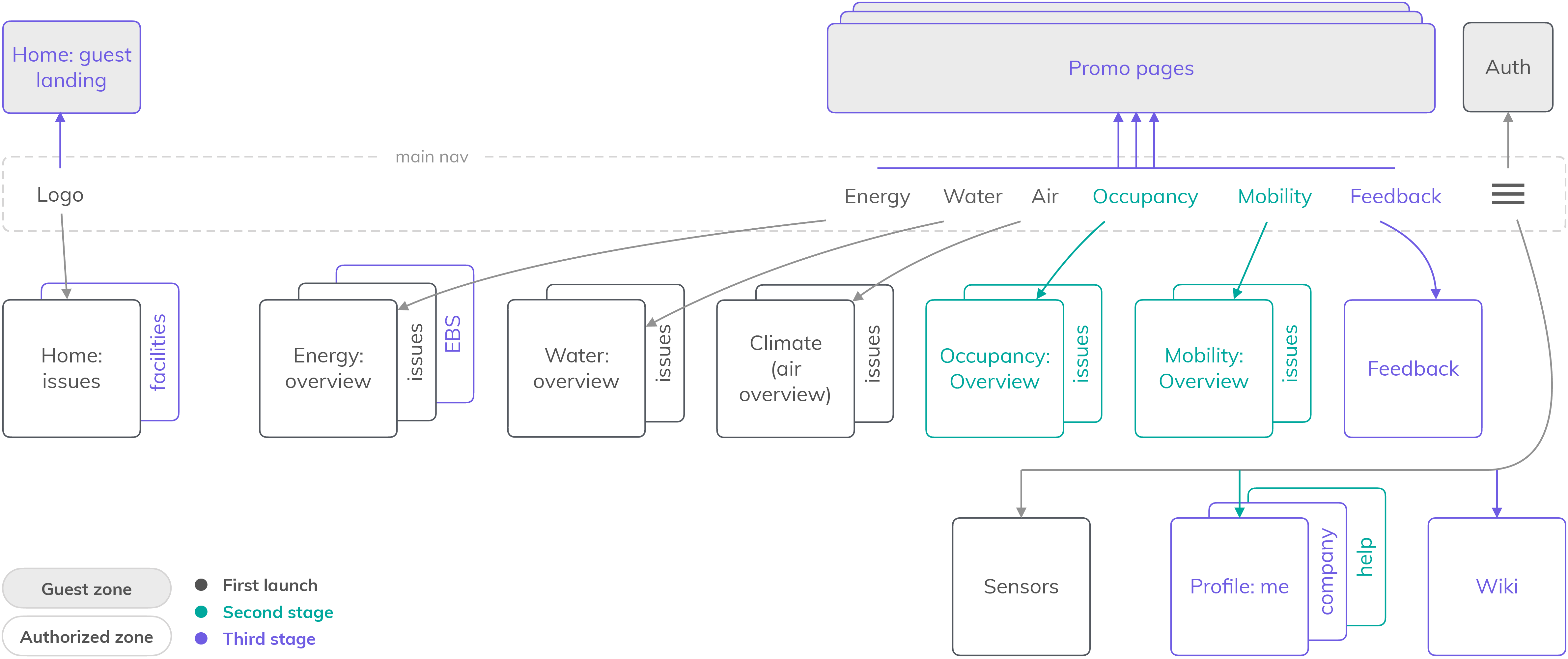
Product structure: modules
Unica did not approach Building Insight from scratch. There were multiple smaller building management-related products, earlier and in parallel, some of which destined merge into the platform. These legacy products had not just users with formed habits, or salesmen with their piles of slides, but first and foremost — infrastructure of physical devices such as sensors already up and running at clients’ facilities, and real-world pipelines of installation and support. So while visually my design inherits as much as fonts and ‘boxy’ style of the main navigation, structurally it dealt with a lot of givenness.
It is perfectly expectable for a complex platform to enable customisation via modularity: let them pay only for ‘lego pieces’ they need to build the solution for their specific task. However, the team didn’t have much freedom in deciding how to shape the ‘lego pieces’: we had to accommodate legacy products (and as usual - to start selling ASAP :)). As a result, the modules of BI [1.0] were independent of each other and shaped as follows:
- Energy. Electricity consumption and production.
- Water. Water consumption and safety.
- Air. Indoor climate. Initially a stand-alone product.
- Occupancy. Presence of people.
- Mobility. E-car charging stations.
- Feedback. Surveys for occupants.
So two paragraphs above were to excuse an unpleasant fact: Building Insight is structure follows rather its own development than users’ processes and goals. We’ll fix it. Legacy structural and visual decisions will be obsoleted in [2.0]). Rough map:
Layout
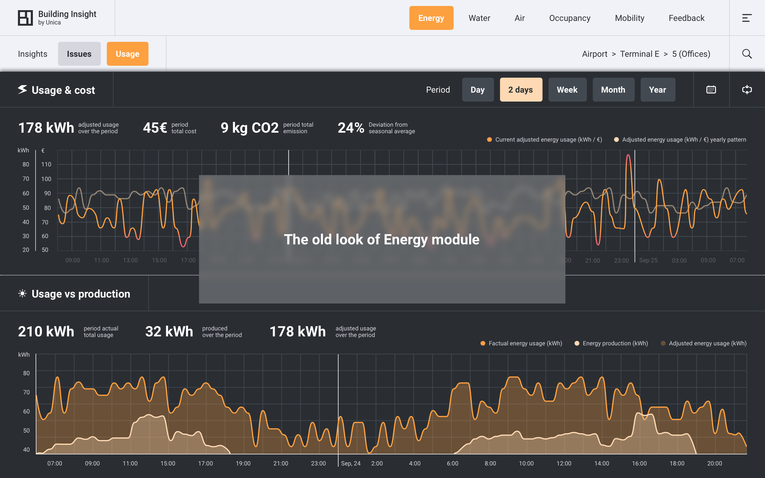
Disclaimer 1. Screens used in the presentation below were made at different stages of the project so their layout is not consistent as it was changing through time. I hope you can forgive me for not updating an obsoleted design. Instead, I explain the final layout here (final of [1.0], not final-final).
[Layout] The most common page layout
Building structure x data panel. Building Insight gives us information (the what) about a facility or its part (the where) for a period or moment in time (the when). Below you can see the most common layout in its two main states:
- navigation focus: navigating to the location of interest (the where). Default for each module, data panel at the bottom is collapsed and shows one core chart (if there’s a location selected and there’s data for it).
- data focus: exploring information (the what) for the selected location and period. When user expands data panel it contains all available charts for the selected location.
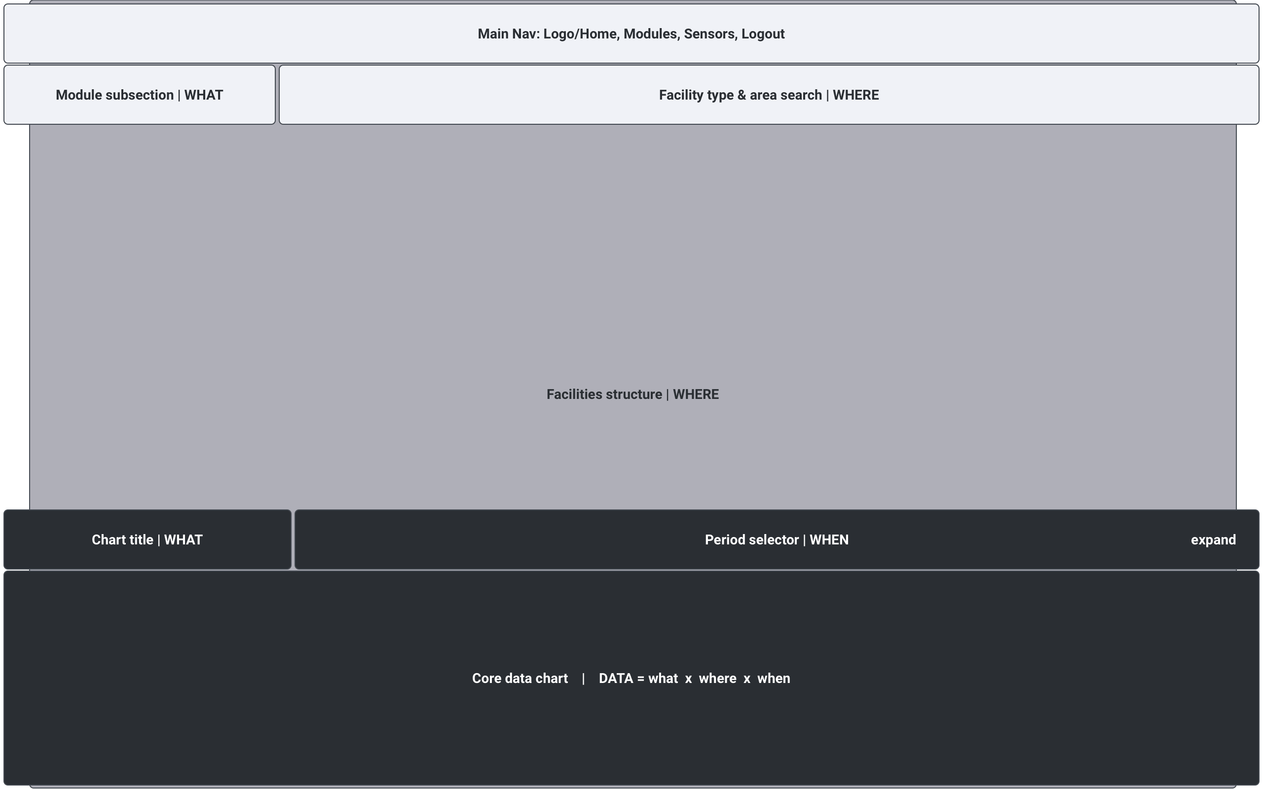
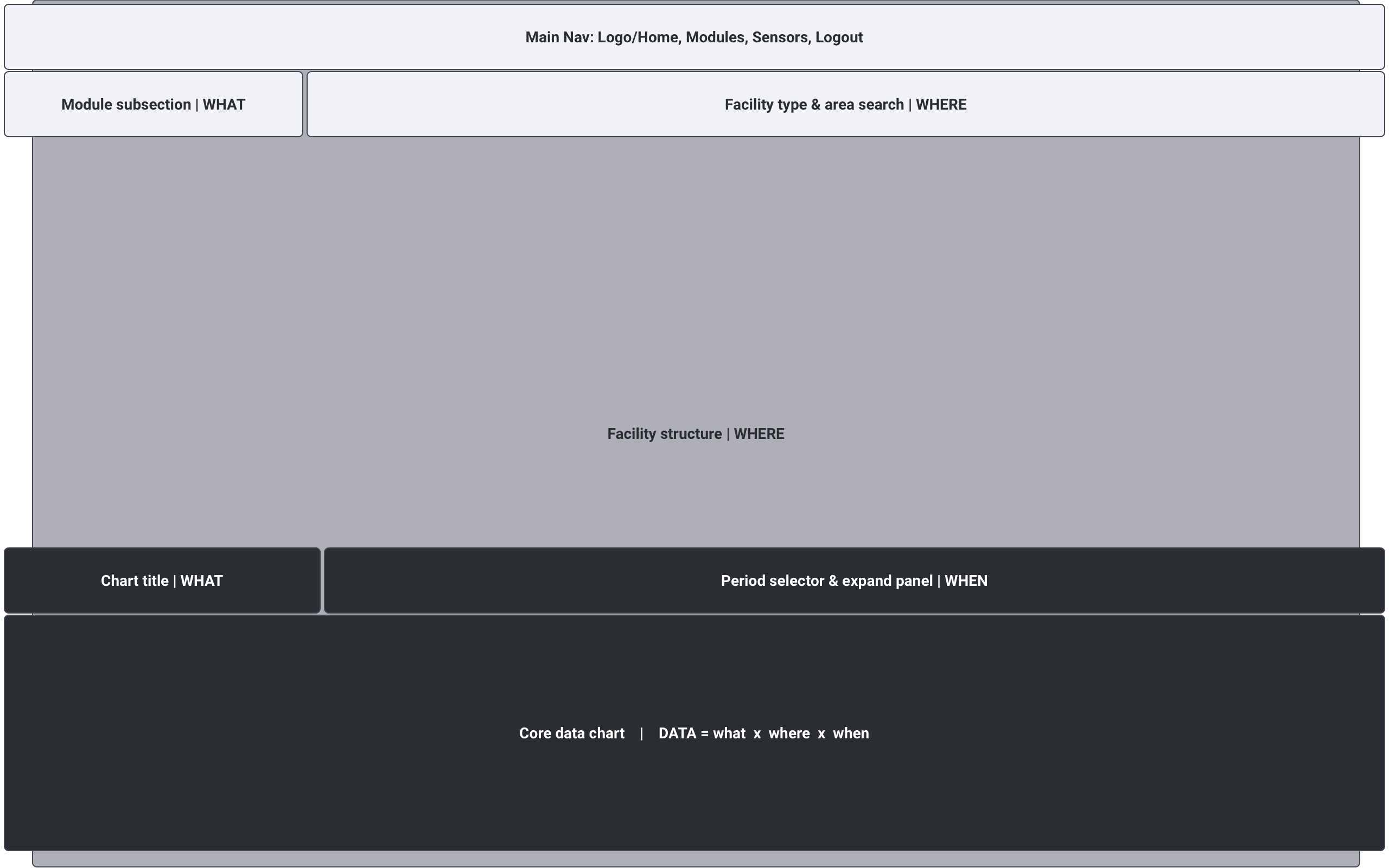
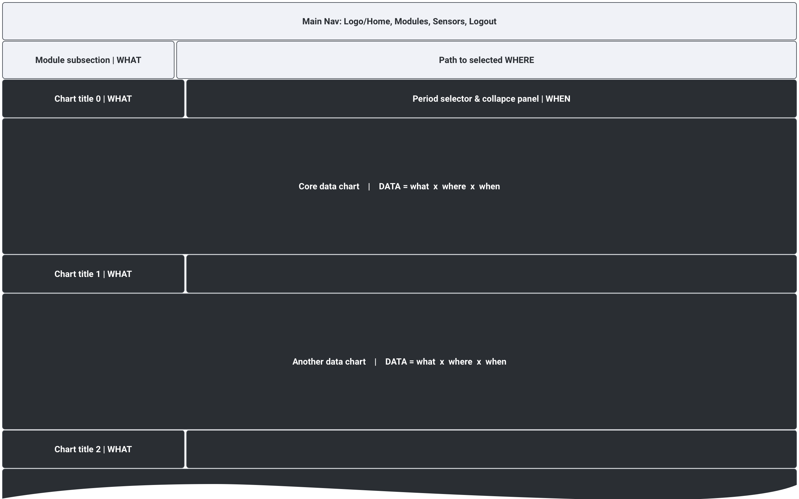
Why on Earth?! - you wonder, I hope. The simpler, clearer and more common solution would be to put the Where (property structure) and the What (data) on separate pages. Unfortunately, user needs to 'walk around' - jump from one location to another - too often. So the split screen won the desktop. As of mobile (where I'd go for separate pages)...
Disclaimer 2. There are 2 secret Dutch cultural traits that Lonely Planet won’t tell you. First is the loyalty to e-mail communication in all situations, even though other communication tools would be easier, more efficient or less overwhelming. Second is creating desktop-only digital products. Don’t ask me where are my mobile layouts. I argued, and begged, and threatened. But all I got is creating instruction about ‘how to make my layouts responsive’ - backwards, from desktop to a smaller viewport.
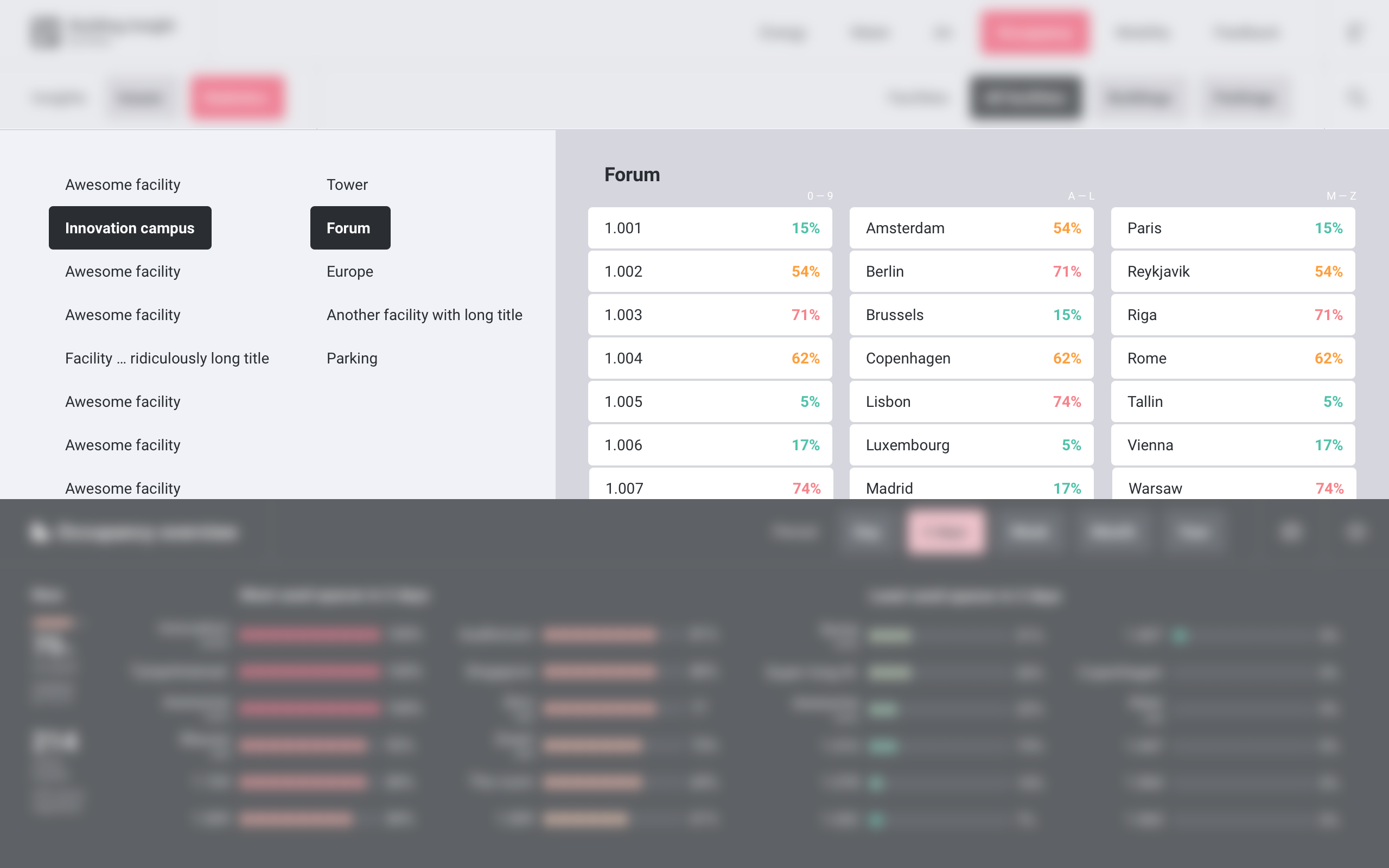
[Layout] Sensors: drilldown through property structure
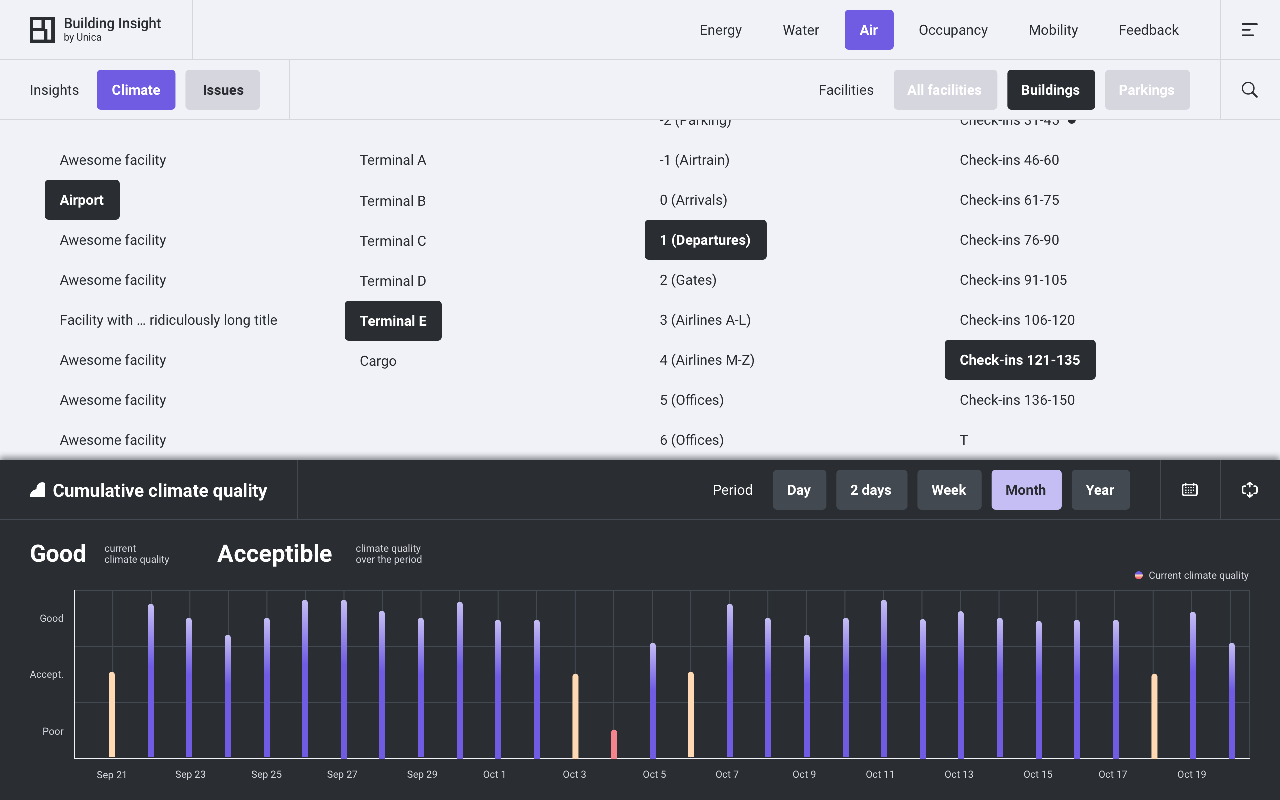
A building is a tree. As a data structure at least. Like files on your computer (just you mostly can’t move them): there are multiple buildings like ‘folders’, floors within each building, rooms within floors, sensors within rooms. The presentation of a tree (with in theory infinite depth) is solved long ago: turn on the column view in your operation system. It enables the fastest navigation between objects on different levels. It’s the most basic view of a tree-like structure, which makes sense to implement first for unknown depth and unknown amount of items on each level.
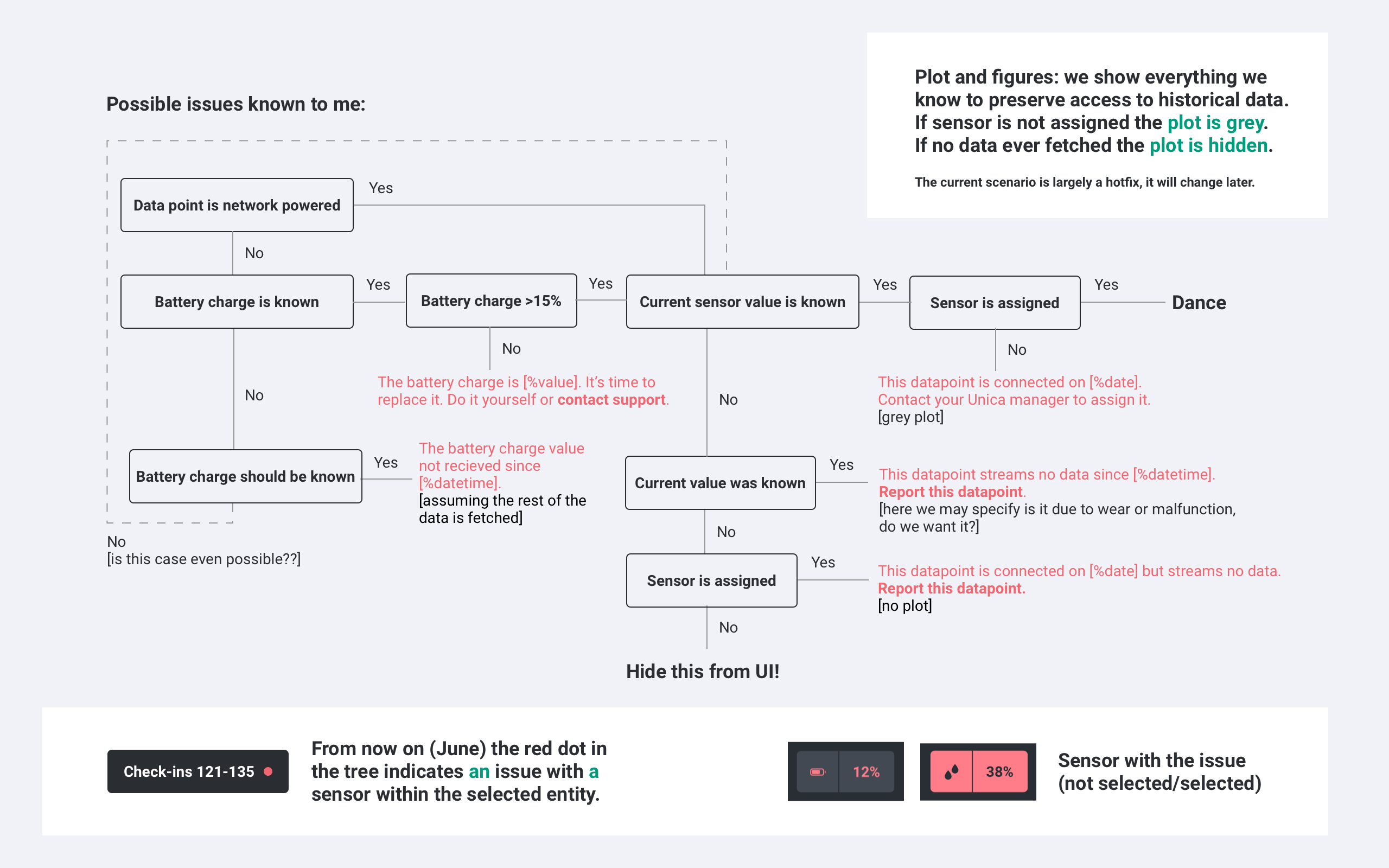
Sensors. Modules (we'll look at them a bit later) display data per location and are not concerned with single sensors and meters - and tuth concerned with (max depth - 1). The deepest level of the structure - all single data sources ever known to the system - can be found in Sensors section. It shows them 'naked' - including unassigned, not located or malfunctioning sources.
The Imaginary Airport. The maximum depth we could imagine is ~ 6, example is an airport: airport > terminal > floor > area > office/desk > sensor. In the carousel below you can see Sensors section for the Imaginary Airport. Red dots stand for problems, the 4th screen shows an example of a 'troubled' sensor, and 5th - a nostalgic work-in-progress item - the first ad-hoc scenario (feel free to ignore :)).
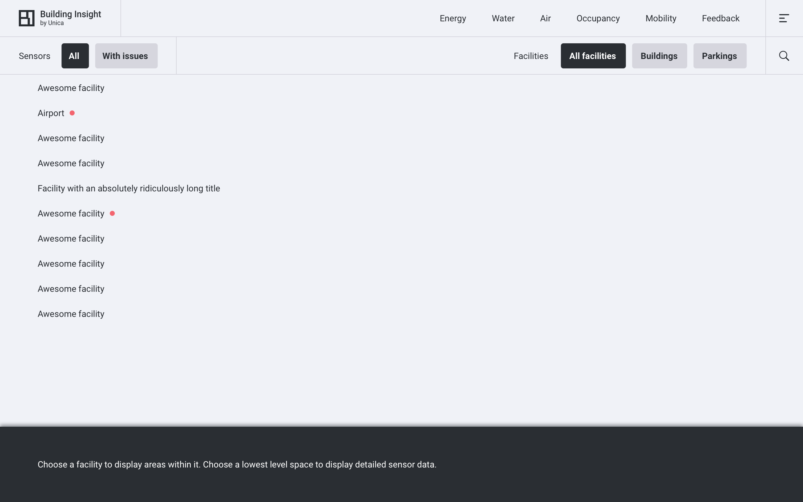
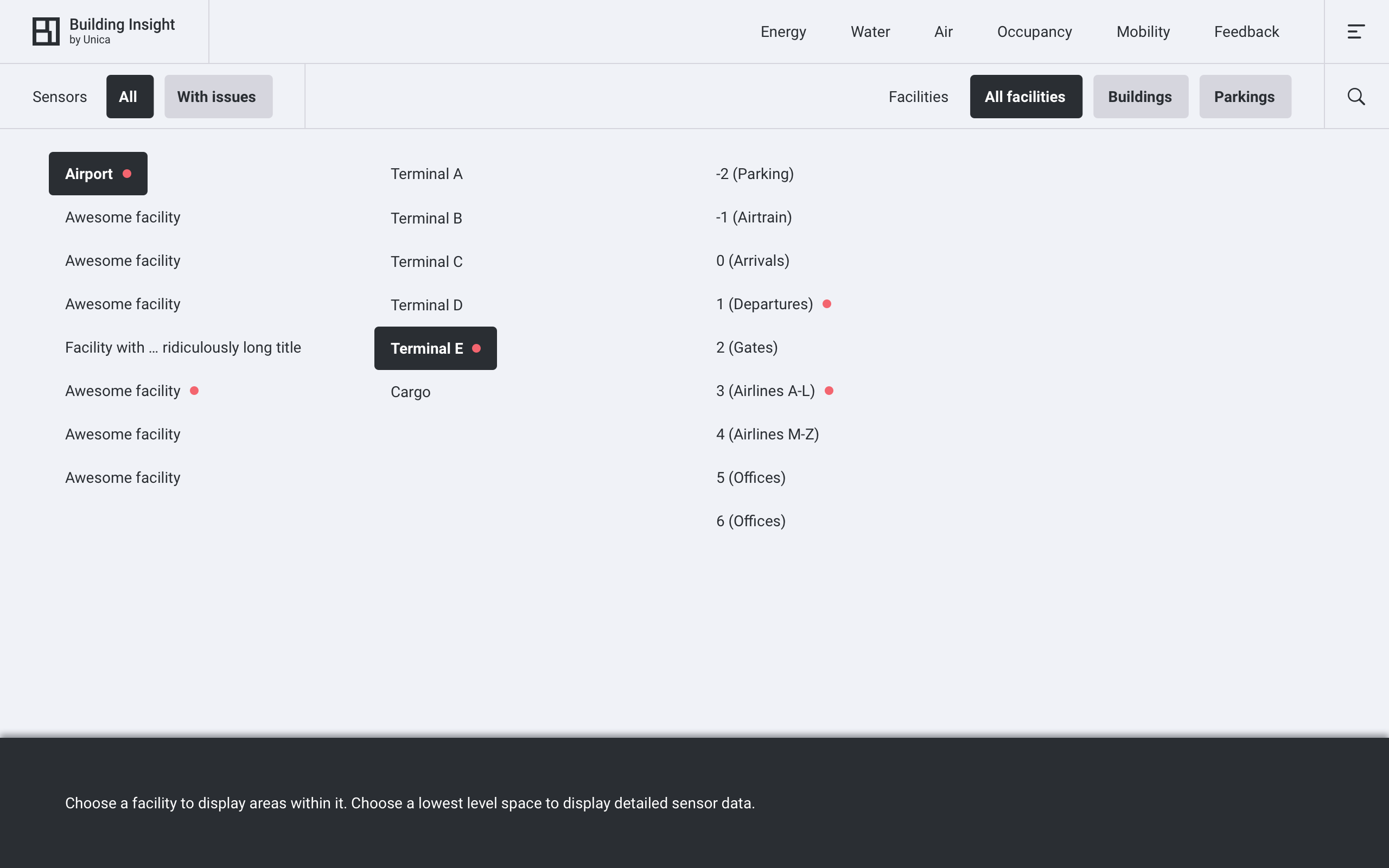
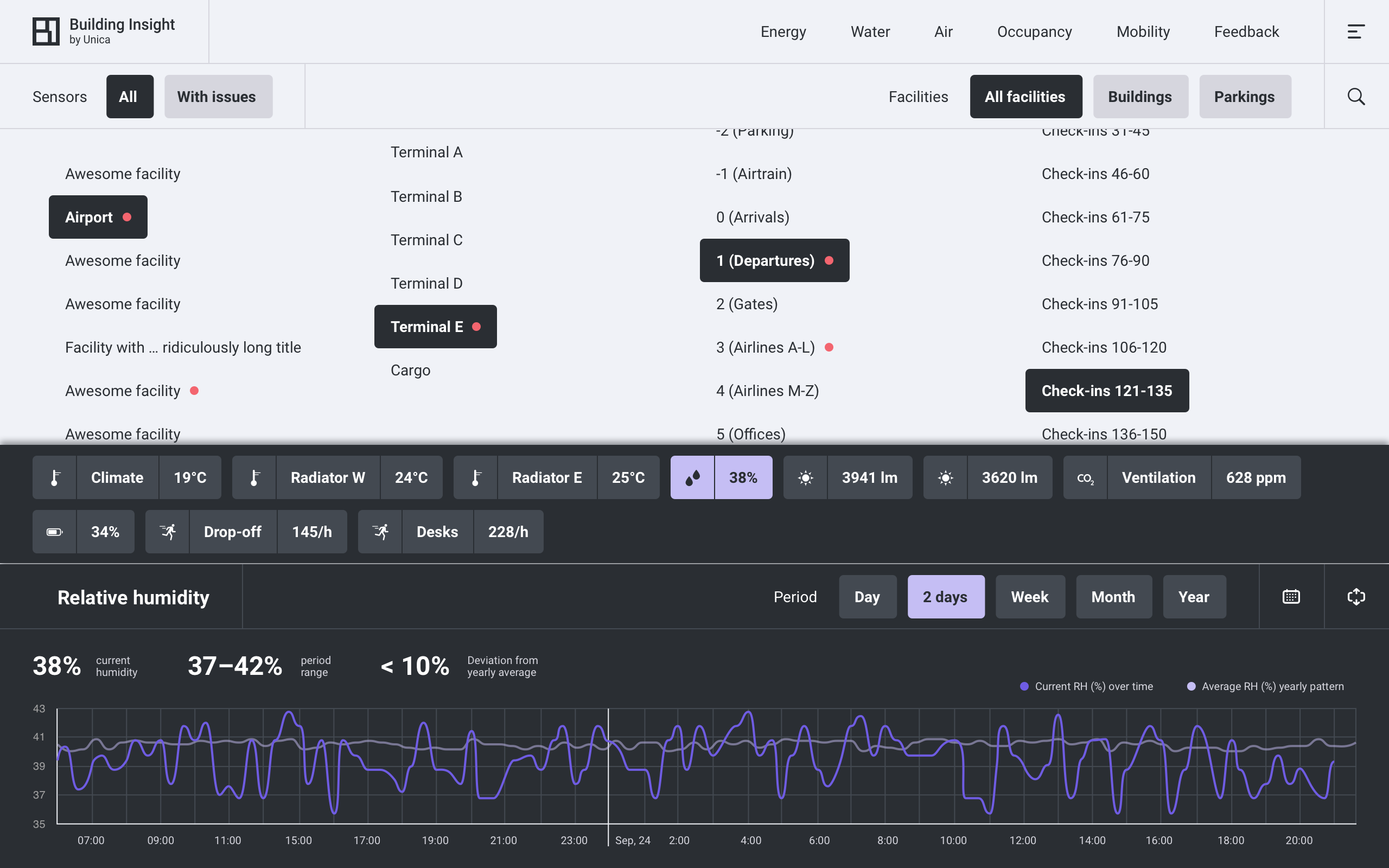
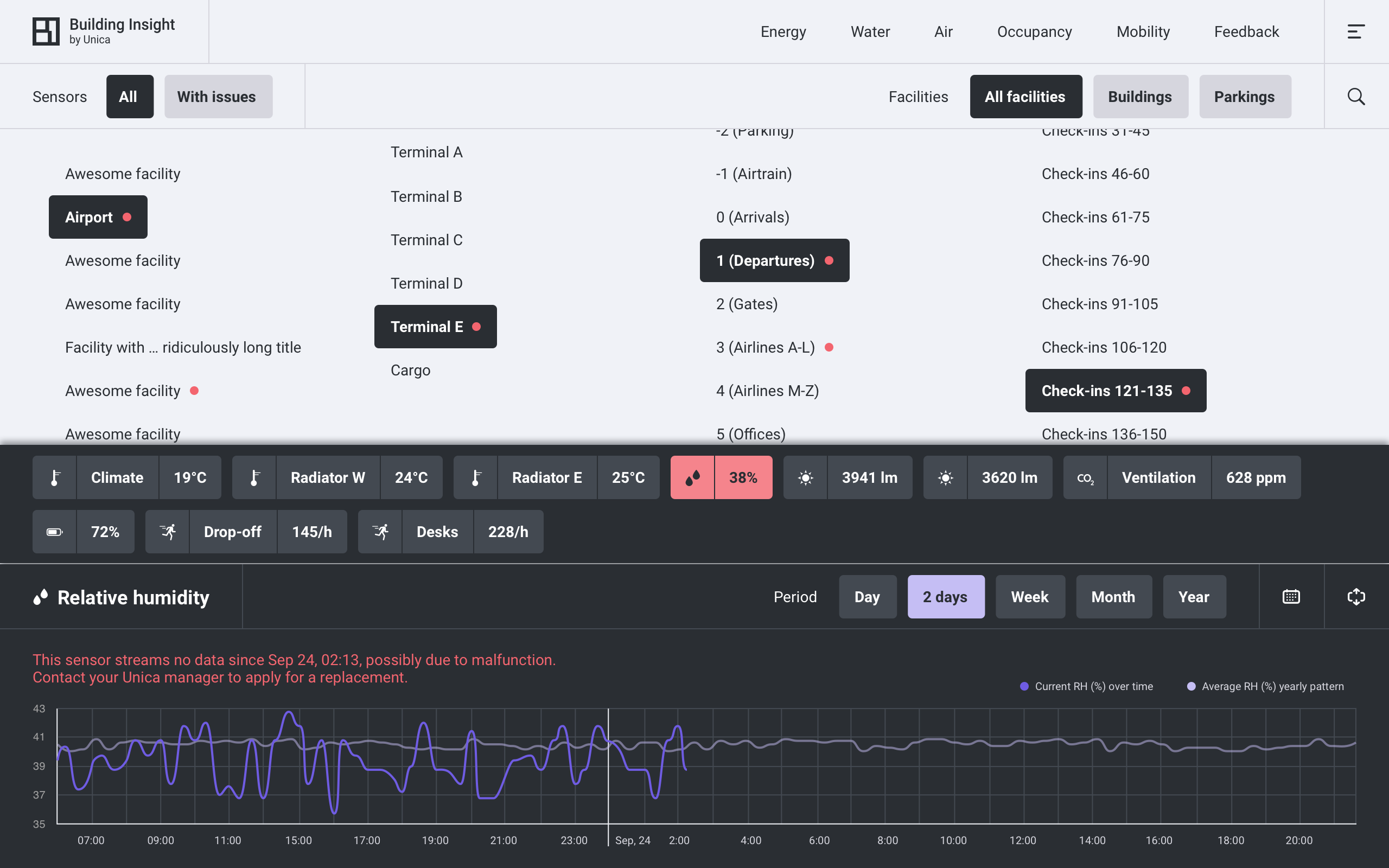
In reality, the maximum depth of a facility ever connected to Building Insight is four. In time structure evolved as shown in the carousel below: space reserved for 5-column structure was partially used for in-context data and extended display of the lowest level:
[Layout] More on expectation vs reality
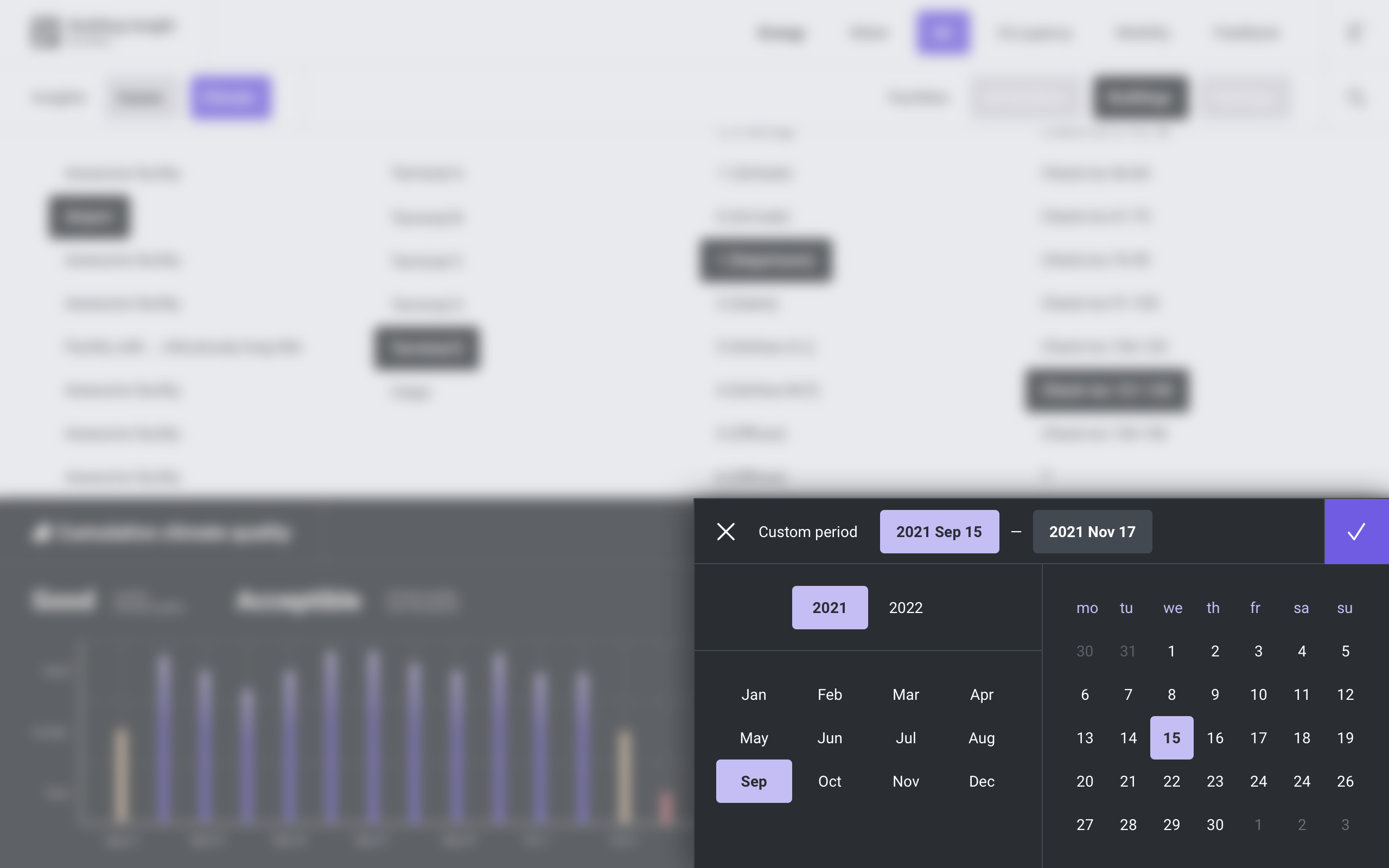
Two last details of the main layout to discuss are date picker (custom period selector) and facility search. Both as well a bit unortodox.
The custom period selector (aka date picker) is another example where universality was surrendered in favour of real data. Date picker is static: user selects each part of the date in 1 click in any order. Disadvantage: only 8 years can be accomodated without scrolling. However, 8 years were even more enough for existing data and the lifecycle of this design.
The search in this version can only search for locations (facilities and their parts). Given this limitation, I listed search results in multiple lists instead of one: each result is listed at its level of the structure.
Energy
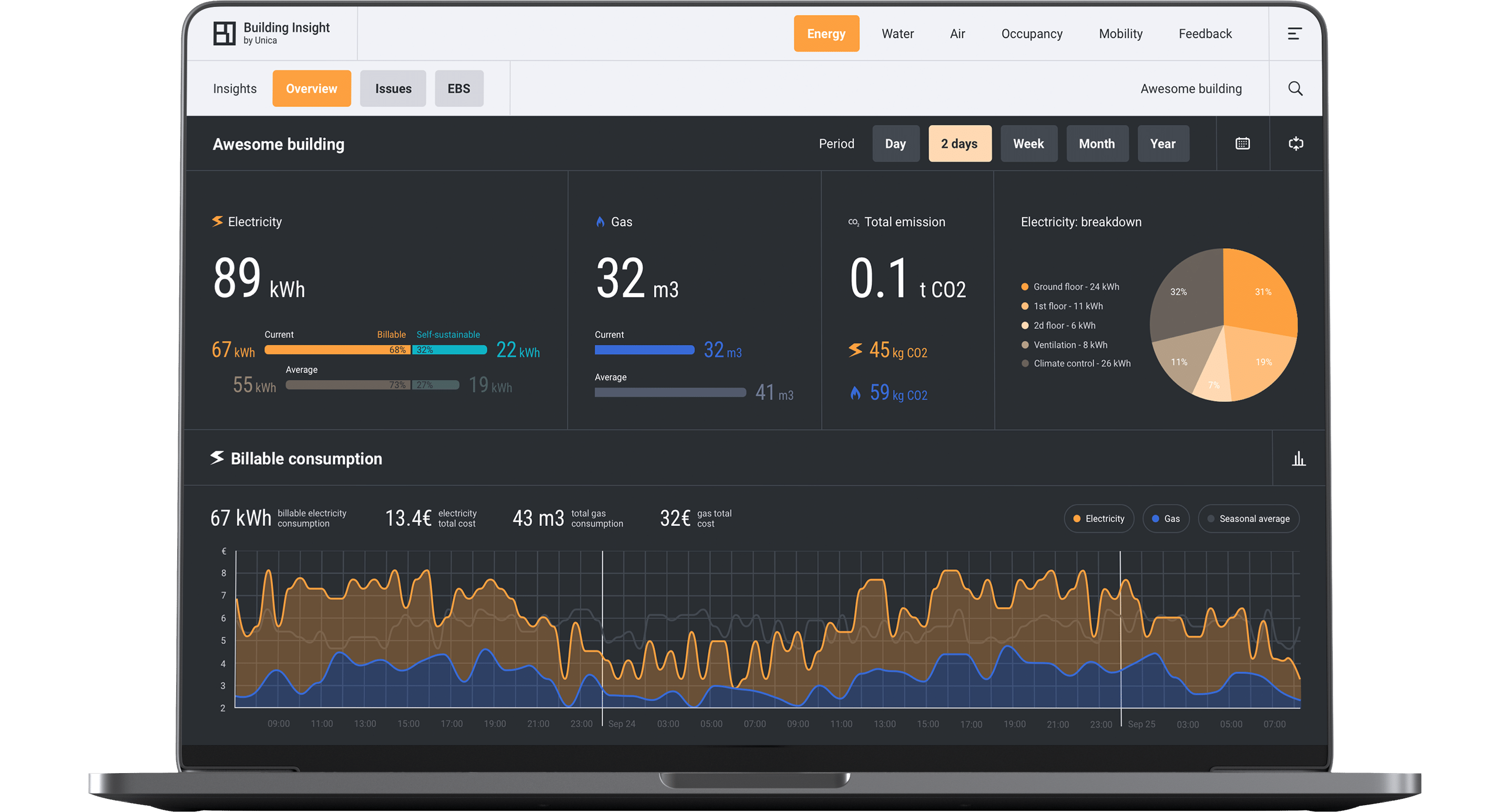
After the longest intro in this portfolio I can finaly move to the core designs: data for building management served. Homepage is shown in the end: it's easier to comprehend after the dive in the data aggregated there. First module to be discussed is Energy: concerns consumption of electricity and gas, and production of electricity if any.
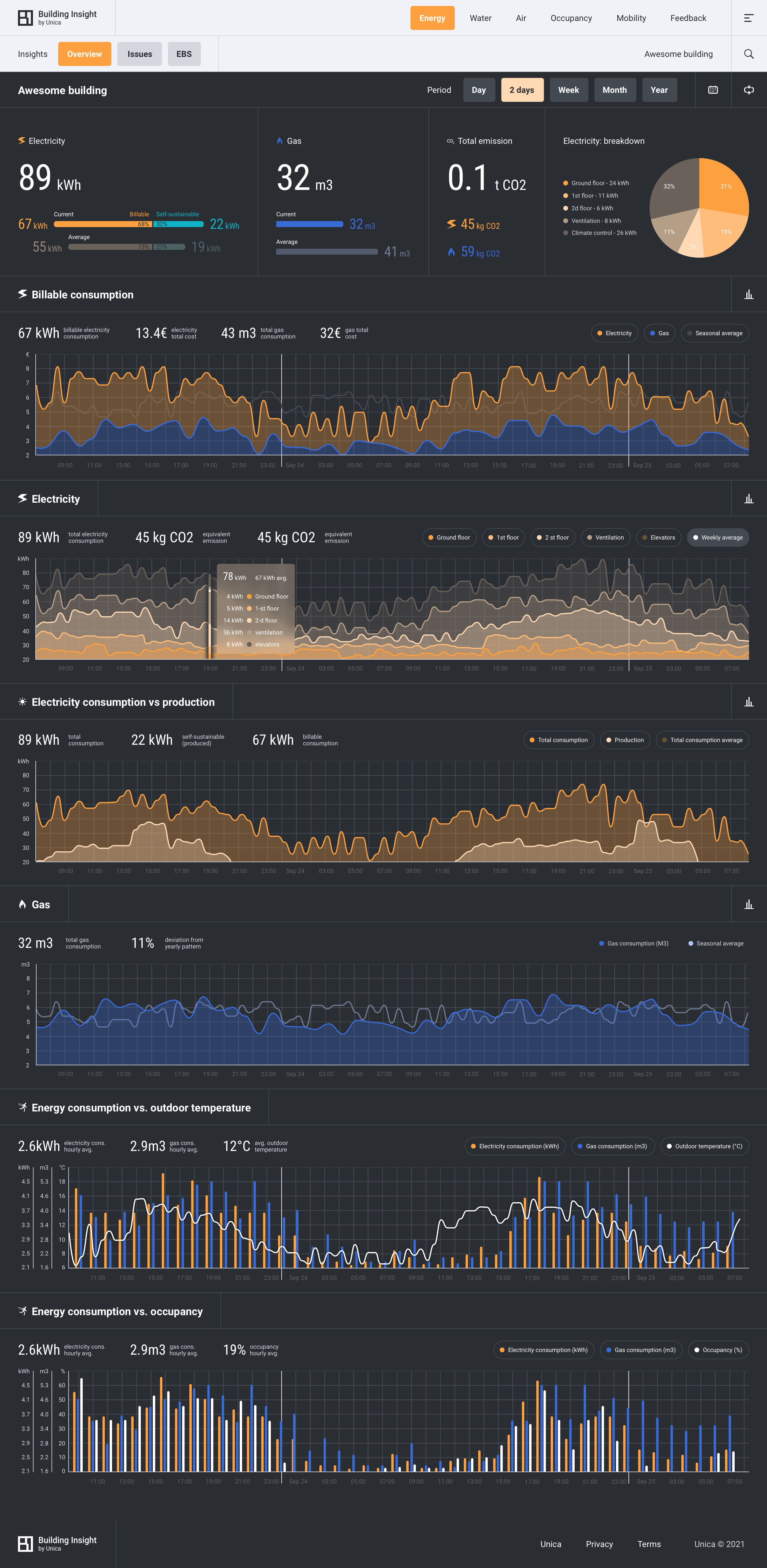
Energy: Overview
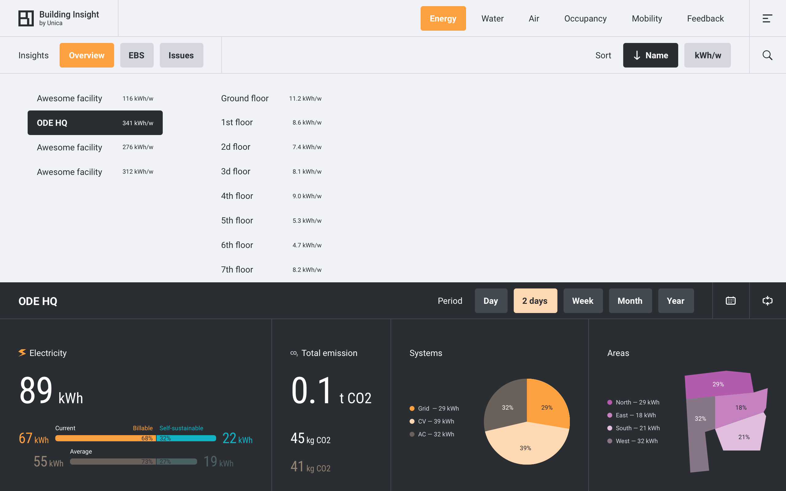
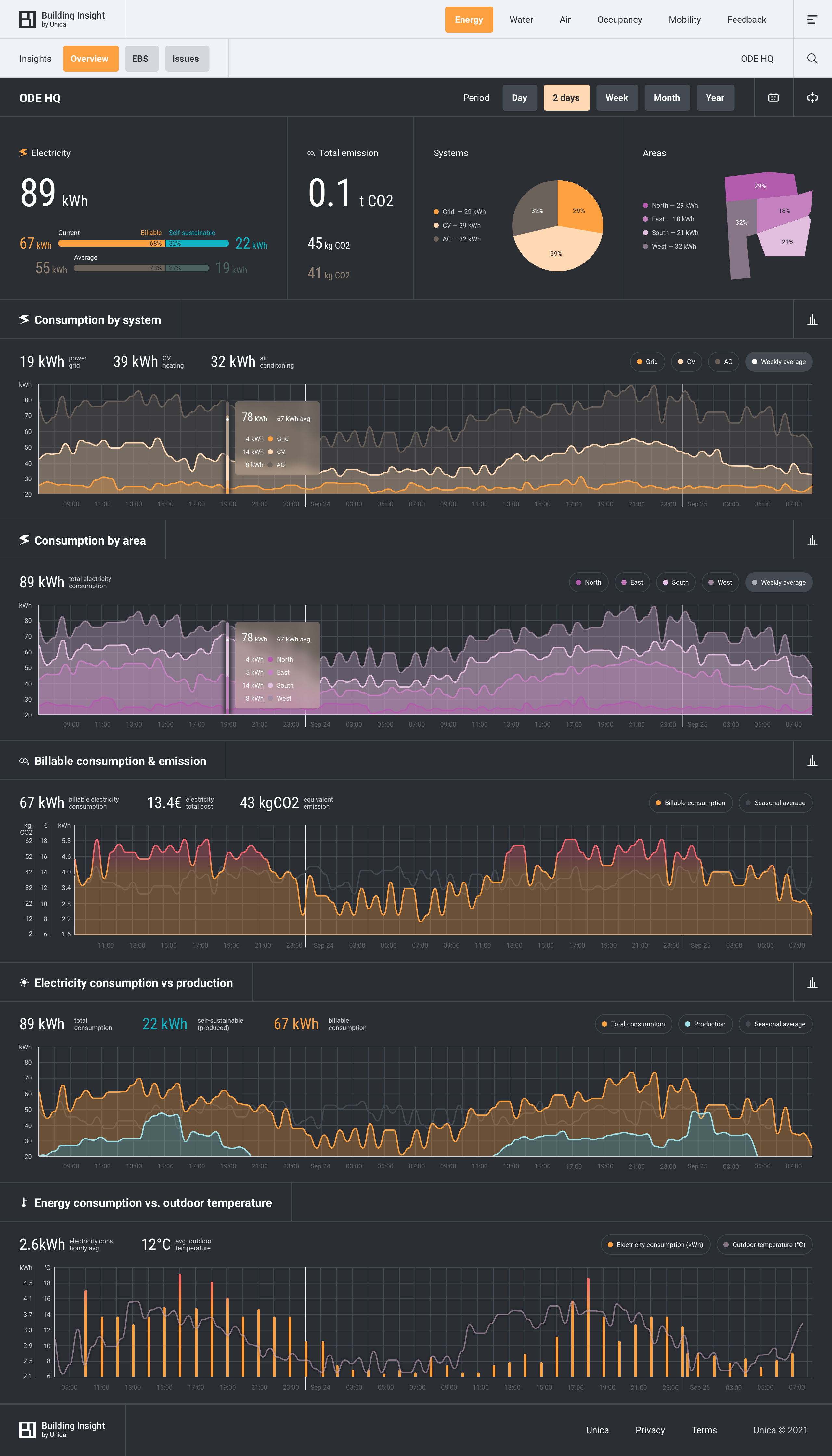
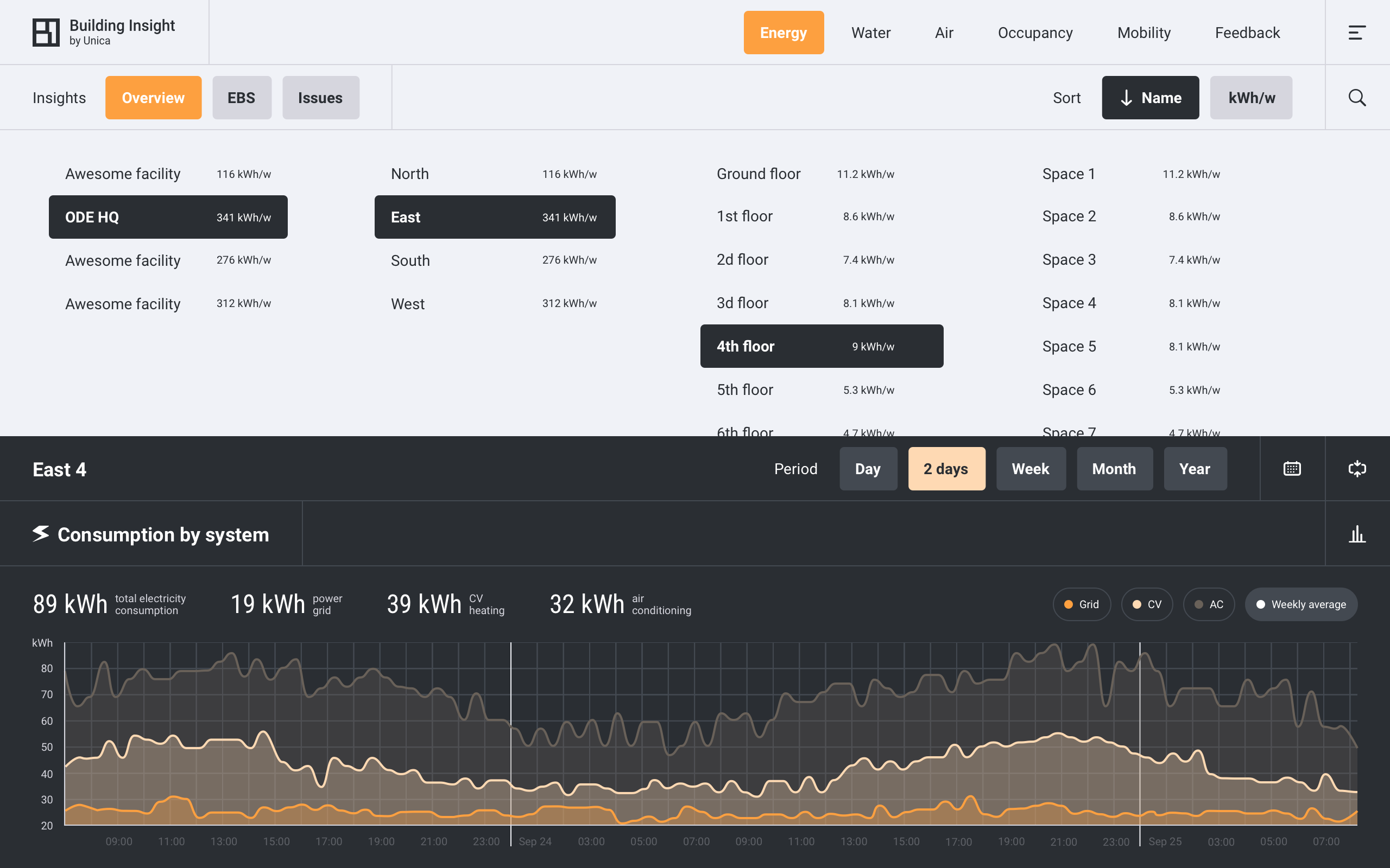
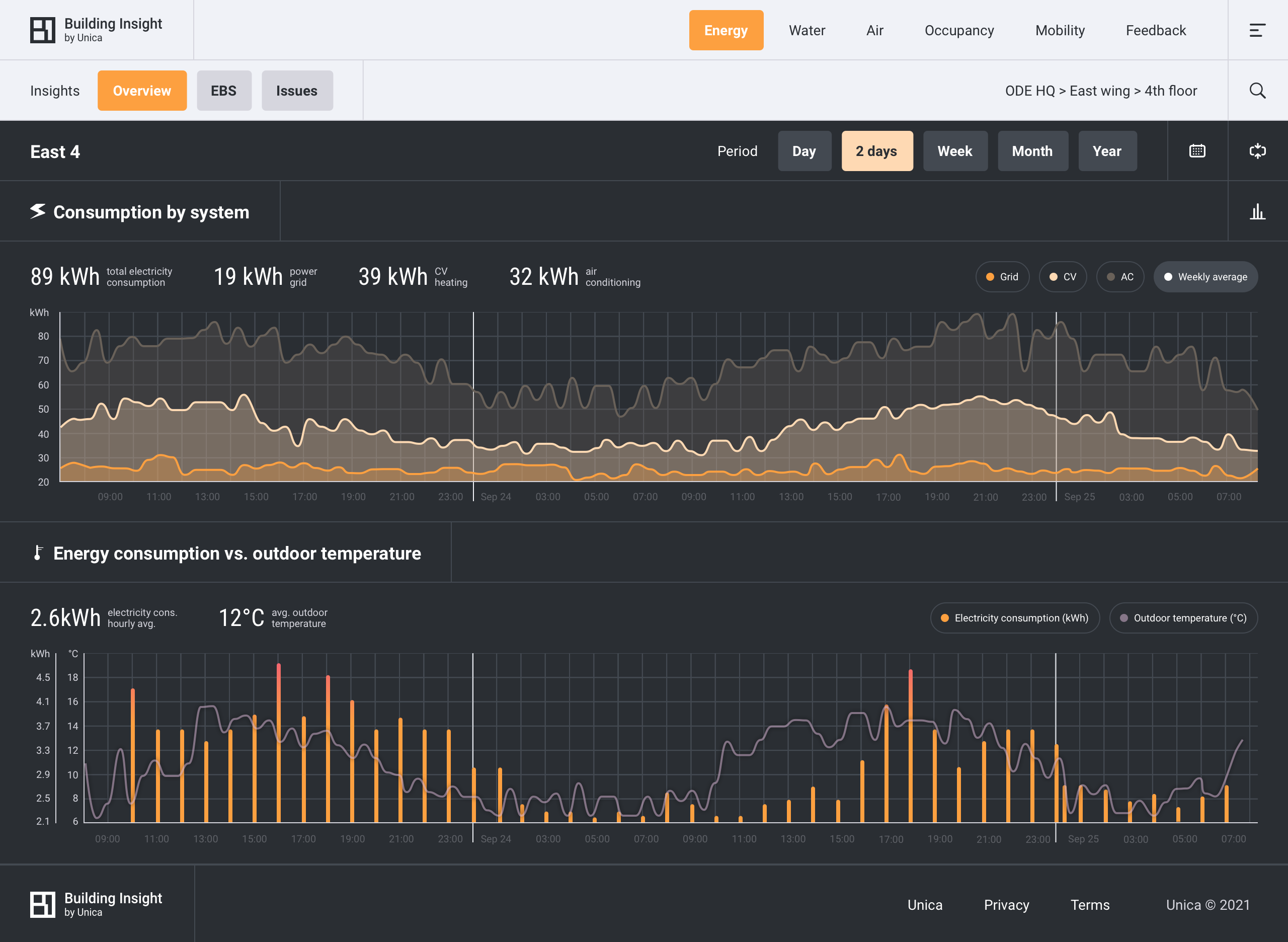
In the carousel below:
- (1) Energy v.1.2> Overview > an entire building > expanded data panel. Scroll it. The building has electricity and gas.
- (2) Energy v.1.2> Overview > an entire building. With tailor-made widget for ODE Booking.com HQ. The building does not have gas.
- (2) ...> expanded data panel. Scroll it.
- (2) ...> floor level.
- (2) ...> floor level > expanded data panel.
- (3) Energy v.1 > Overview. I warned above that you'll see inconsistent layouts. Energy v.1.2 is one of the latest layouts of [1.0]. This is the initial layout of the module, more consisted with other modules which weren't updated.
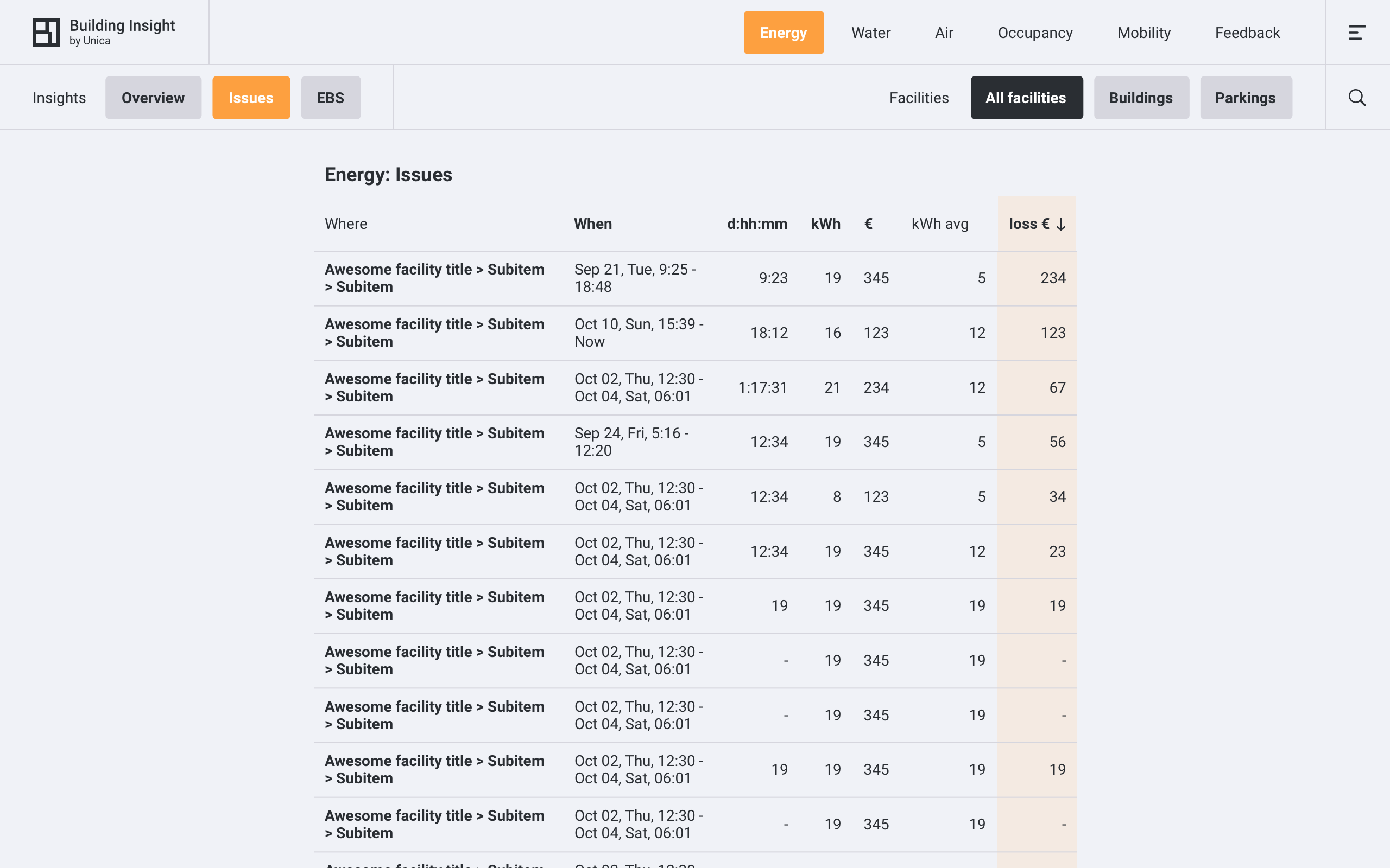
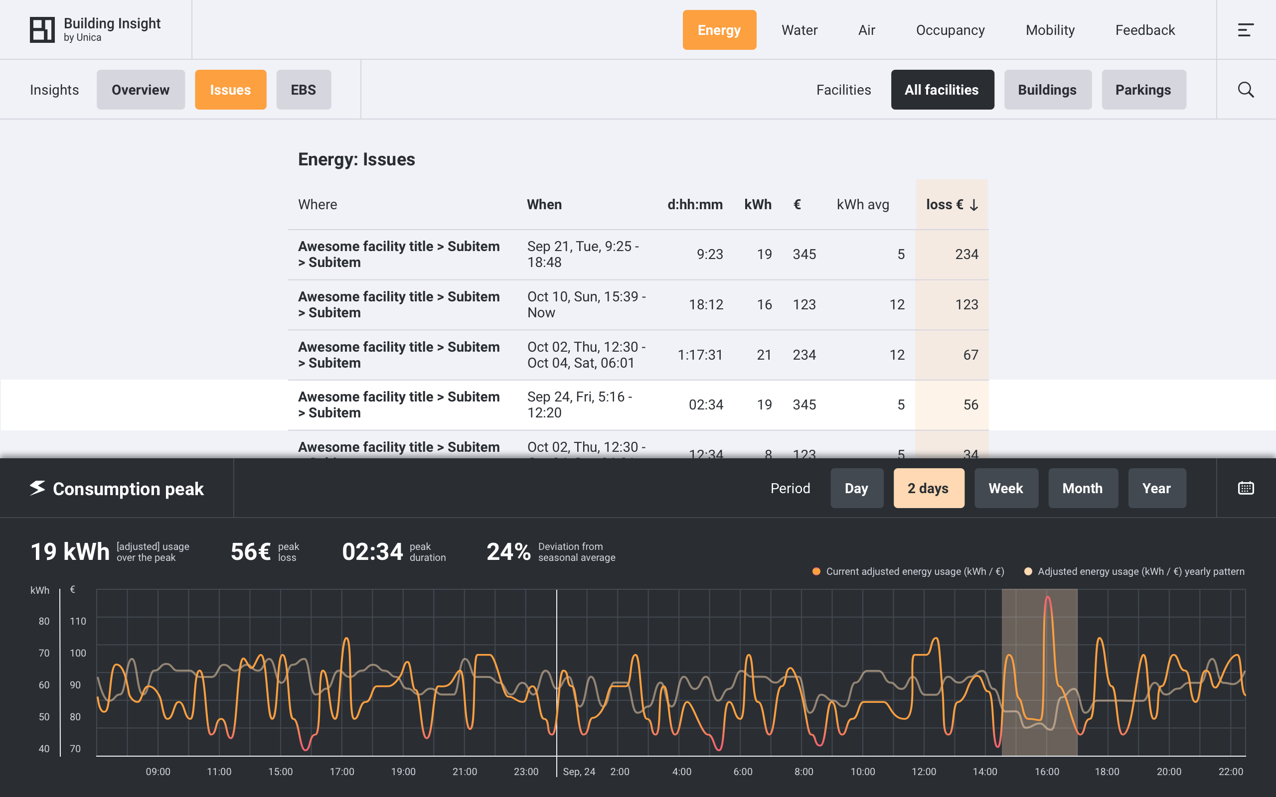
Energy: Issues
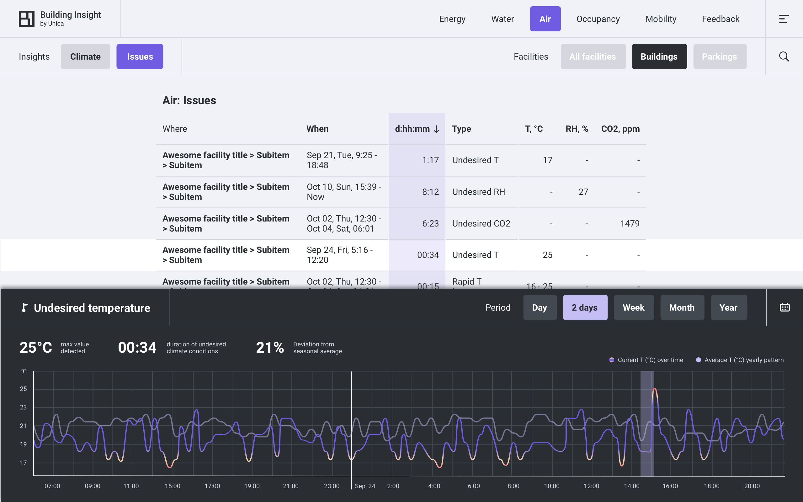
Next tab in the majority of modules is Issues. It says where, when and what something went wrong: anomalies or undesirable events detected in the collected data. For energy there are 3 types of issues:
- High consumption, expressed as "X% higher than during similar period average"
- Critical grid load in relation to allowed by the contract, expressed as "X% kWh max vs grid connection"
- Blackout
Energy: EBS
EBS tab (unique to Energy v.1.2) is the first step to report generation. According to recent Dutch governmental regulations building management has to use a EBS, Energieregistratie- en bewakingssysteem (Energy registration and monitoring system). Let's skip the EBS here as it's given quite some spotlight in the Unica [2.0].
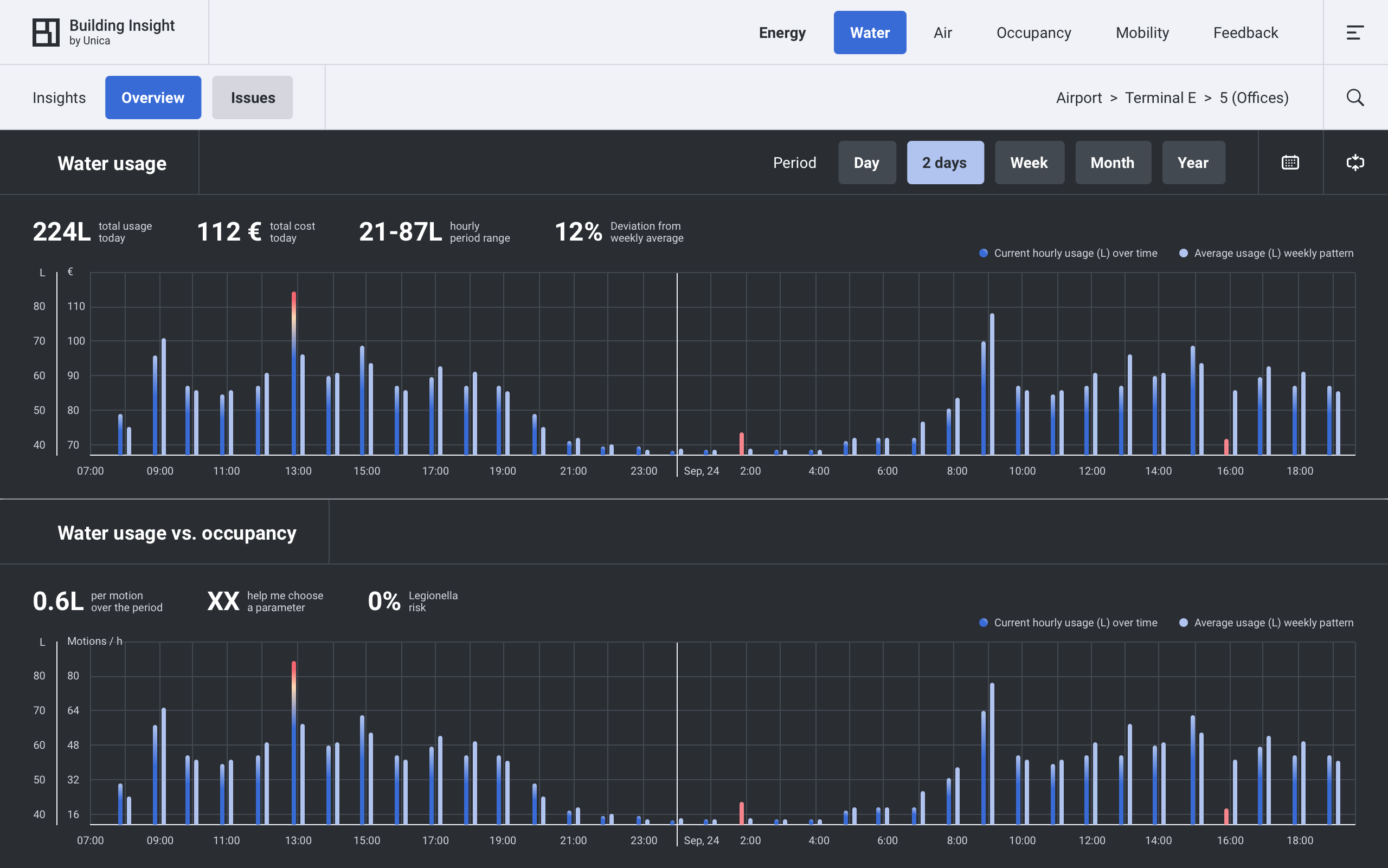
Water
Water is the simplest module: it shows how much water is used. And the best example why ‘element’-based modularity (energy-water-air) doesn’t make much sense: energy and water monitoring has different goals. Sustainability-at-large aside, energy is monitored to comply with governmental regulations and to follow the costs. Both matters are not that pressing when it comes to water. Costs of water comparing to e.g. gas are rather negligible (this is why no one rushed adding ‘billable consumption’ in the early version of the Water module shown below).
Water consumption data is collected, of course, for the sake of more complete insight. But the other - and even more important goal is… occupants’ safety. In particular, idle pipes are a lovely environment for a certain bacteria (see Water Issues below). Not the first thing you think of when one says 'water consumption'. So organising data into modules by goals and business processes would make much sense, and - spoiler - I will move this mountain a bit in Unica [2.0].
Water issues:
- Leakage risk - expressed as "continious consumption during time T".
- High consumption - expressed as "X% higher than analogous period average".
- Legionella risk - expressed as "no consumption during 72h or more". In short, water pipes are to be in use regularry, otherwise there's a bacterial risk. In length: RIVM, WHO.

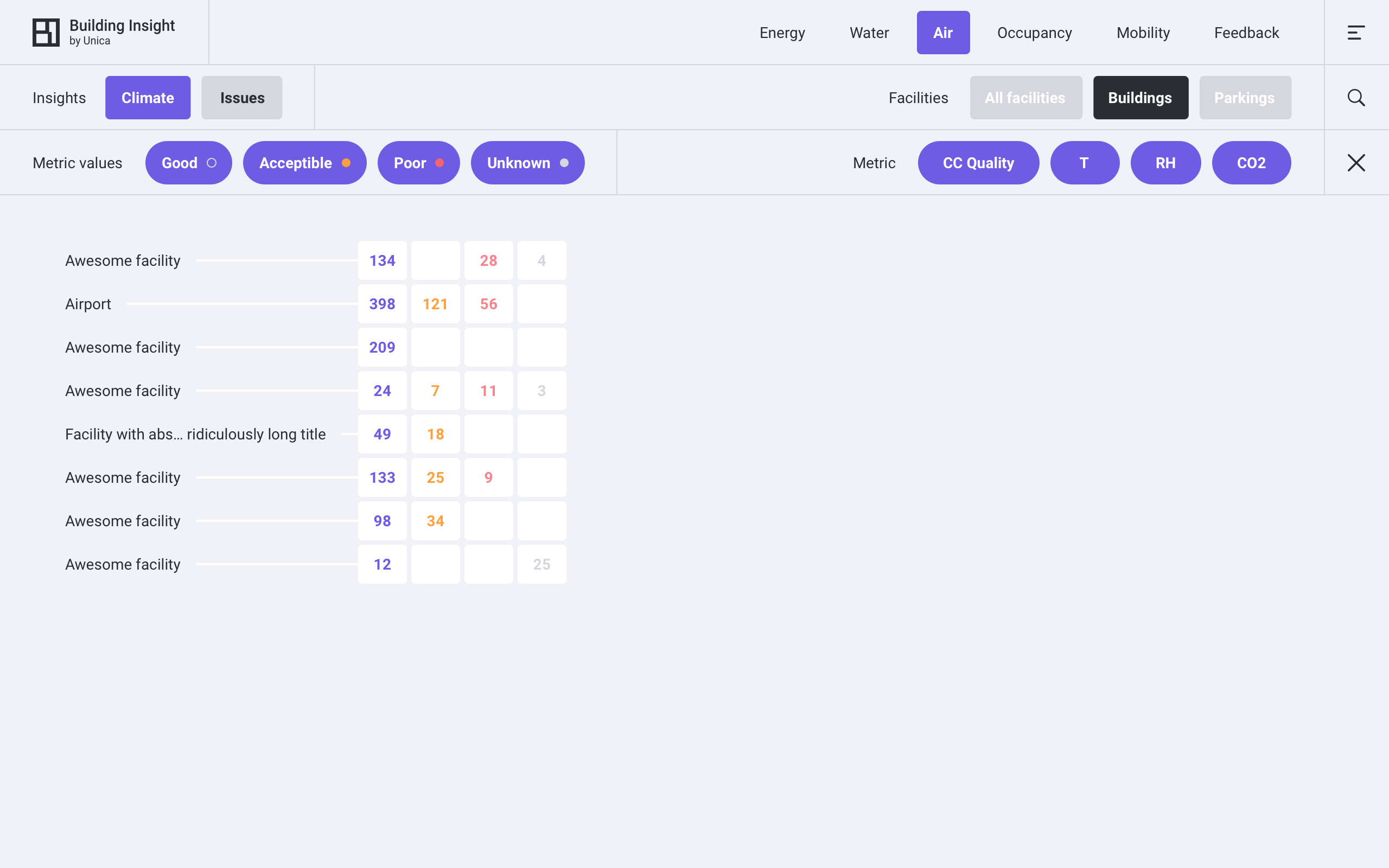
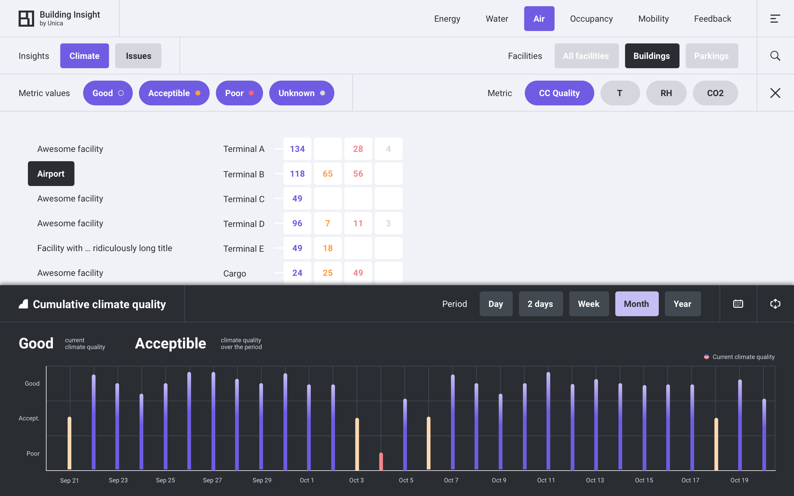
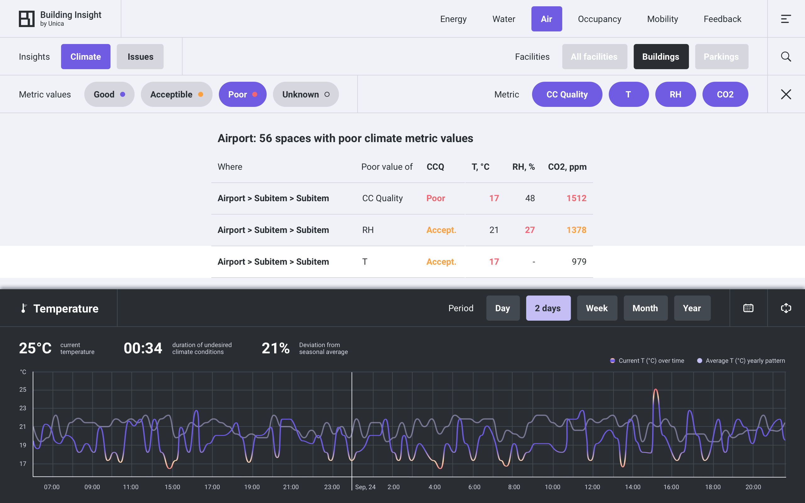
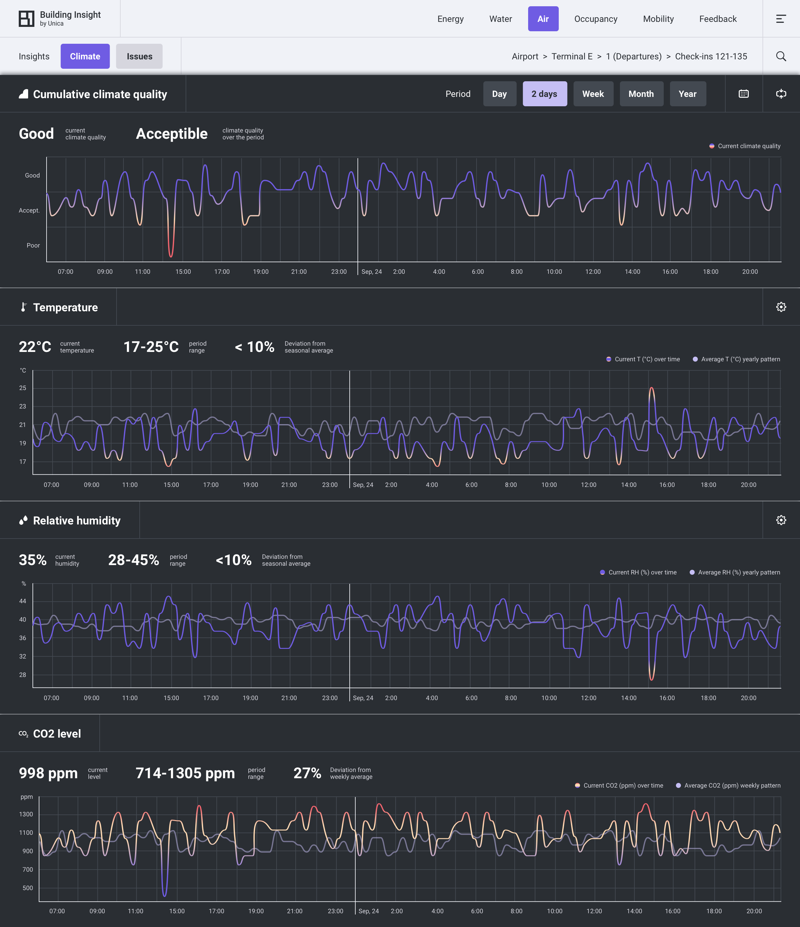
Air
Air module sensors are little boxes with temperature (T), relative humidity (RH) and CO2 single sensors inside. BI inherited them from a stand-alone legacy product, together with installation and assignment pipelines. The little boxes are to be sticked to a wall in every corner where a separate measurement makes sense. So Air module is associated with a huge, often the biggest pile of actual sensors.
The module is way more popular than you can imagine when thinking of a pile of thermometers. People in uniform come and install cute boxes with QR codes. It’s visible to all occupants. They can check values. The boxes measure something understandable and directly important for your comfort (spoiler - you can even give feedback, but more on that in Feedback module). So no, I do not have a study to back up that statement, but: Air module is the innovative image module.
The purpose of the facility defines thresholds for what is good T, RH and CO2 (an office, greenhouse or gallery with XV century paintings obviously have different demands). To save users (including occupants in this case) some cognitive effort, I insisted on creating a cumulative metric CCQ (cumulative climate quality), which answers the question ‘is indoor climate good here?’ with ‘good’, ‘acceptable’ or ‘poor’. These ‘grades’ can be generalized, unlike exact values of T, RH and CO2 which can only be shown at a room level. Grades were added as extra filters to the layout (another promised between-module inconsistency).
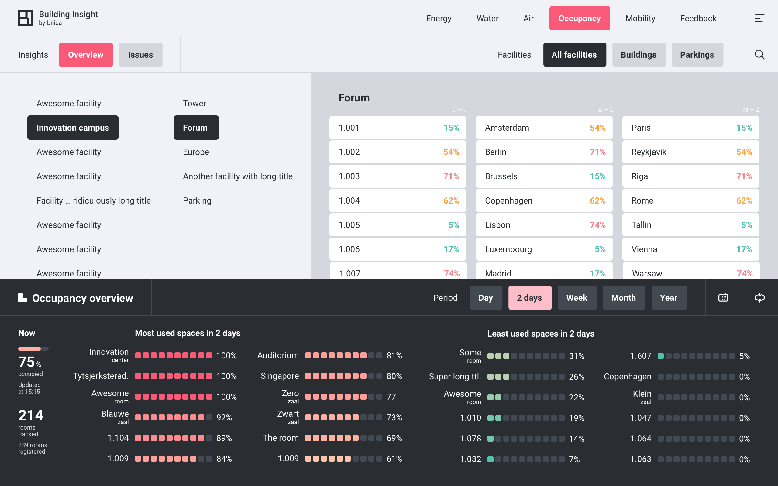
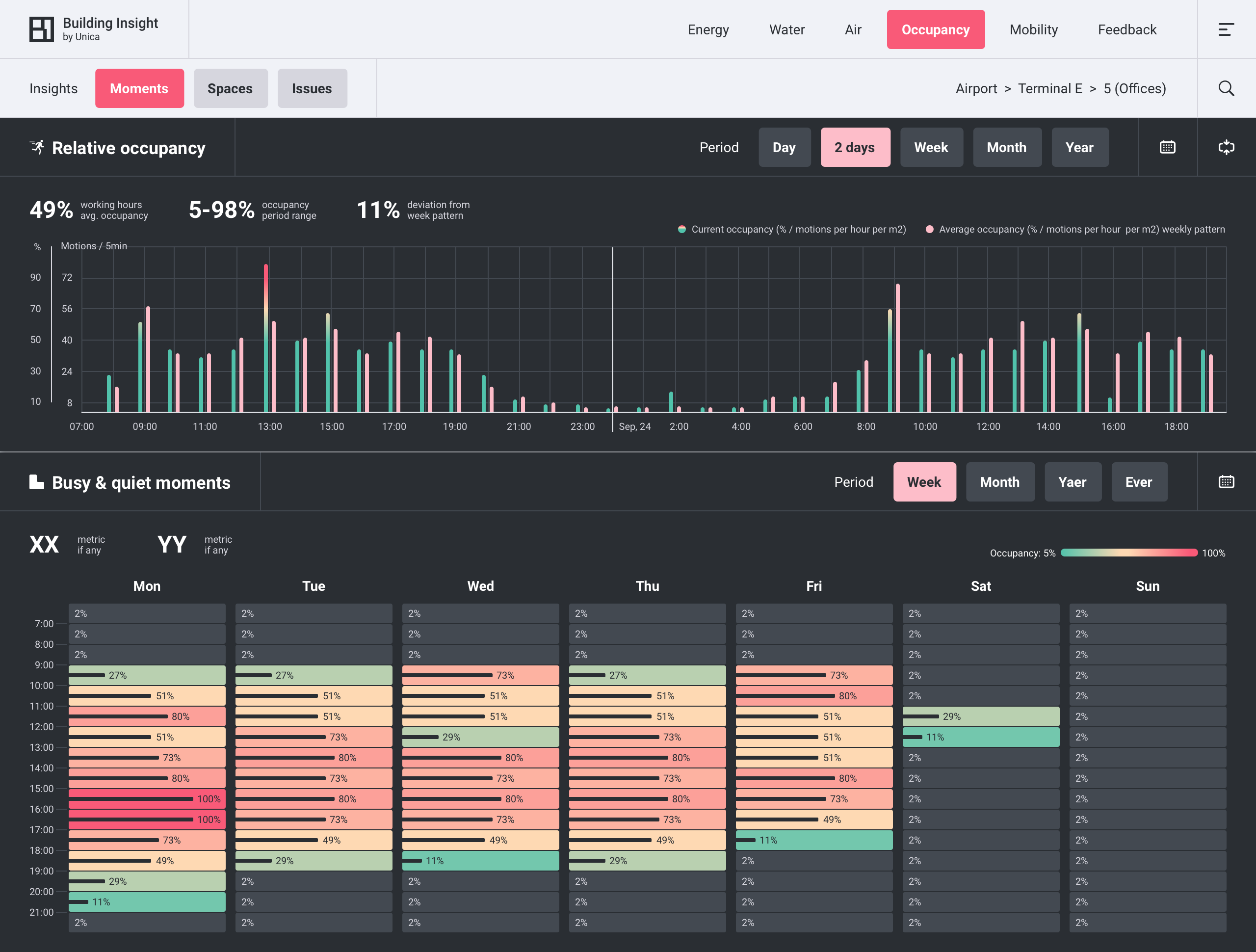
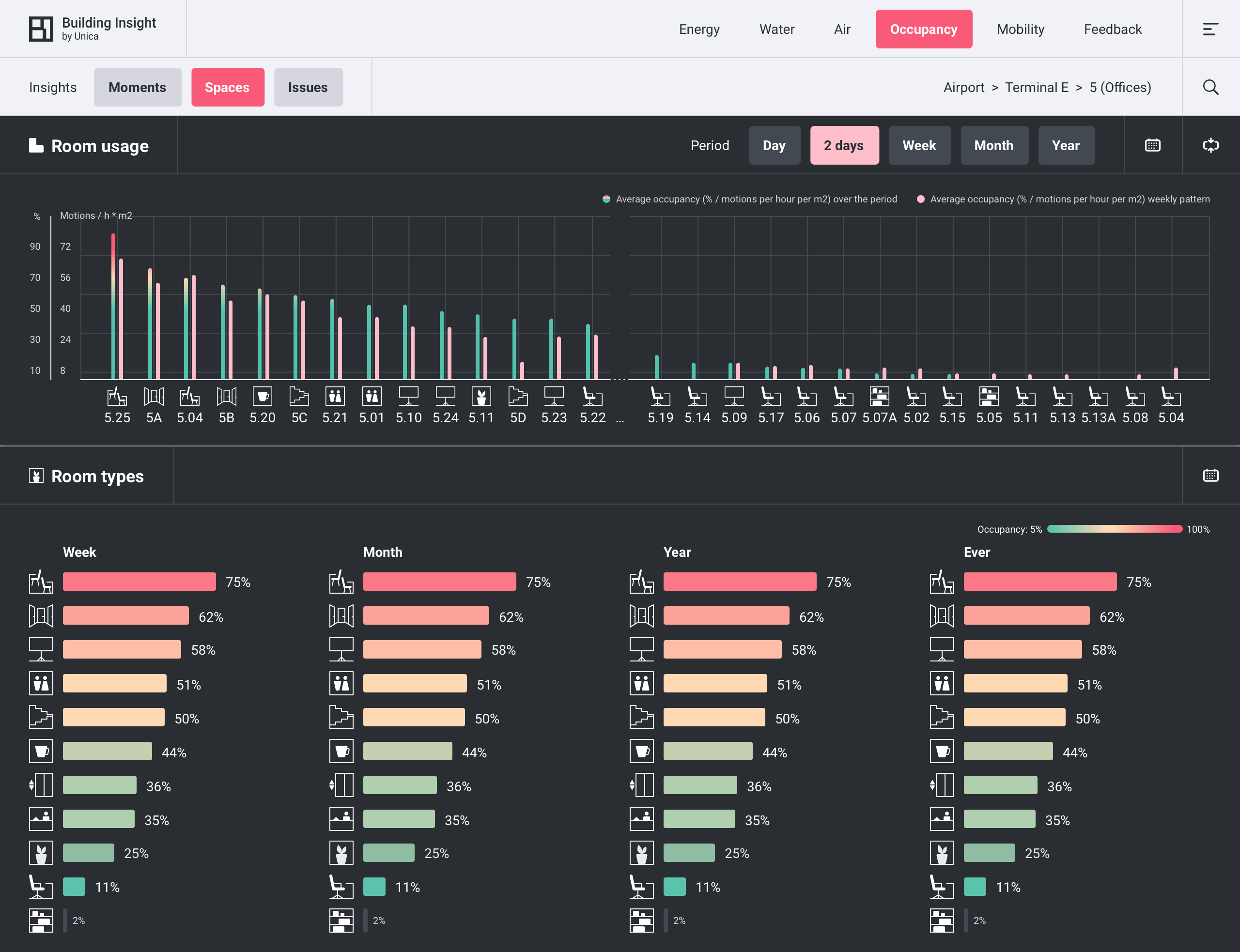
Occupancy
Occupancy module shows human presence in a facility.
Unit: the precision-privacy trade
The common expectation is that the module ‘tells how many people are in the room’. I wish it would (then aside from general precision it would become our pandemic crown jewel — as an immediate tool to monitor person limits). However, our clients wish so not, due to obvious privacy concerns and related image risks.
In BI occupancy is measured with motion sensors within rooms, and the main unit is 'motions over time'. Or percentage of the maximum occupancy which assigned based on historical data (sometimes with tailor-made adjustments). I’ll skip the reasoning for that choice of the solution (I was suggesting break-beam sensors instead of motion sensors). The precision sacrifice is obvious: children move more than adults, a warehouse loader moves more than a librarian, how about animals and so on. You can’t tailor them all. Nevertheless, the implemented solution draws a fairly informative big picture.
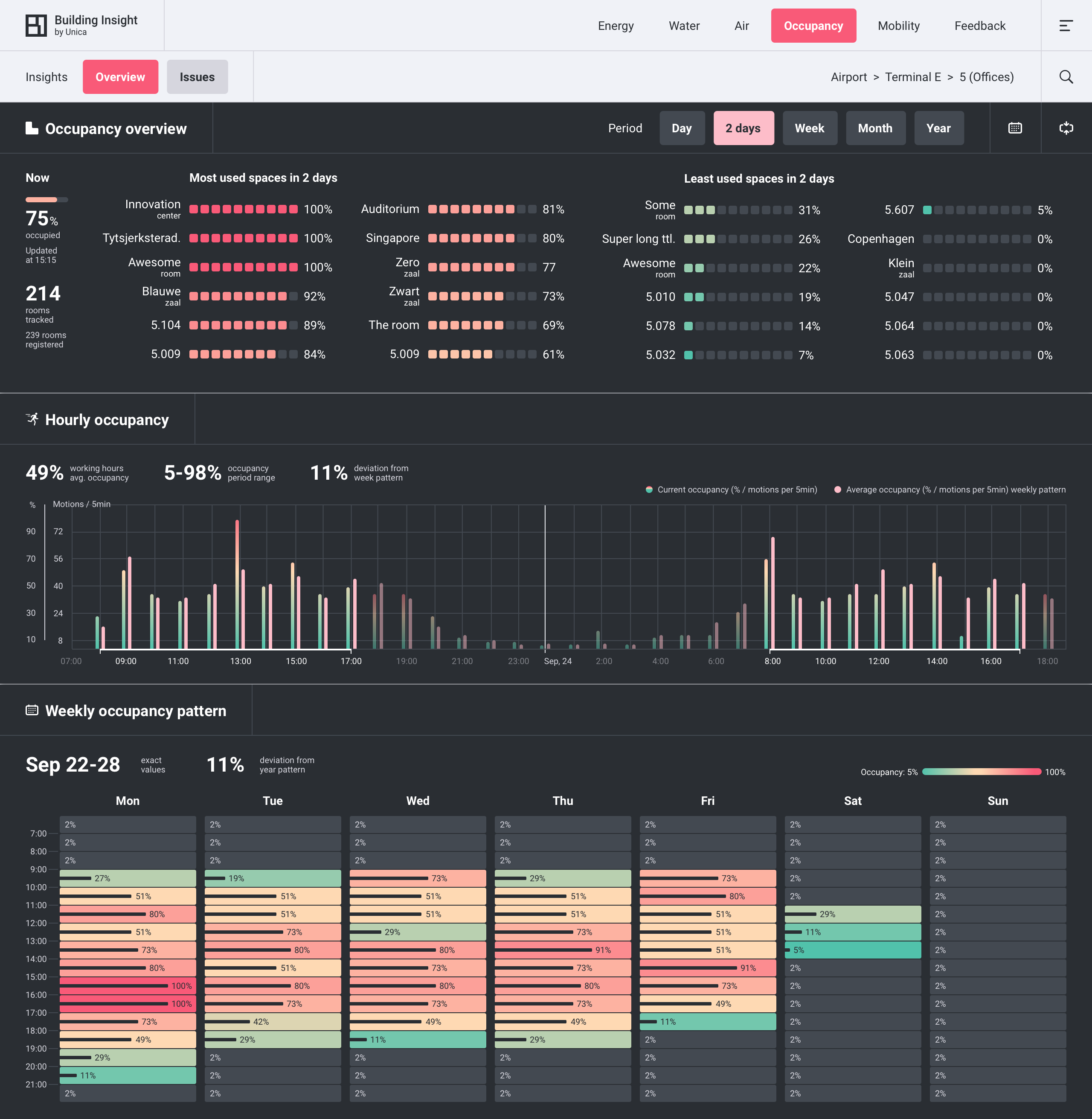
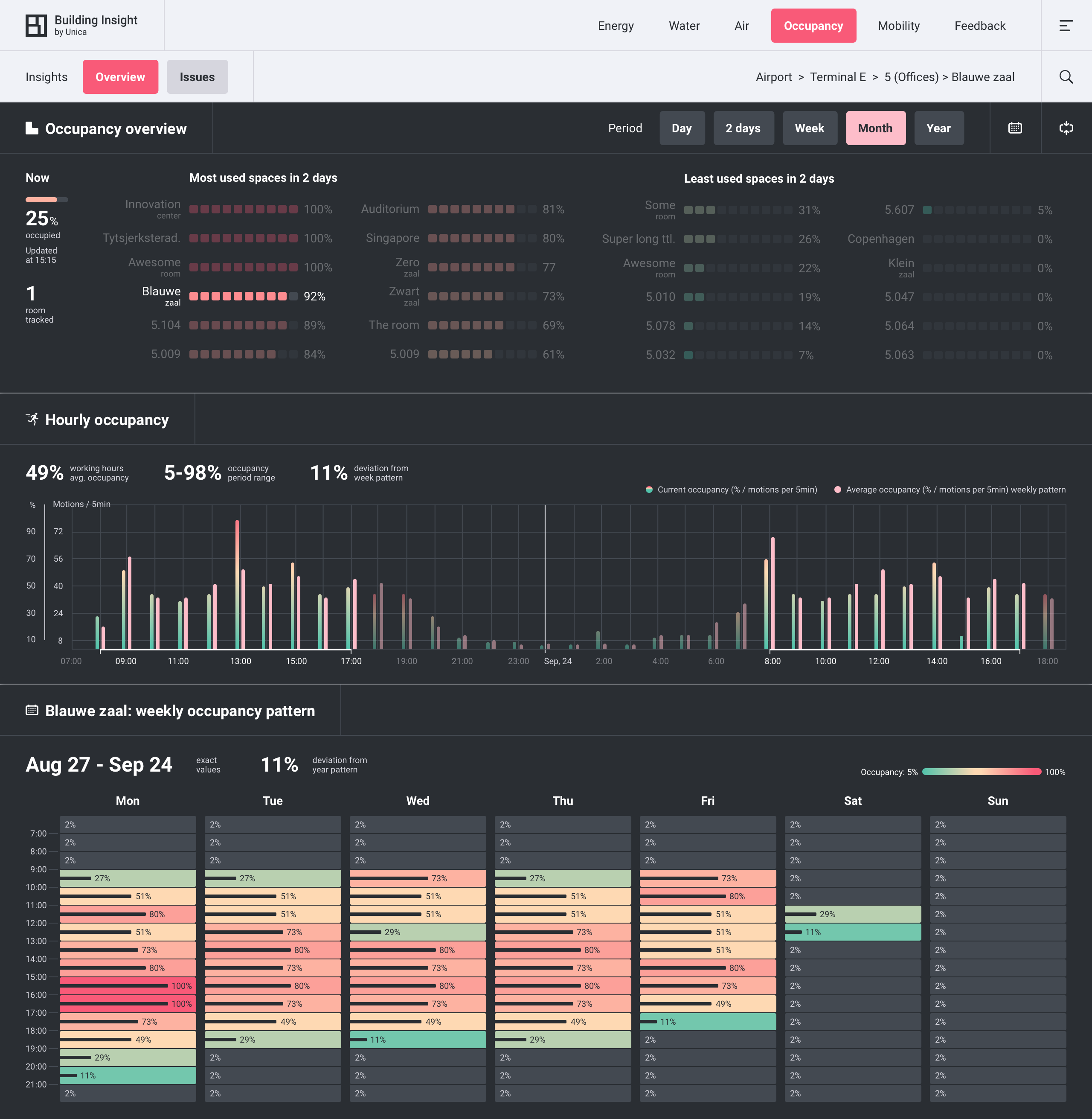
The two screens above with expanded data panel are for levela (1..N-1) and level N accordingly.
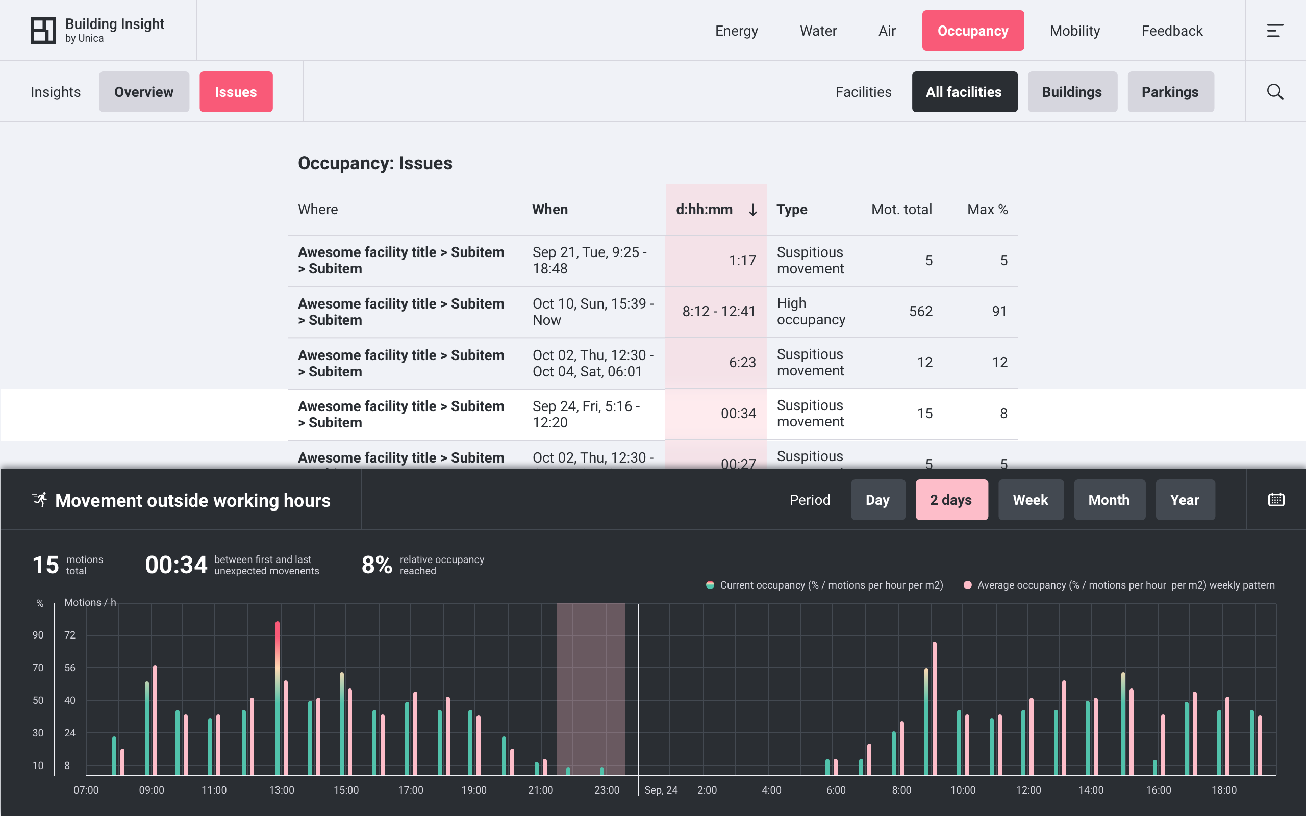
Occupancy issues x facility parameters
Occupancy issues:
- High occupancy level, expressed as ‘higher then X%’.
- Movement outside working hours - as a potential security risk.
The latter issue is the first use case explicitly operating facility-specific parameters which can significantly improve all modules, but specifically Occupancy - improve dramatically. In BI [1.0] some of the parameters already exist in the system but only developers can access them. Below you can see drafts for Occupancy ‘if we would have room types’.
Room type is a good example why facility parameters should be user-generated. Even assigning facility types on dev side is not a scalable solution, assigning every room is a job for the Fairy Godmother. More about user-generated parameters and some drafts can be found below in the Profile section.
Beyond occupancy: the never-added Clean module
Occupancy tracking allows to tell which rooms were used, and hence need to be cleaned. Unica’s solution for smart cleaning remained a stand-alone product. It wasn’t added to BI so far, but was evolving in parallel. I got to contribute by designing the app for cleaning workers.
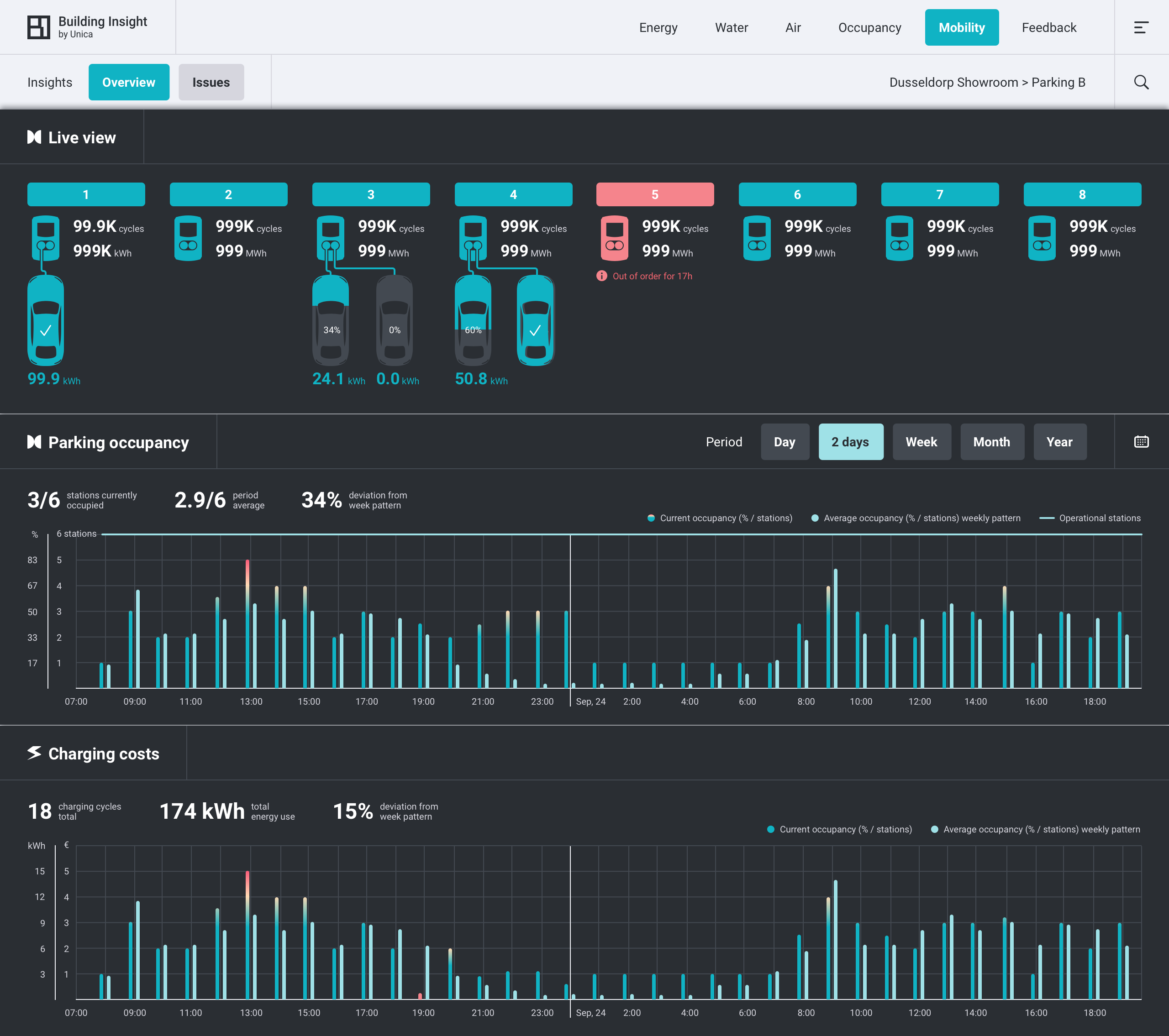
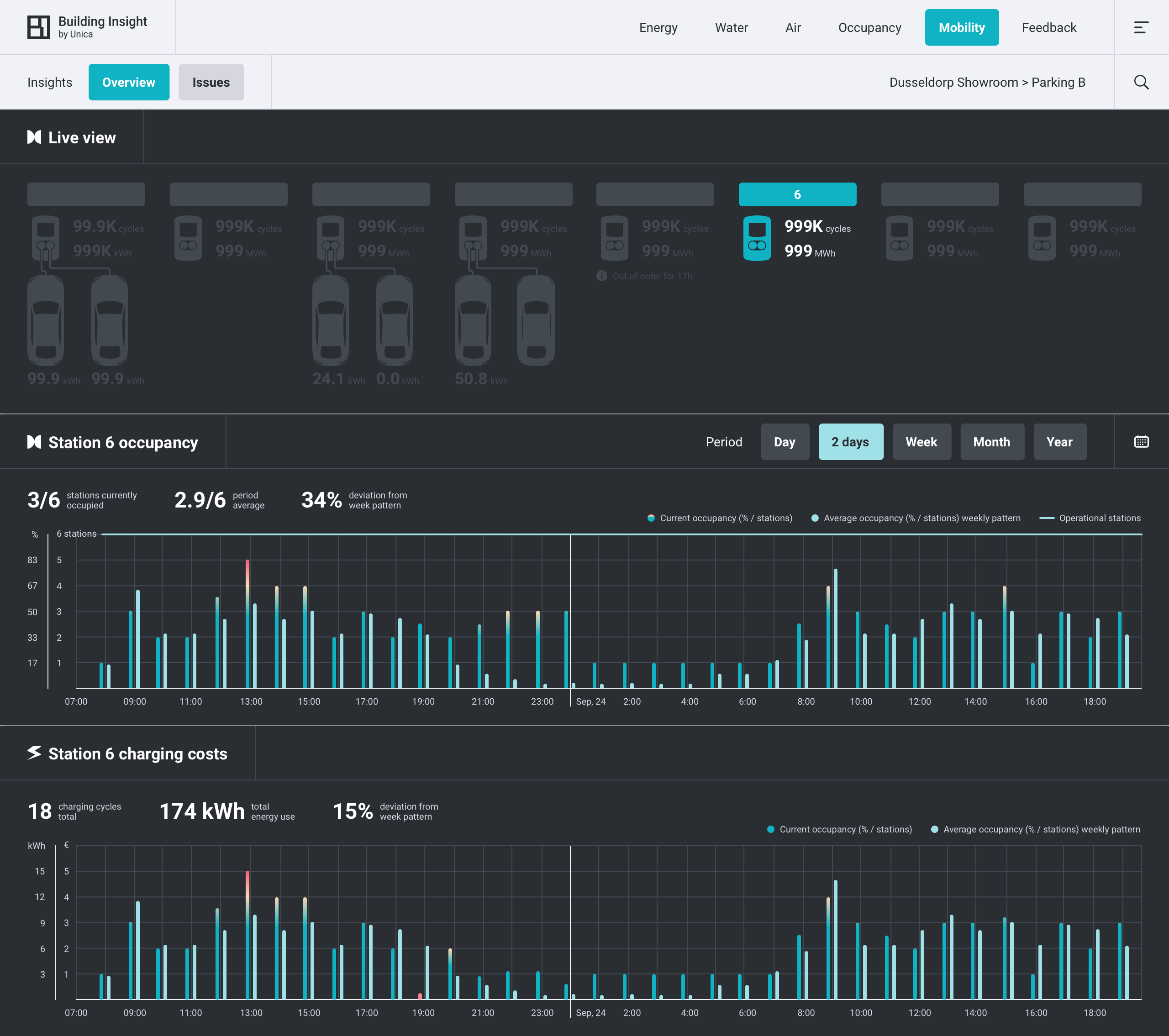
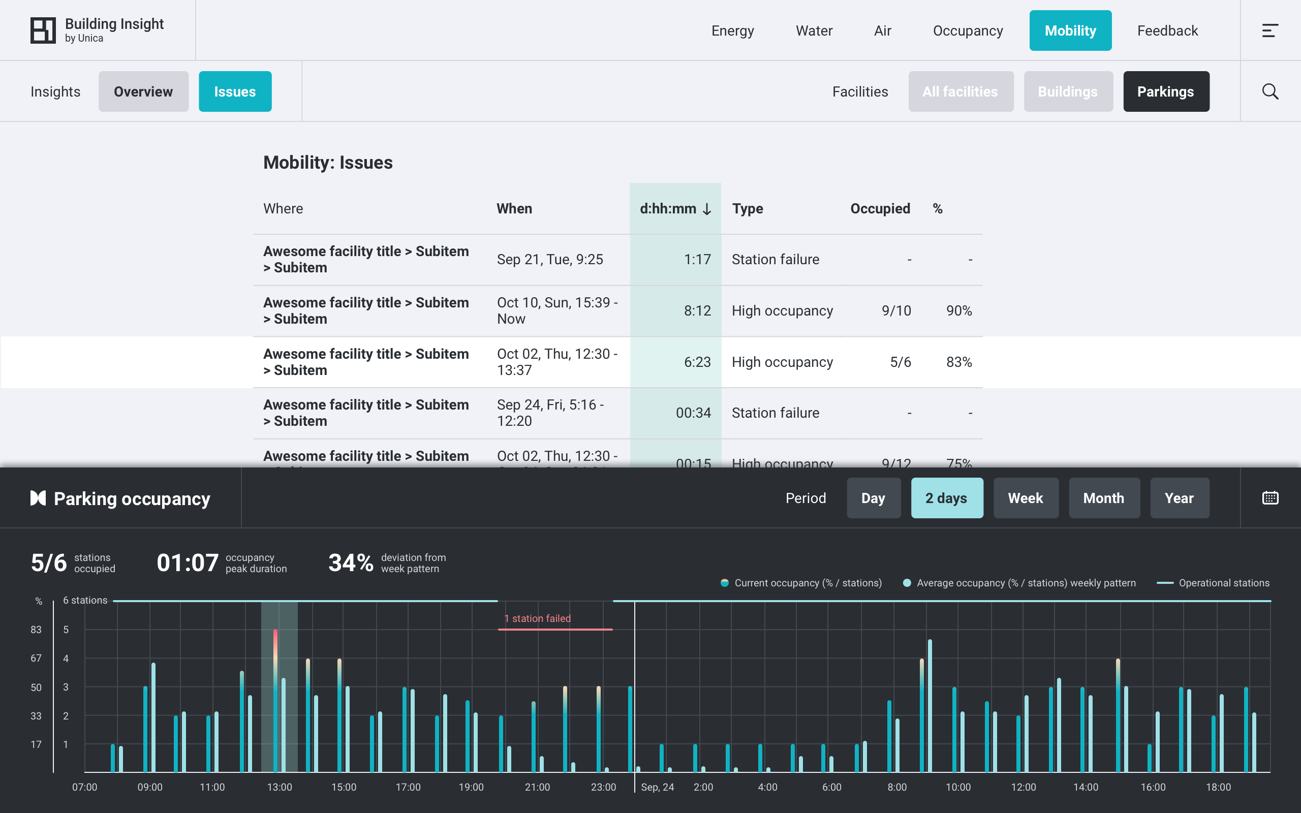
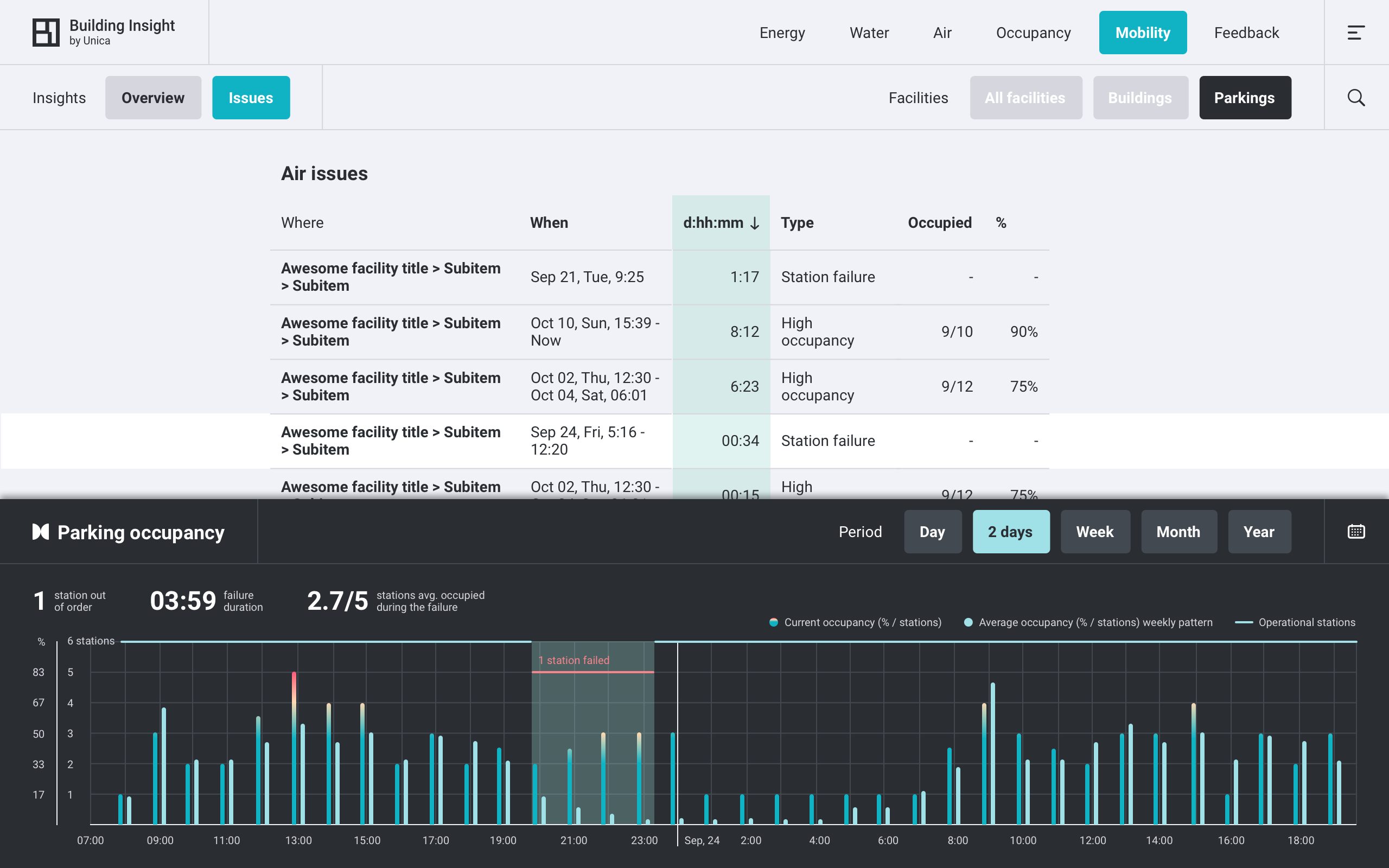
Mobility
Mobility module features digital twins for electric car charging stations. It’s like the parking lot is under your window and you have a superpower to see can see how much each car is charged, if the station operational and so on. Below you can see overview for a parking lot, overview for a single station and two types of Mobility Issues:
- High parking lot occupancy,
- Charging station failure.
Feedback
...to be continued, updating the portfolio ;)