Splashfolio
Interaction design
Design for the Splashfolio platform distributing photography tutorials of its own production.
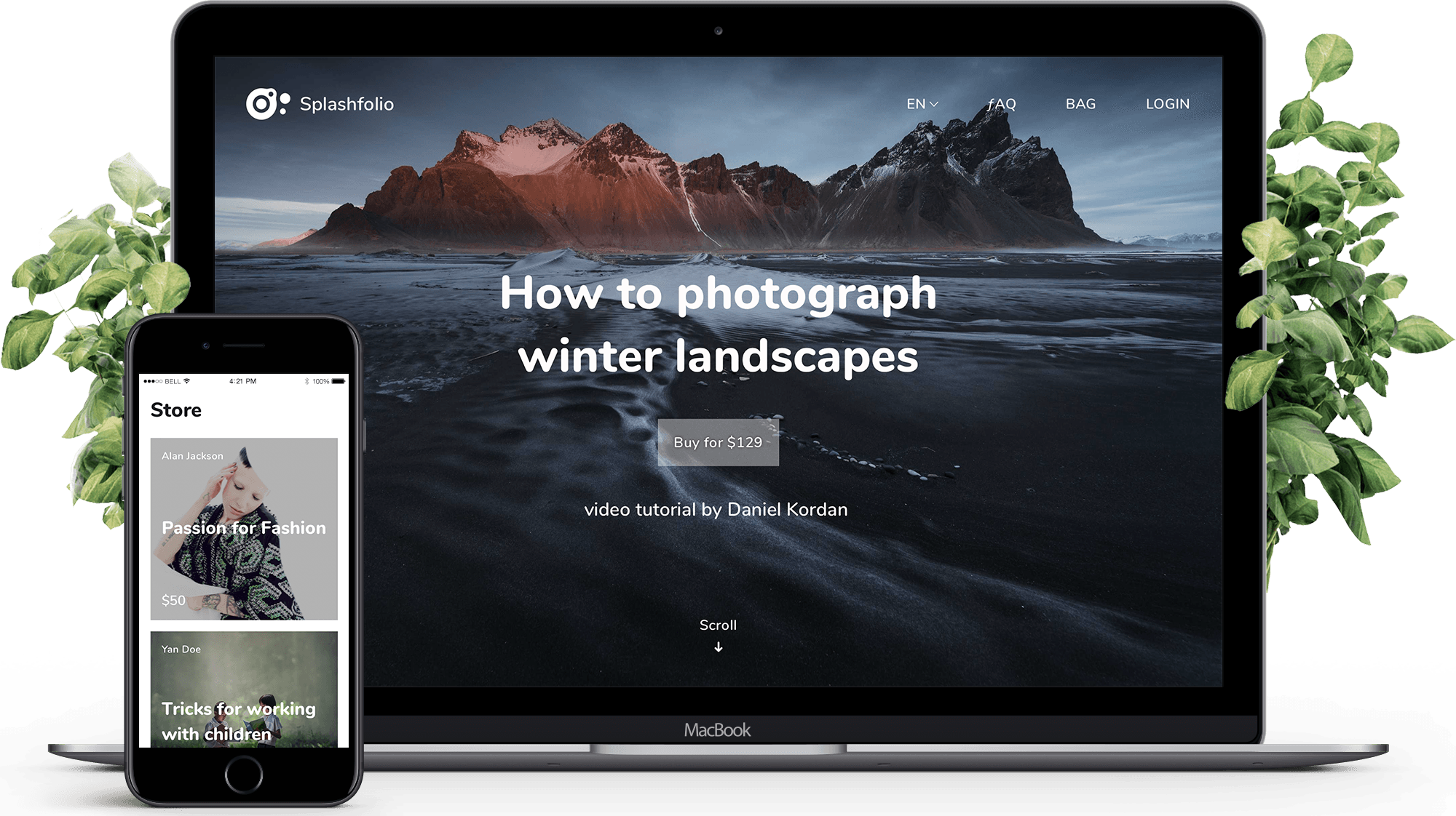
On a brief view designs may look inconsistent because of the constant change of the backgrounds. However, it is not happening in the real flow, as every product (tutorial) has one main illustration. Beautiful pictures that make an aspiring photographer wish to 'do it like this guy' is what sells tutorials after all.
Disclaimer: Images used in the design belong to Splashfolio's featured photographers, mostly Daniel Kordan. Combinations of names and images are random, some names are fictional.
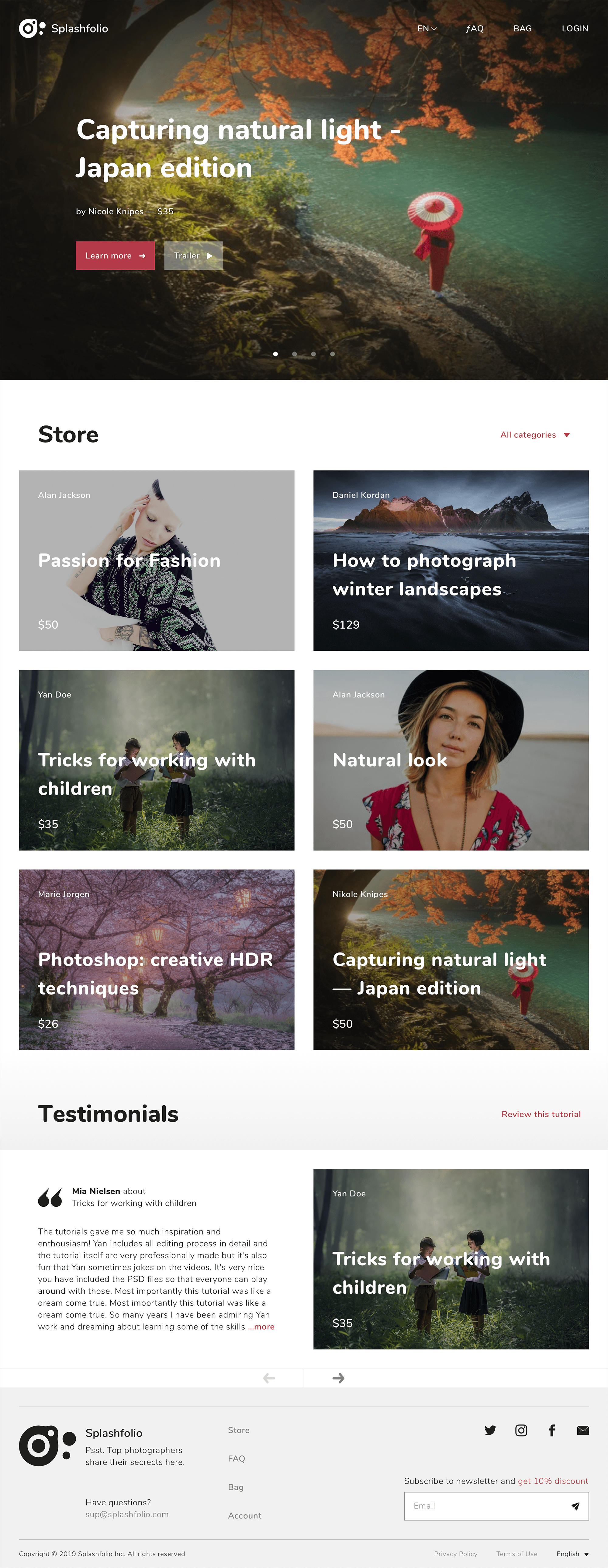
Home
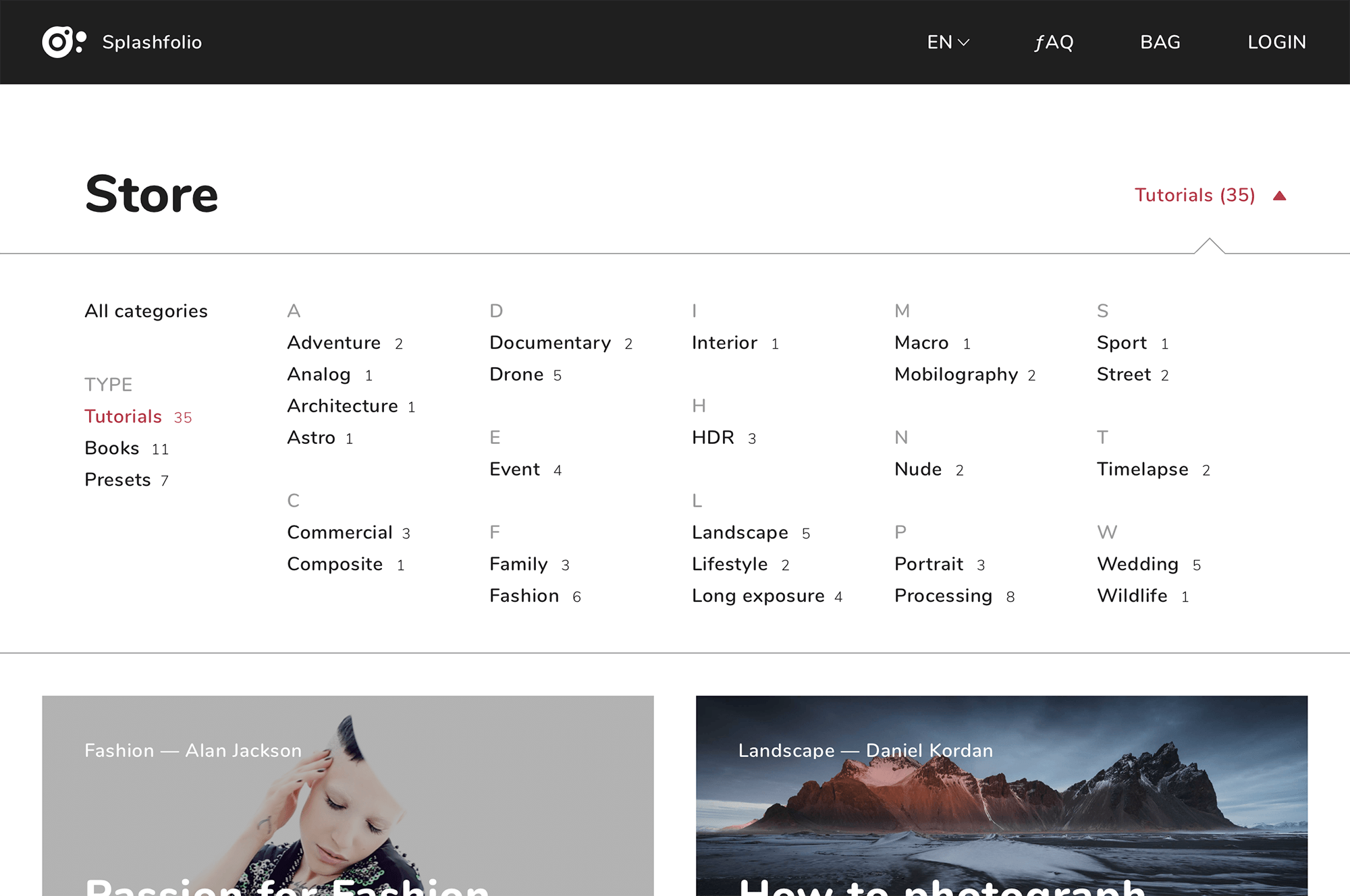
Store is right here (mouse over the picture and scroll it).
Tutorial page
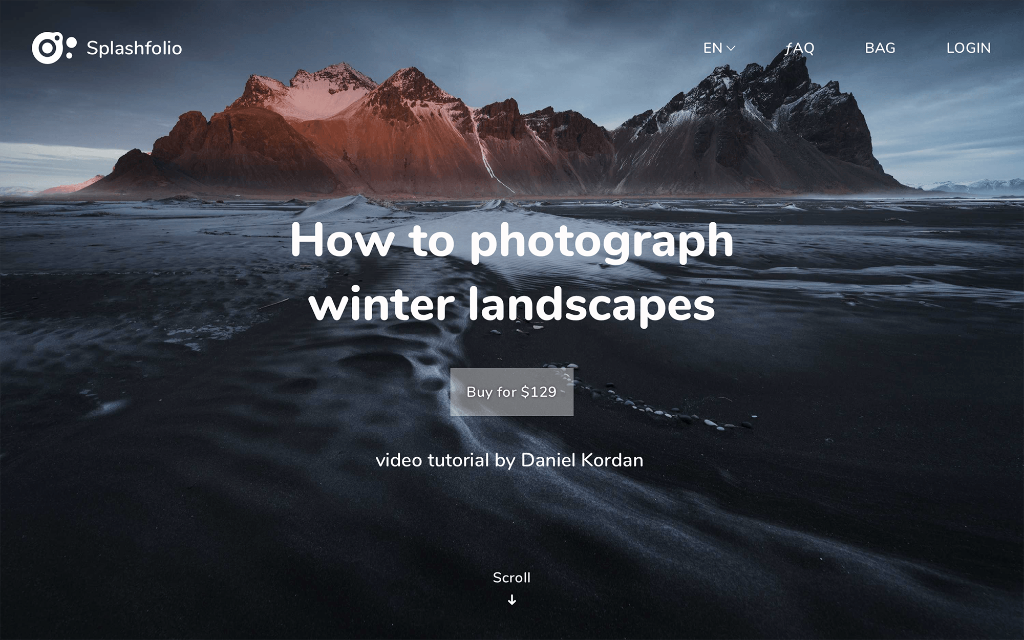
Pic 1-2. Tutorial description is presented on two images, as its behavior is hard to replicate here: snap points, then standard scroll. I.e. content on the second screen replaces content on the first, then the scrolling continues as usual. Mouse over pic 2 to scroll.
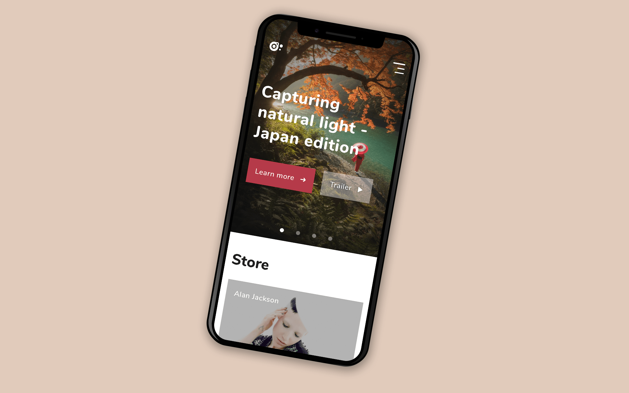
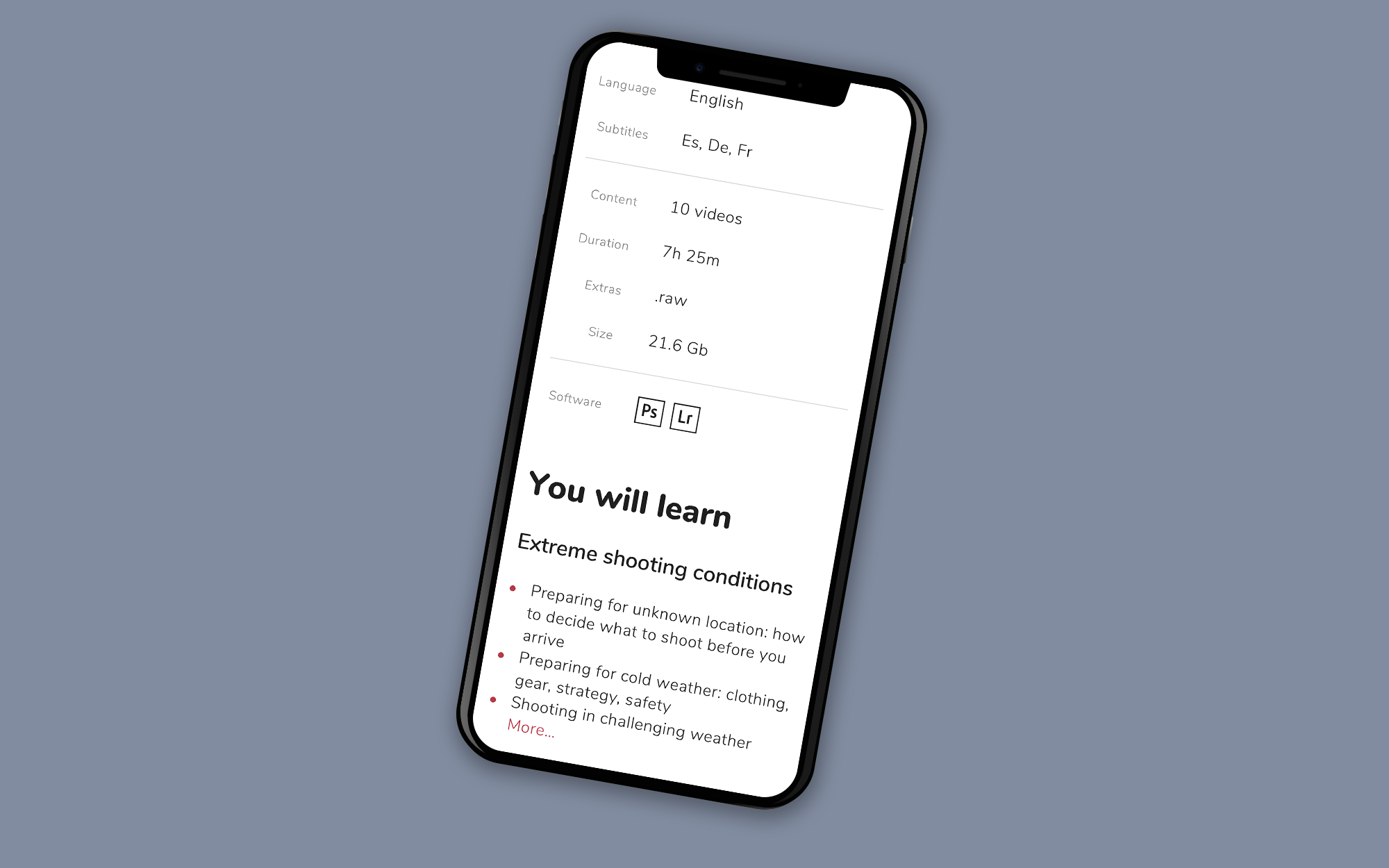
Pic 3. Tutorial page on a mobile.
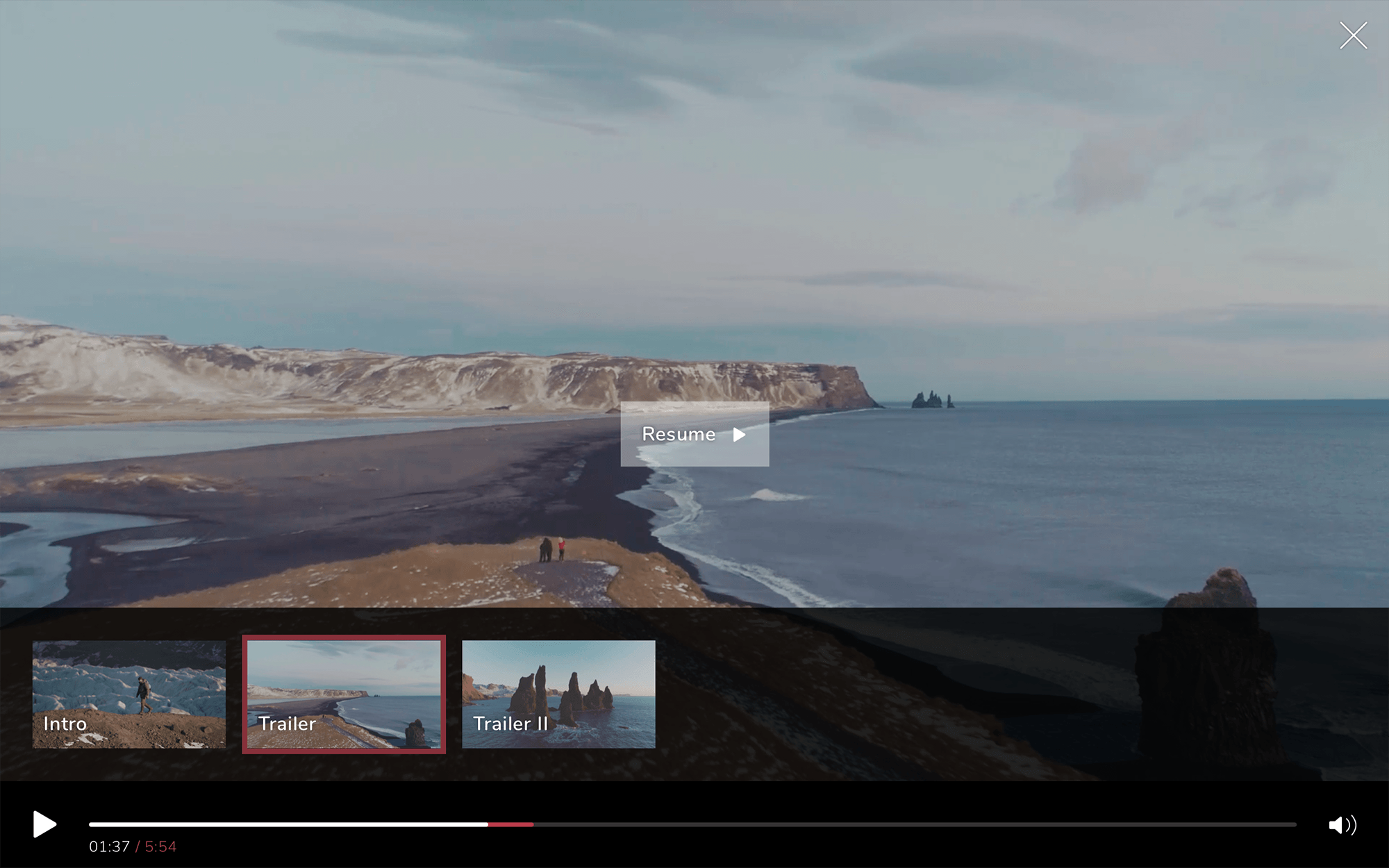
Pic 4. Tutorial trailer on pause.
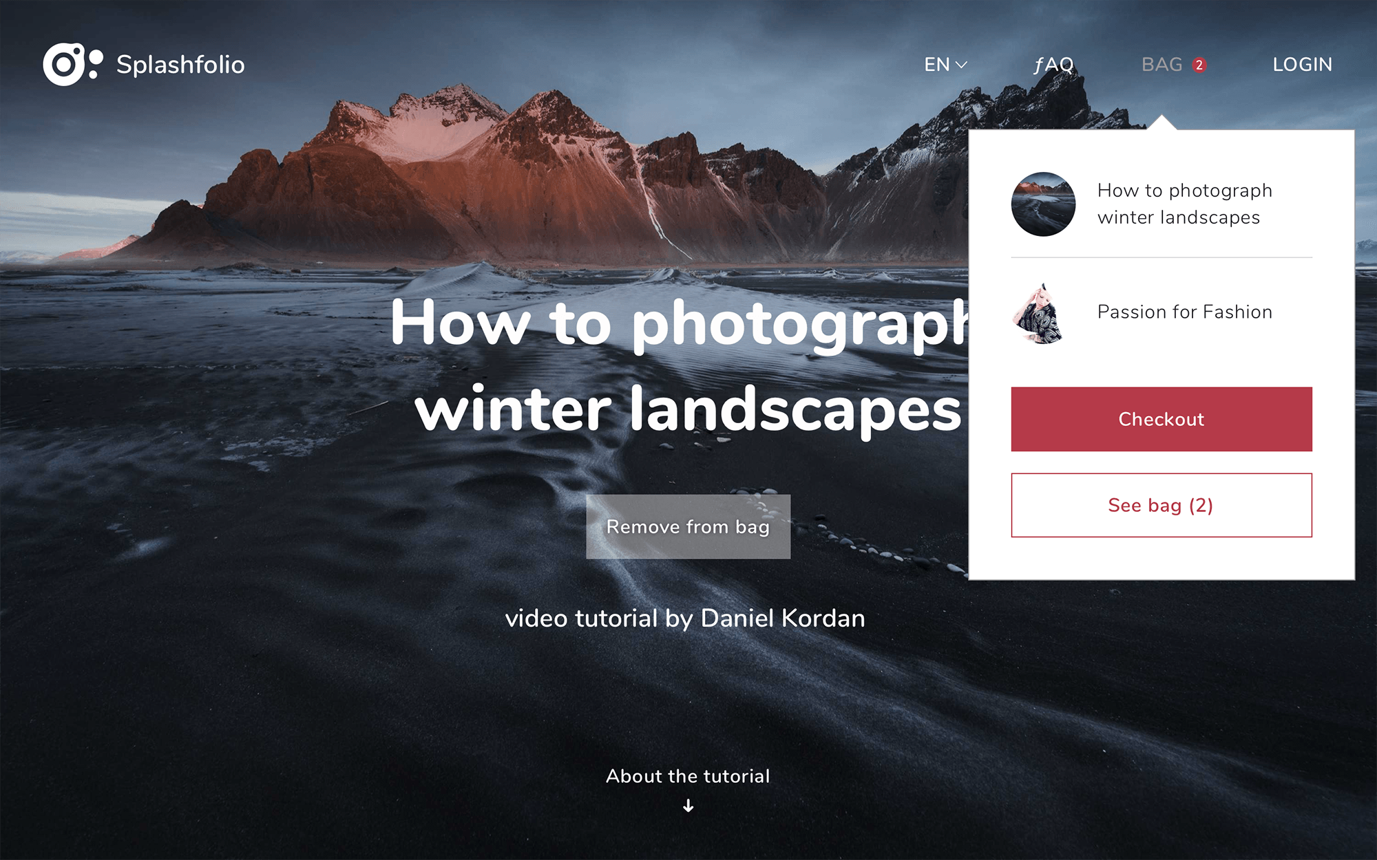
Pic 5. Modal window with suggestions that appears when a user adds the tutorial to bag.
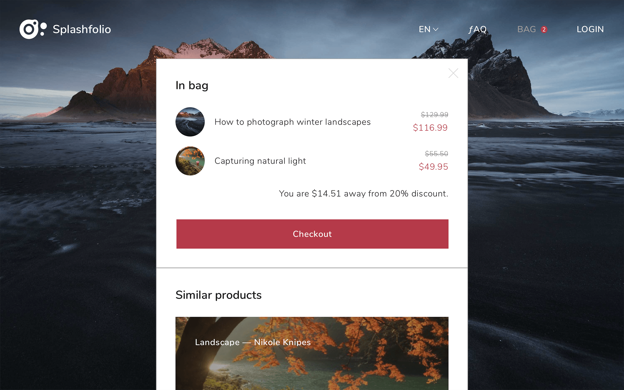
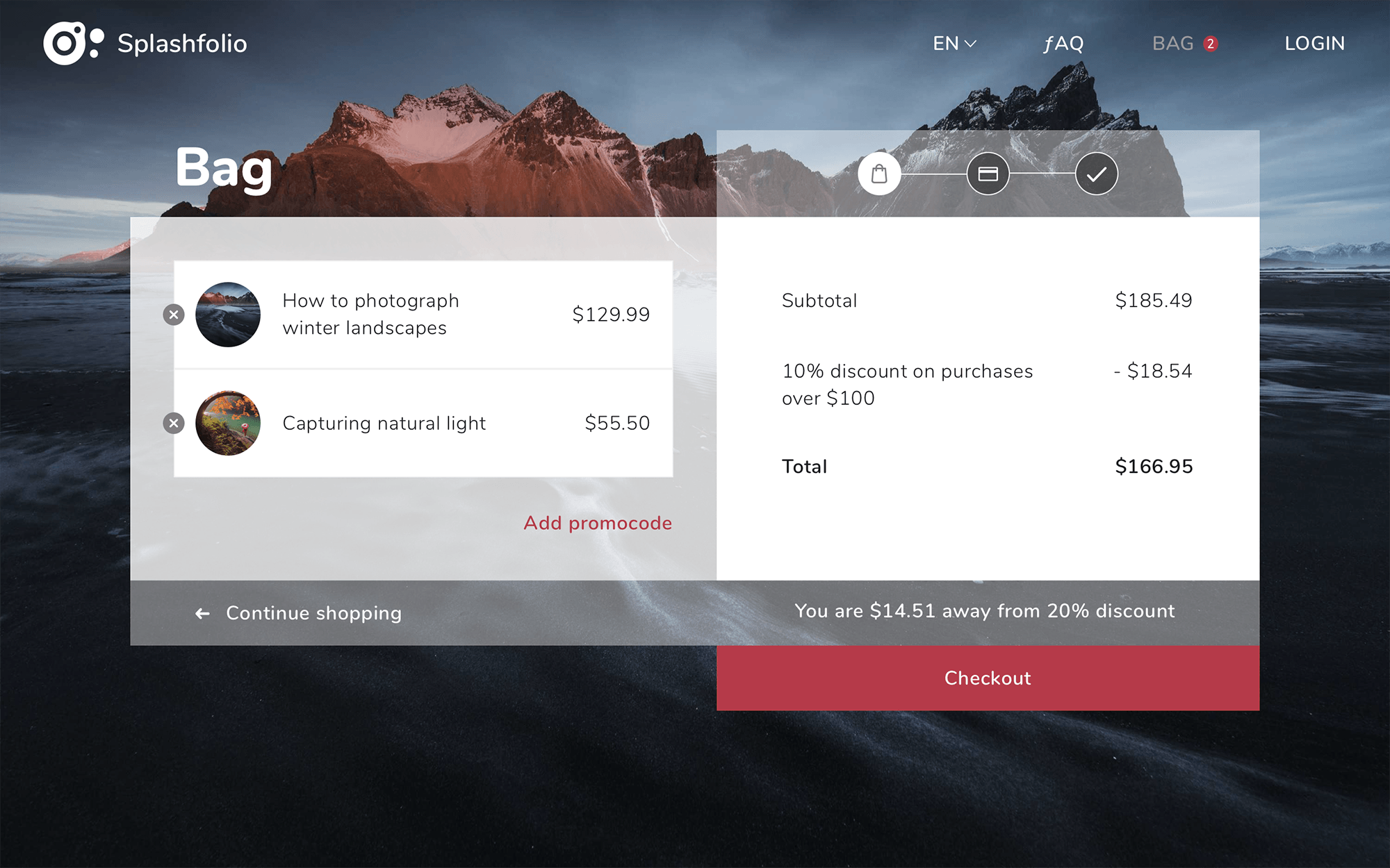
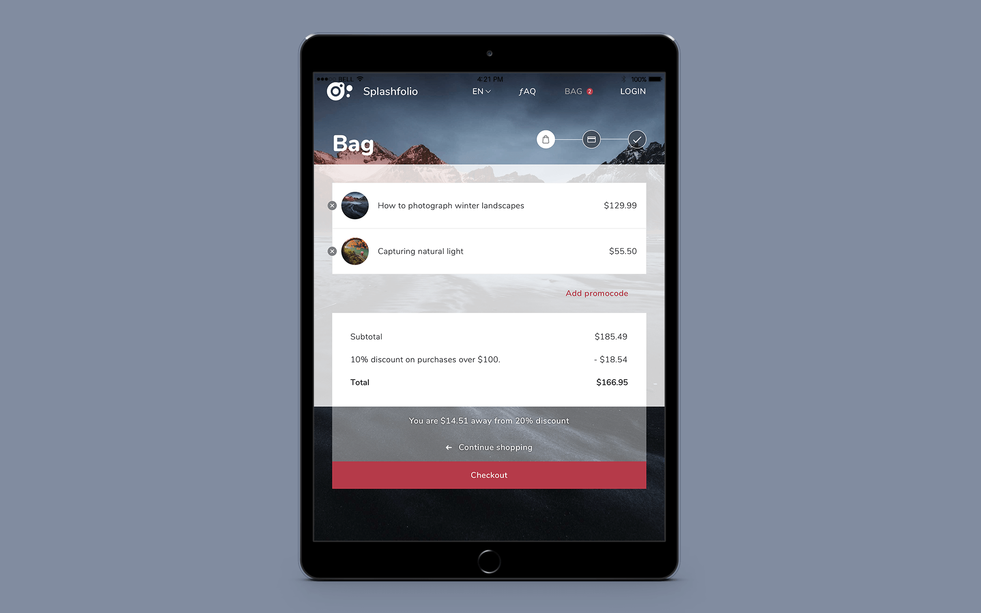
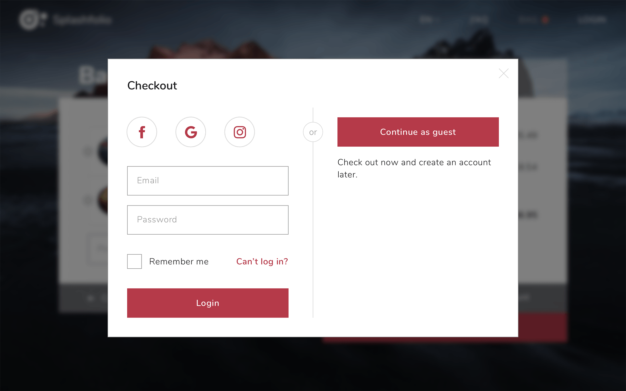
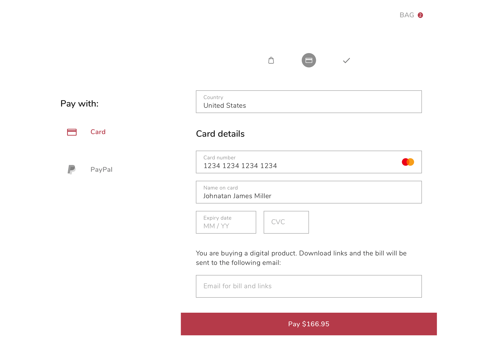
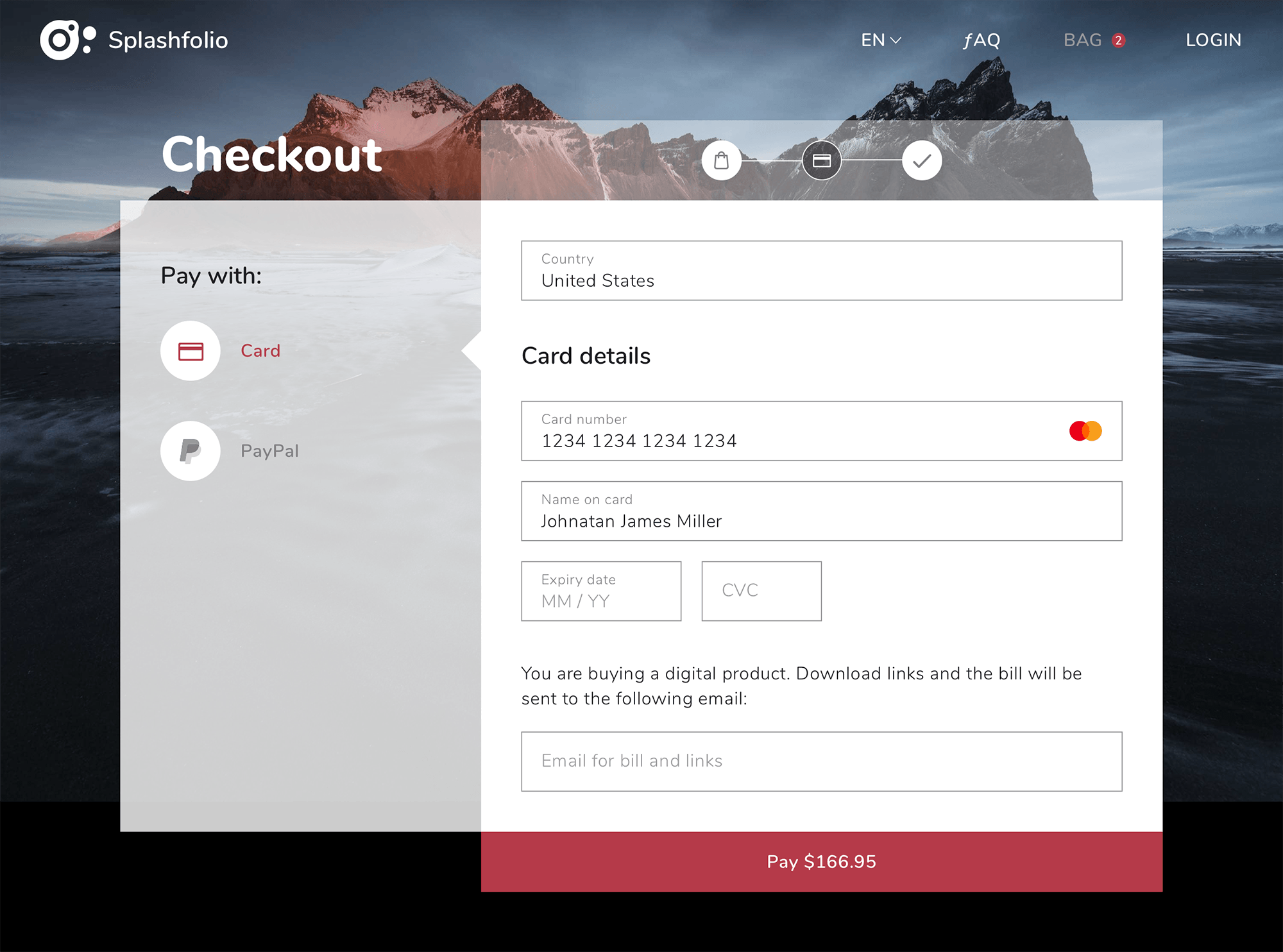
Bag & checkout
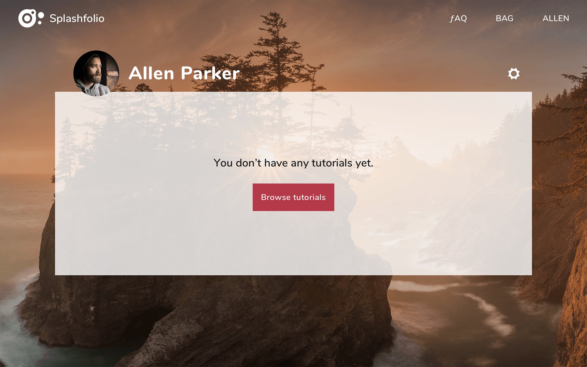
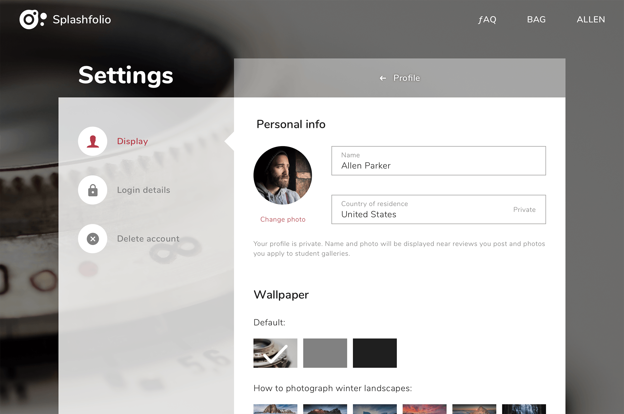
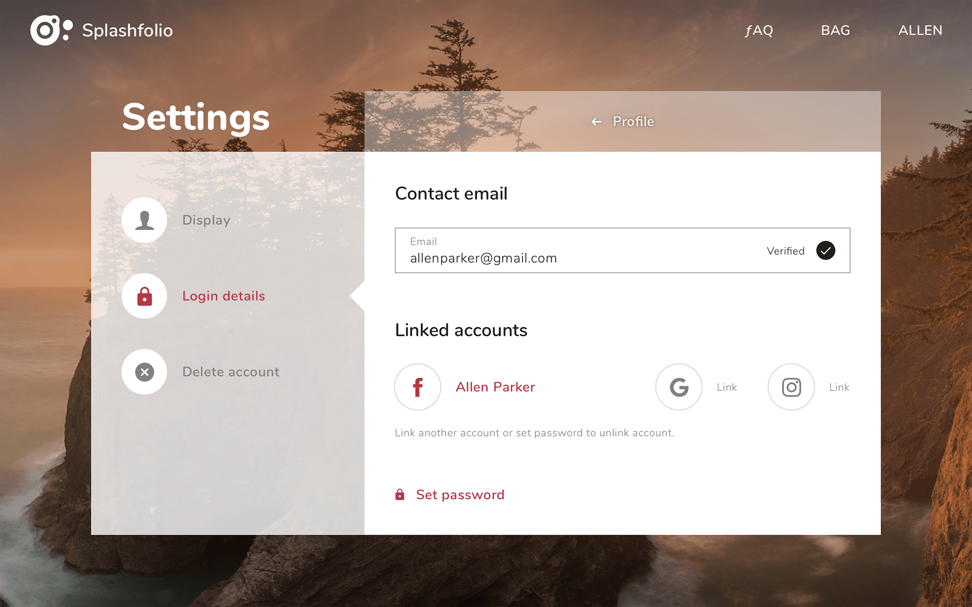
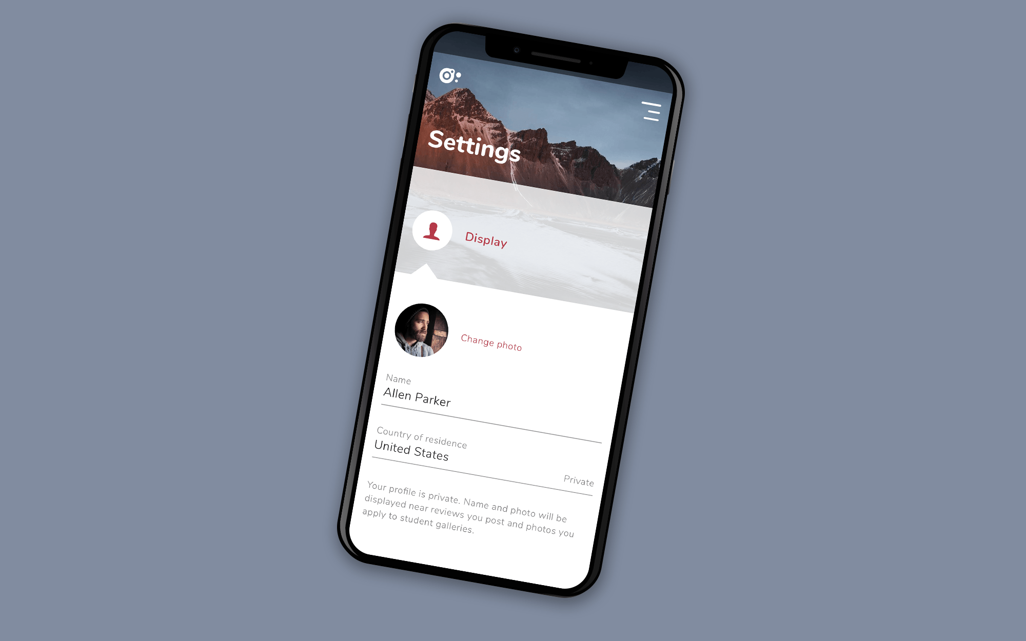
Profile & settings
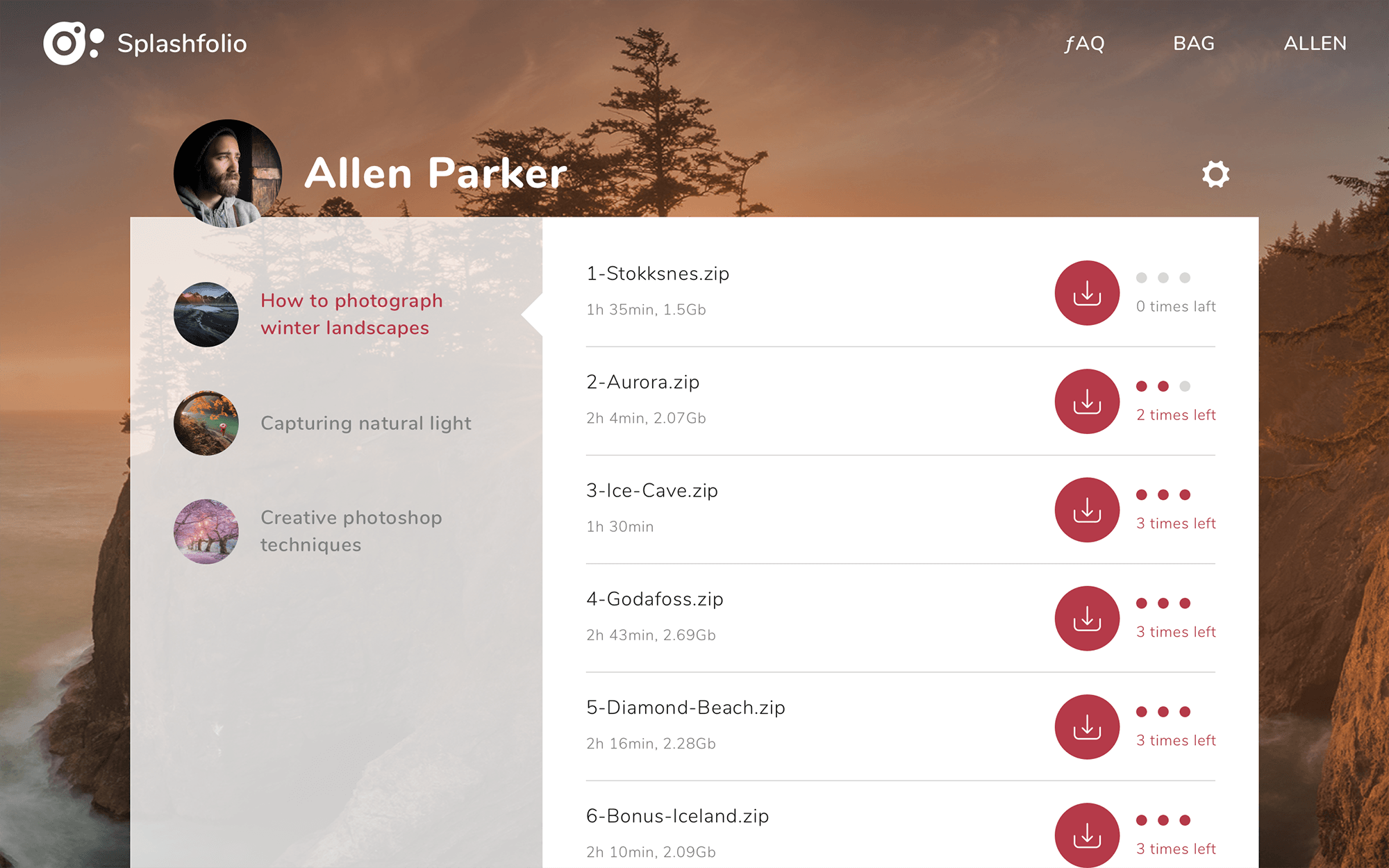
Purchased tutorials are downloadable and cannot be watched online - an existing client's solution I disagree with. Download links (per chapter of a tutorial) are available in the profile, each link works 3 times.
Etc.
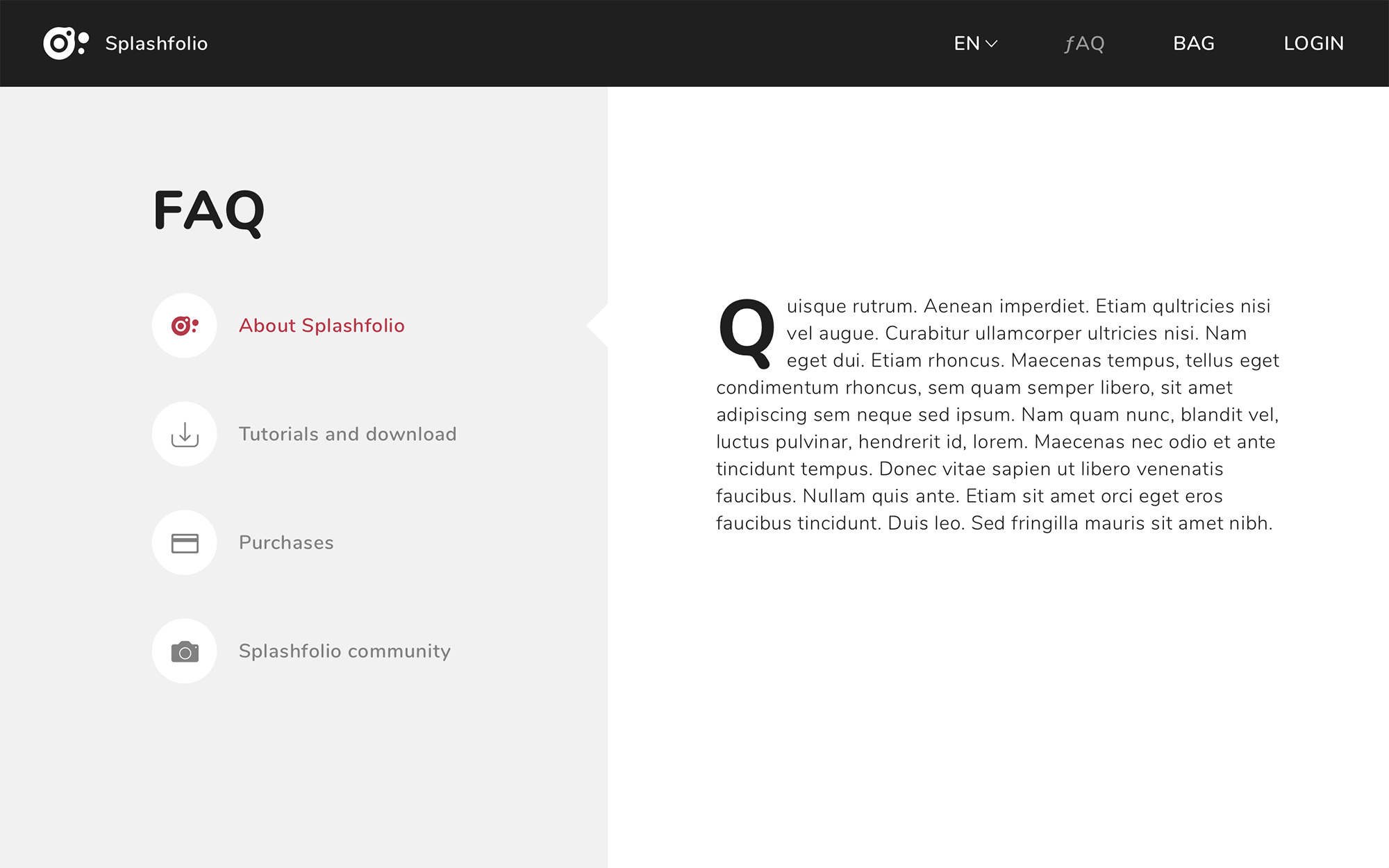
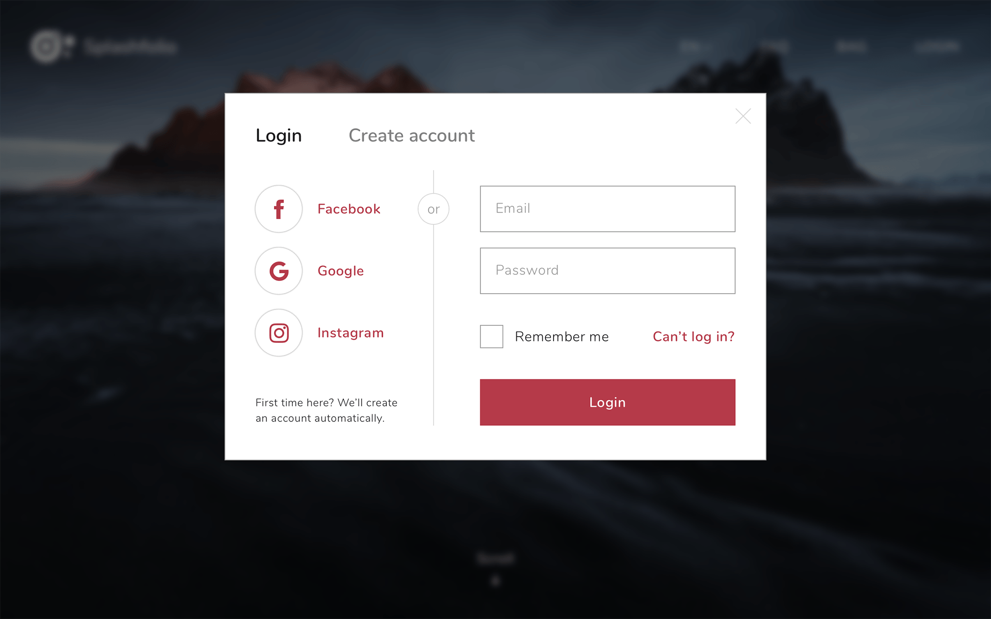
Some other pages.
