Emotion Miner
Interaction design
Emotion Miner is a micro work platform by Neurodata lab as their researches in emotion detection and recognition area require human intelligence to create training data.
Format: Bootstrap-based responsive website
Disclaimer: I have no control on implementation of my designs presented here.
Challenge: Come up with new structure and design for sections presented below. Layout for mobile devices.
Result: New design and copywrite, minor structural changes.
Key facts and structure
After registration, tutorial and English proficiency tests users may complete small paid tasks:
- Watch a video (usually a talk show)
- Switch to fragments (5-10 second cuts from the video)
- For each fragment choose an emotion from a given list, if any
Work is verified by Neurodata employees. Task are paid via PayPal and differ only in size.
Structure:
- Home - taskboard (unregistered - landing)
- Task
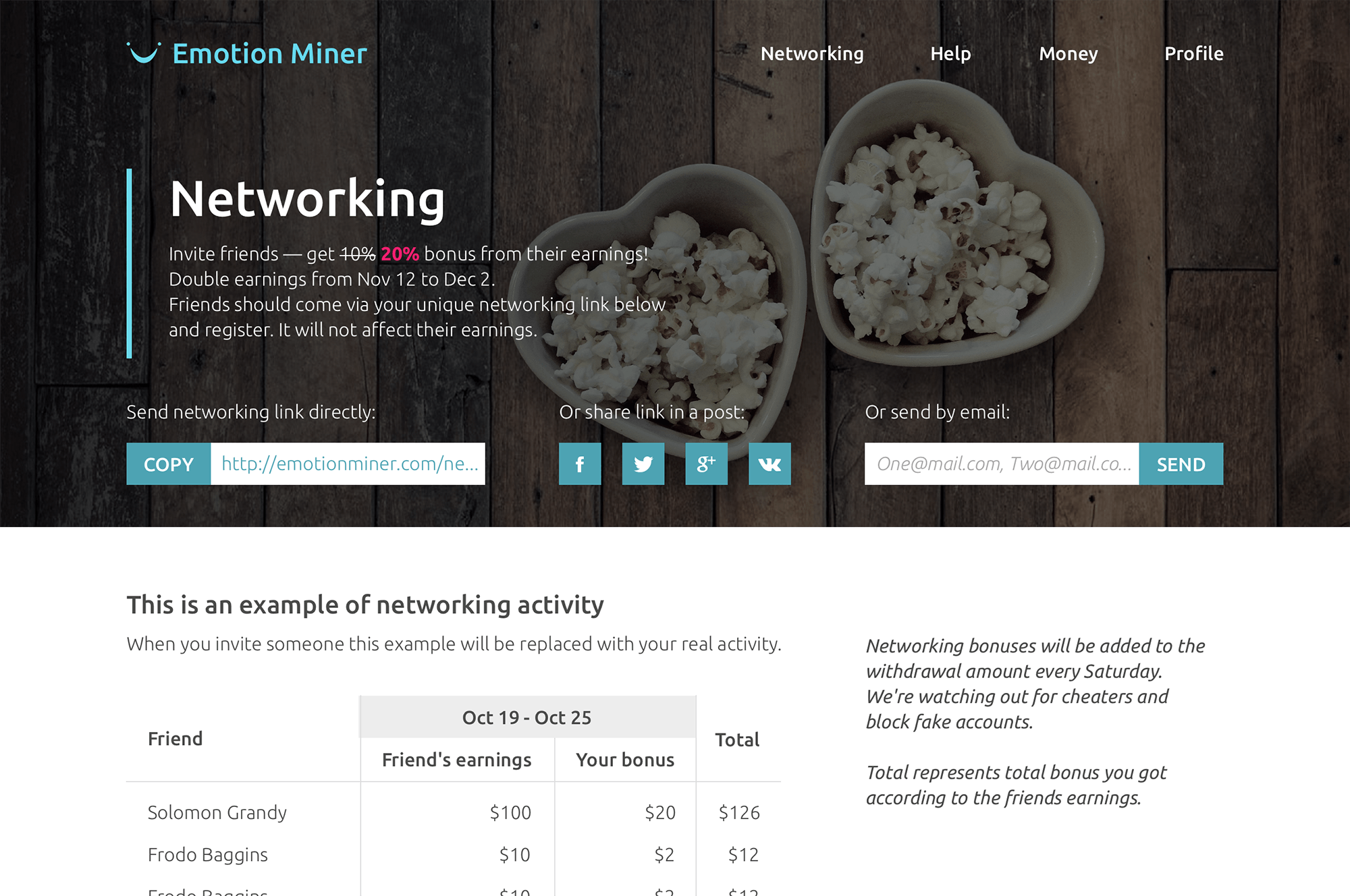
- Networking
- Help
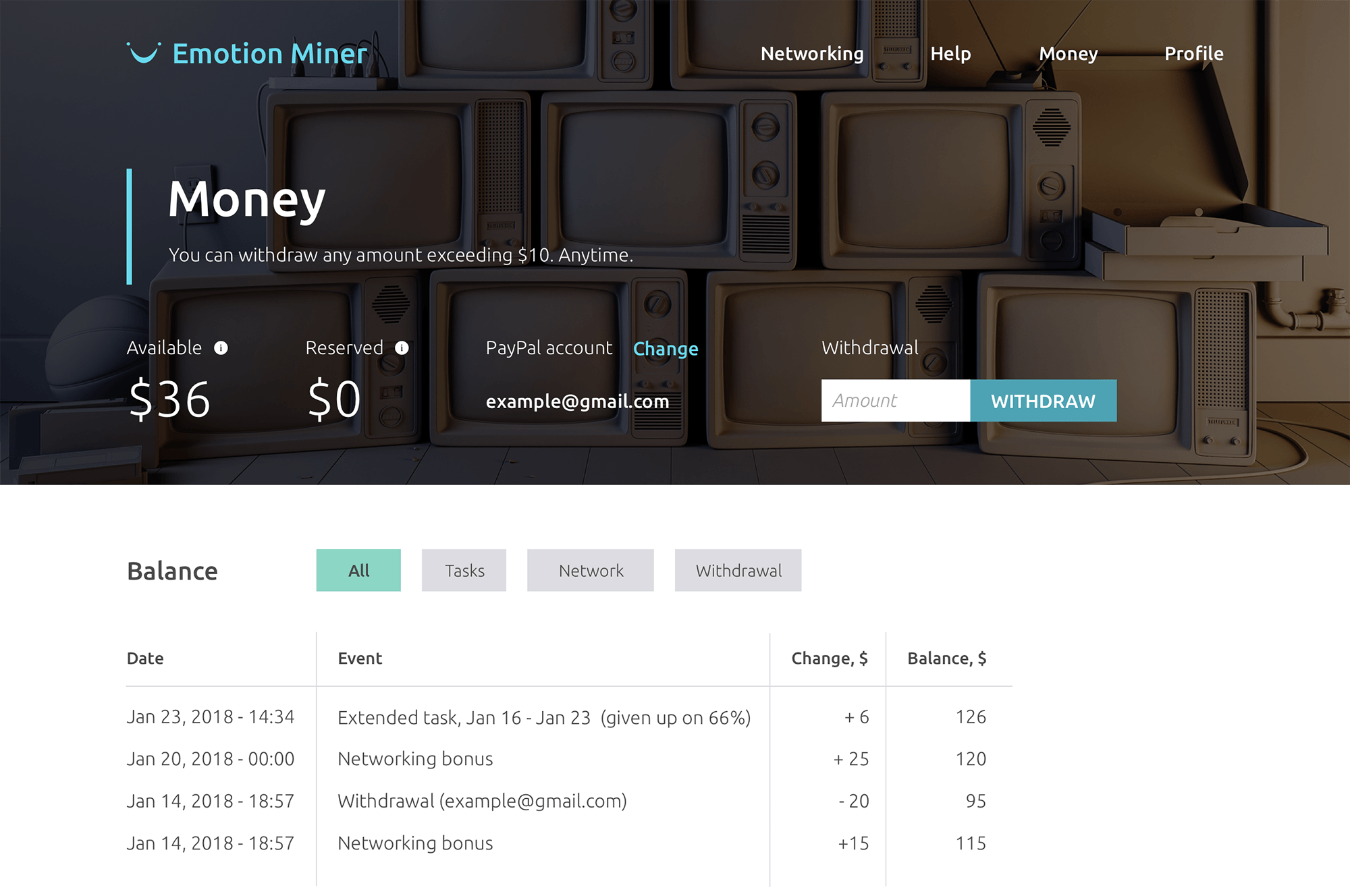
- Money
- Profile
- Tutorial
- Footer: Reviews (for unregistered - in menu), Terms, Neurodata
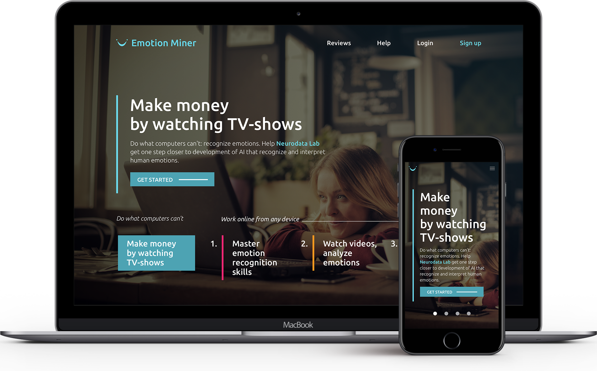
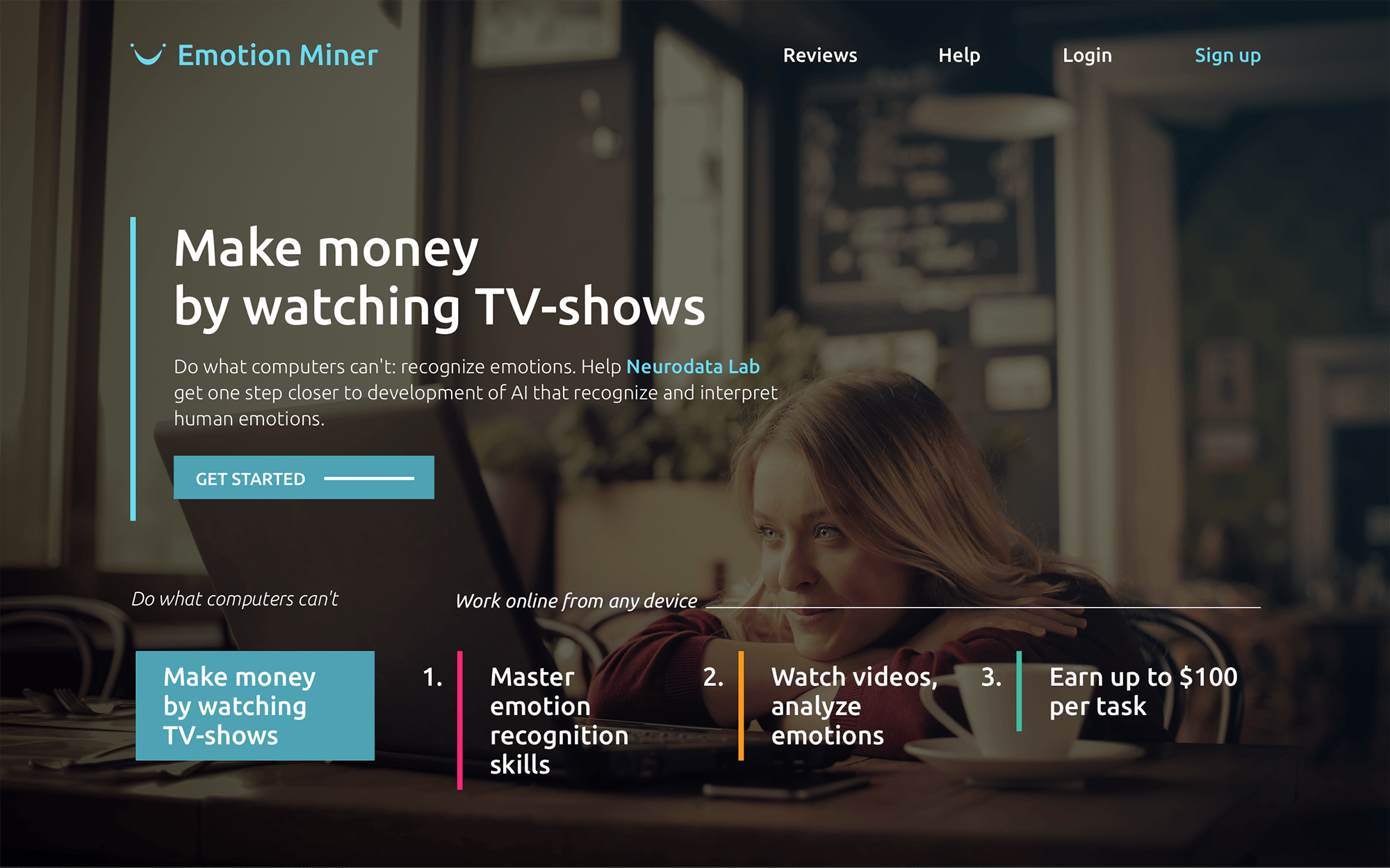
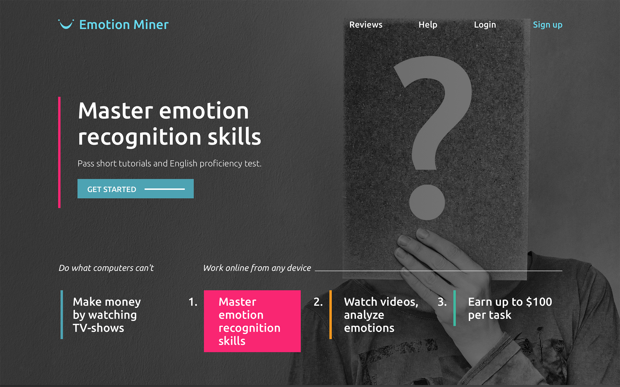
Landing
Homepage for unlogged users. Fixed-position full-screen horizontal paralax carousel. 2 of 4 states:
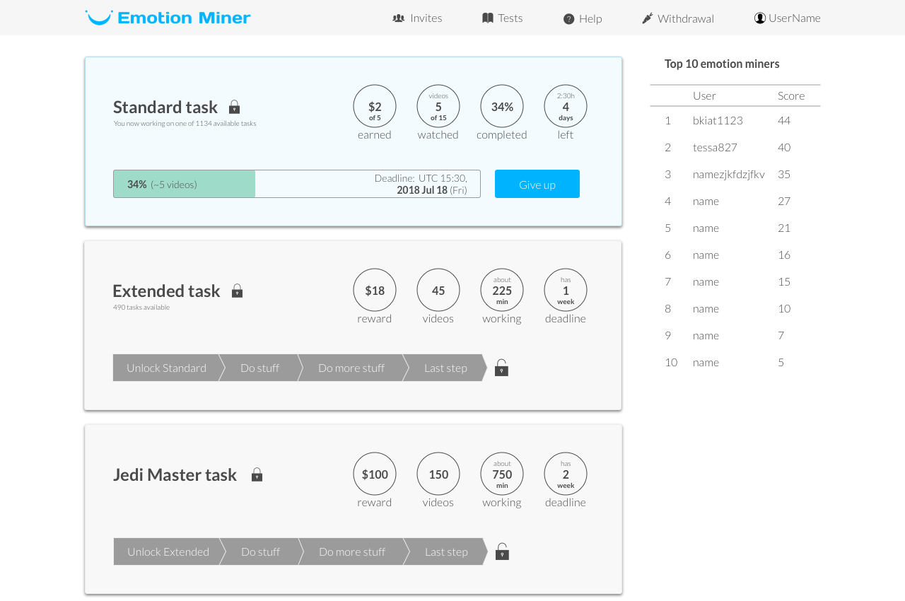
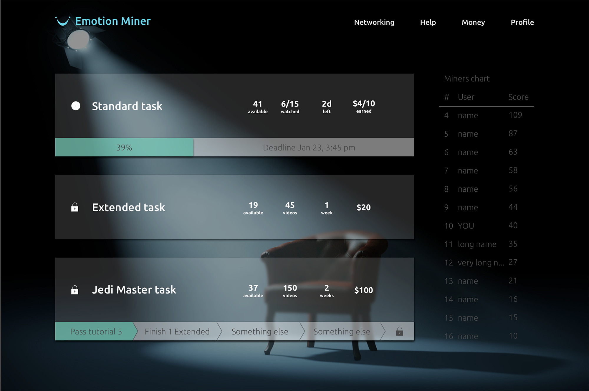
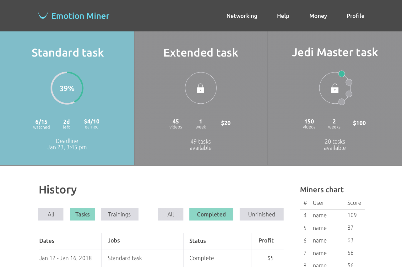
Taskboard
Evolution of the taskboard - homepage for logged user:
Task
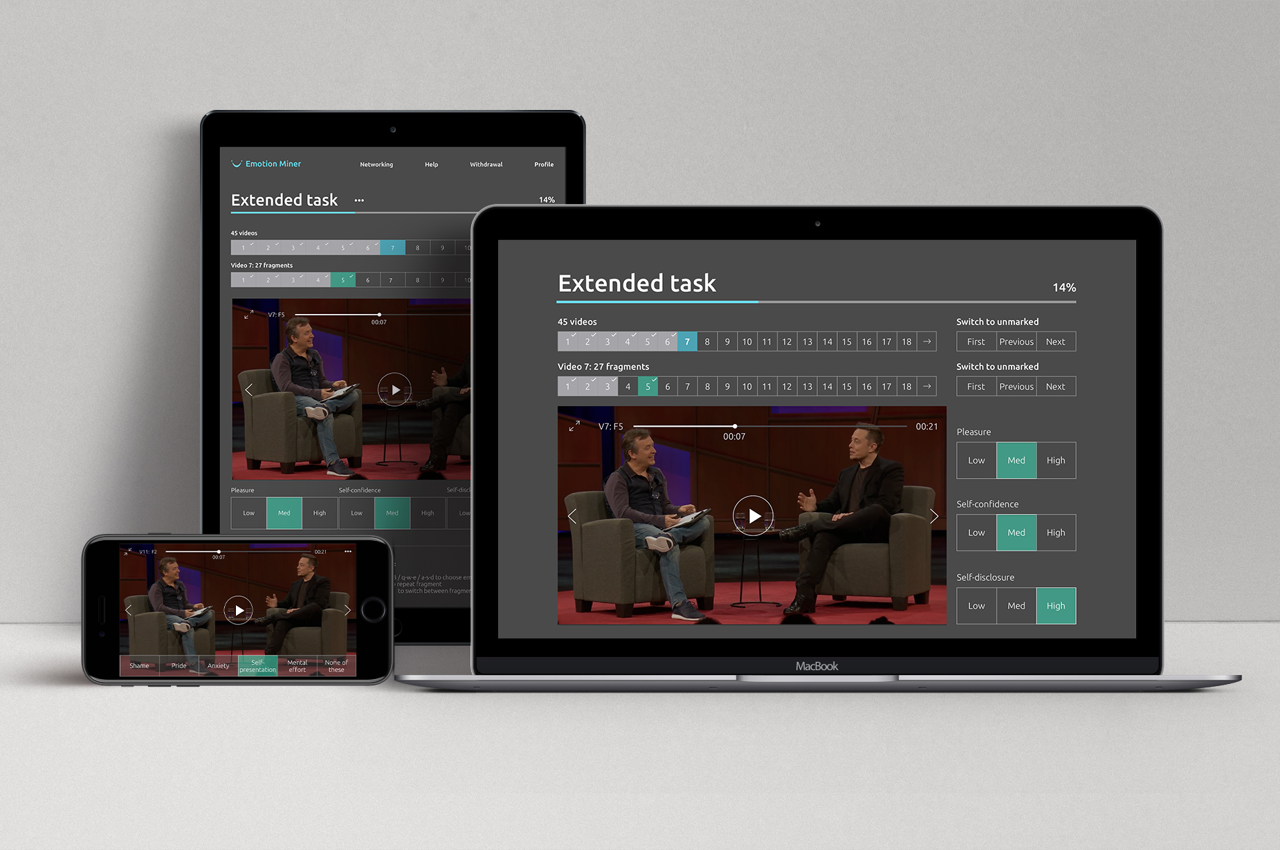
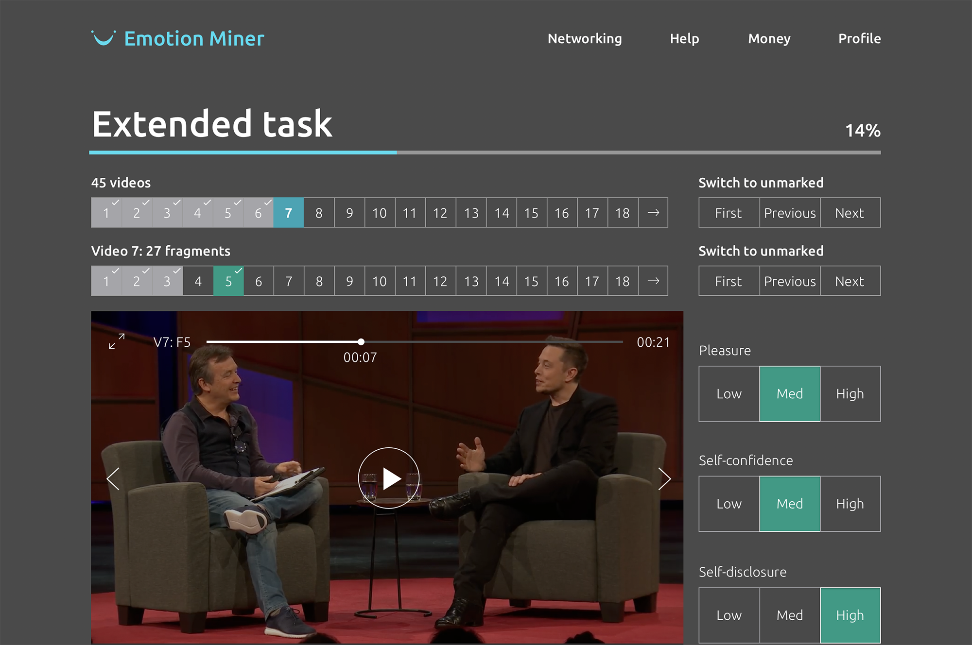
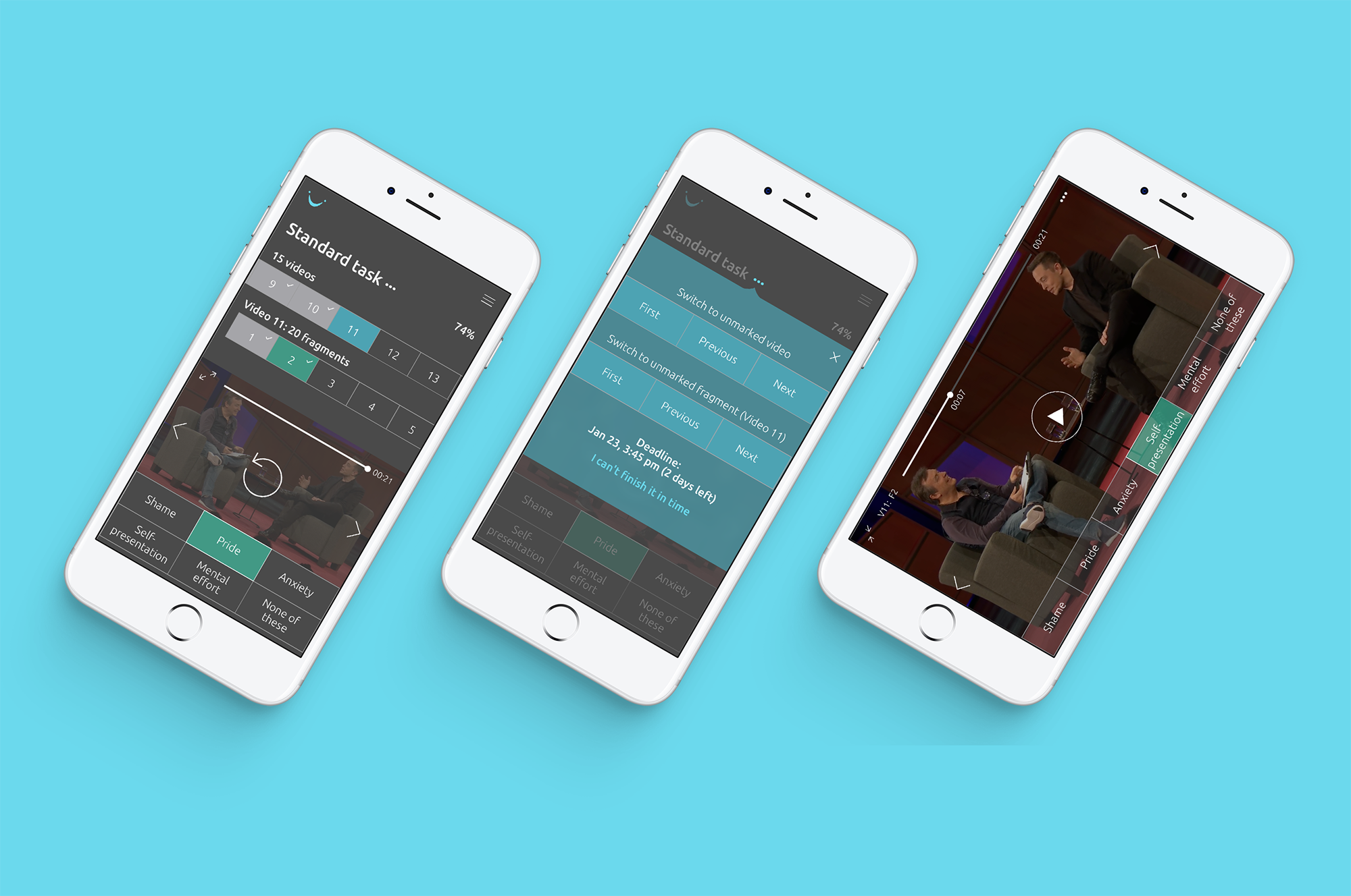
Onboarding. To access any task users should pass tutorials. Tutorials are inevitable: people should learn the meanings of emotion scales. Change of the scales are out of the discussion - users are paid for dealing with them. During tutorials the interface itself turns out to be explained. So I not just didn't add - I actullay removed tips and hints from the working area. After half an our of working they become extremelly annoying.
3 types of emotion scales:
- Two scales "choose one of 5 emotions if any, or "None of these"
- One scale: "choose level (low, medium, high) for each of 3 emotions"
Why it's so dark? Did you ever collapse a movie you're watching on full screen and saw a white screen right after, especially in a dimly-lit room? It hurts.
Other pages