MAI campus map
Interaction design
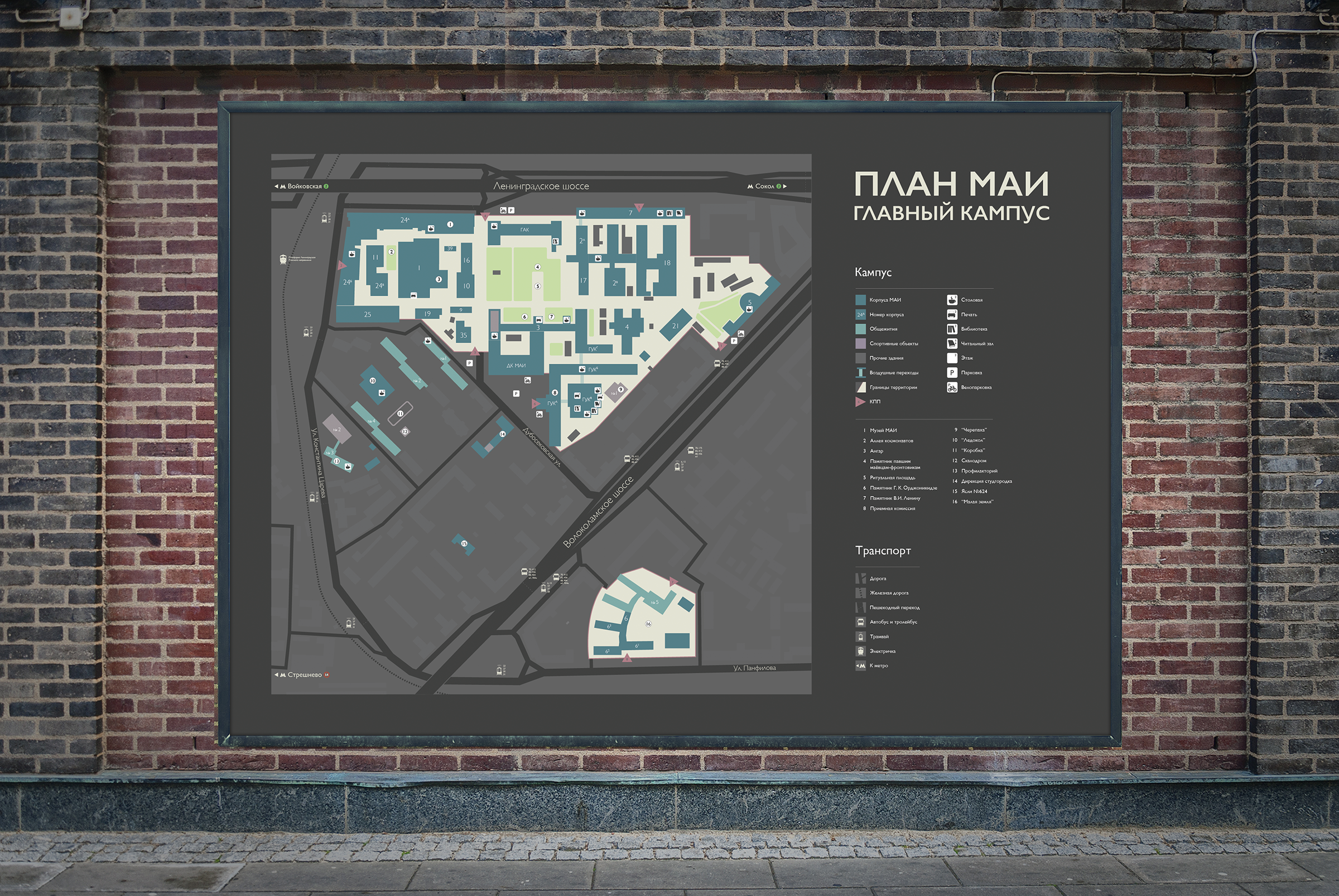
The honor to fix a pain point you had as a student. Aka UX in analog world.
 English version in PDF (0.5 Mb)
Challenge: Map we had when I was a student was dramatically correct in terms of distances, markup and details - may be even suited some construction documentation standards. Obviously, it was hard to read.
My goal was to specify locations that students and stuff are acually looking for - places to eat or to print a paper, find where these places are today. To highlight on the map what people need and to hide what they don't - technical buildings, exact positions of tram rails or bombshelters.
Result: Color-blind safe vector plan with target size of 2120x1500mm