MAI admission 2017
Graphic design, Interaction design
Miscellaneous works for Moscow Avianion Institute admission campaign in 2017.
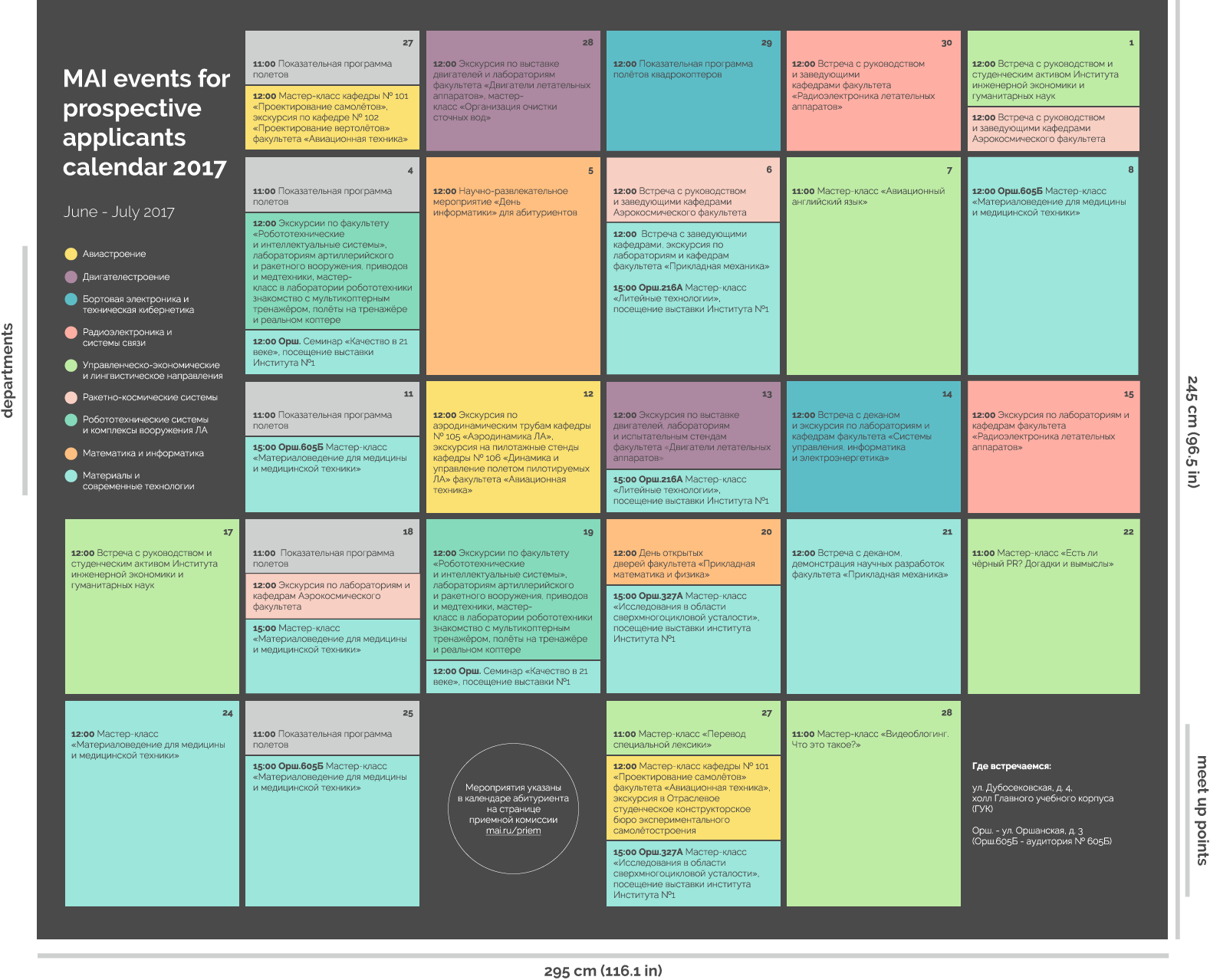
Event calendar
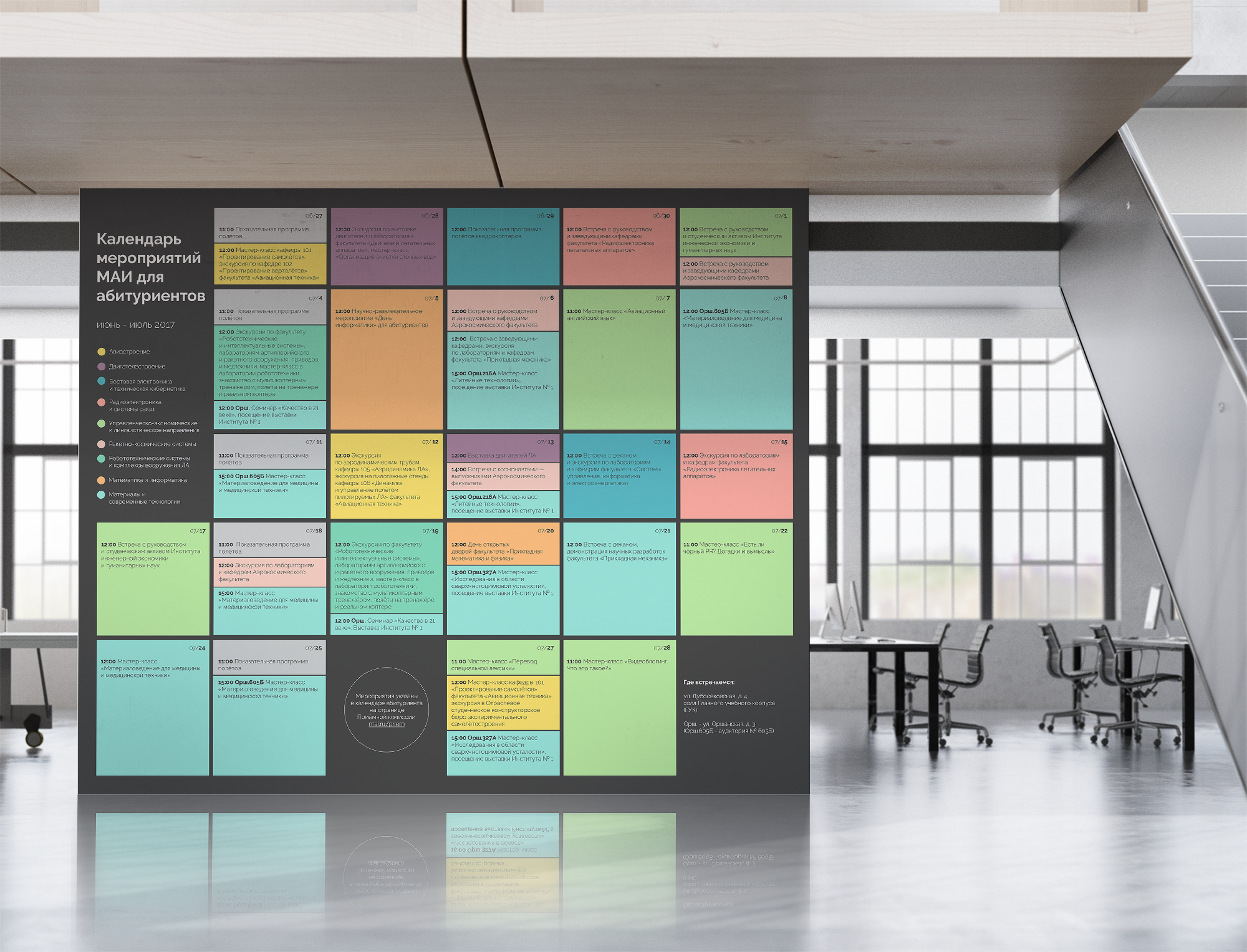
Format: Banner, 295 x 245 cm (116.1 x 96.5 inch)
Task: Make a banner with table of events for prospective applicants.
Challenge: Table was organized by department. But people are allowed to apply to up to 3 programs within any departments. So, I want the chronological order.
Partial translation to make some sence:
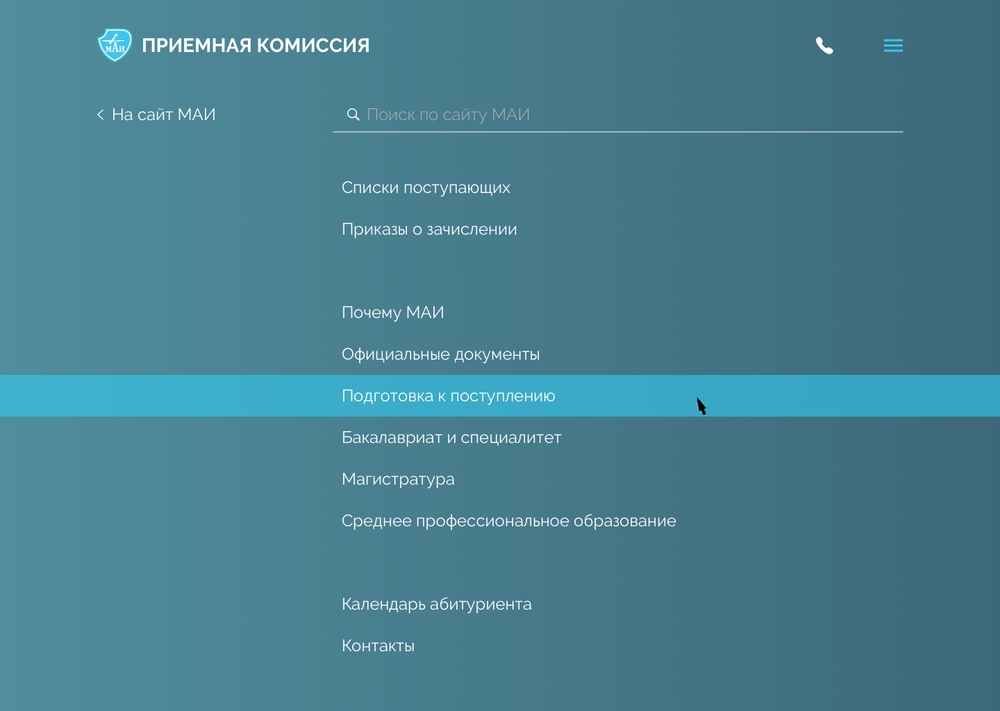
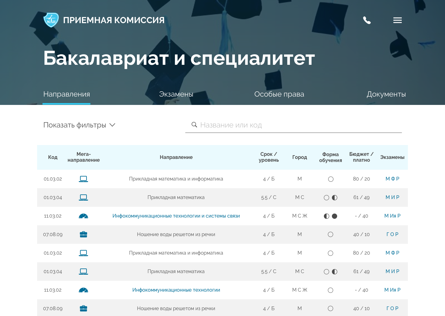
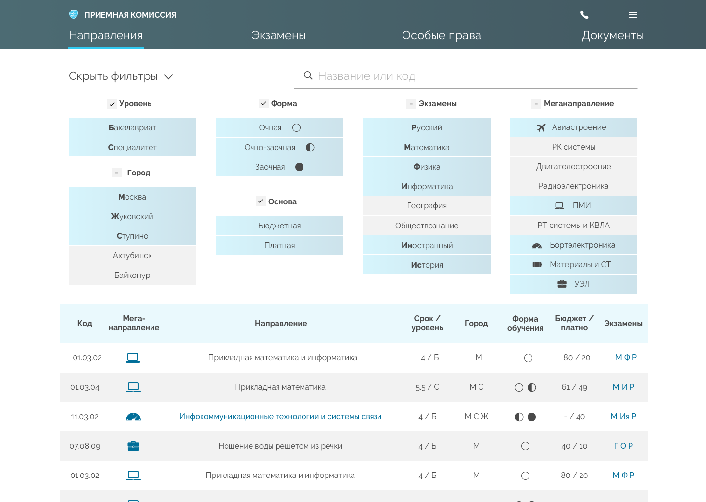
Website
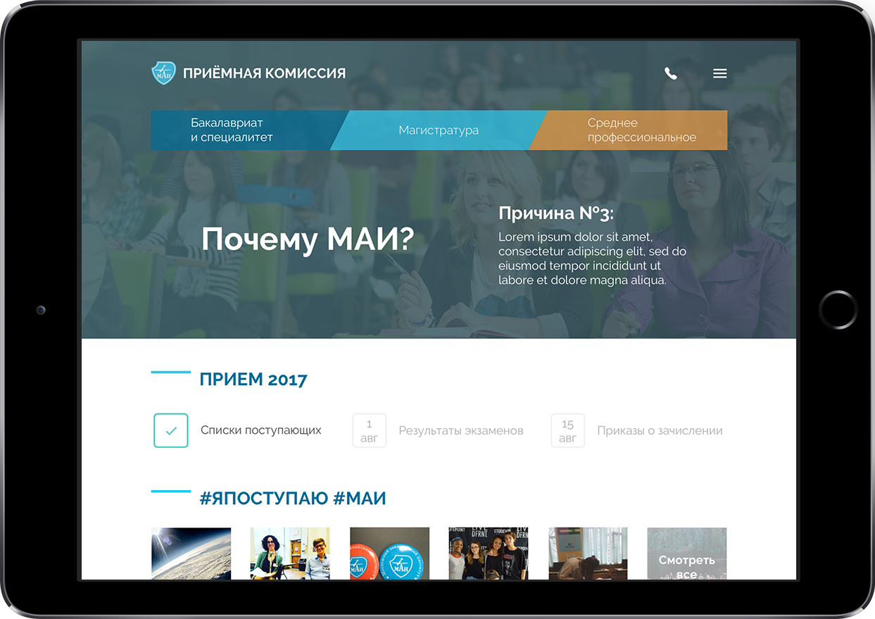
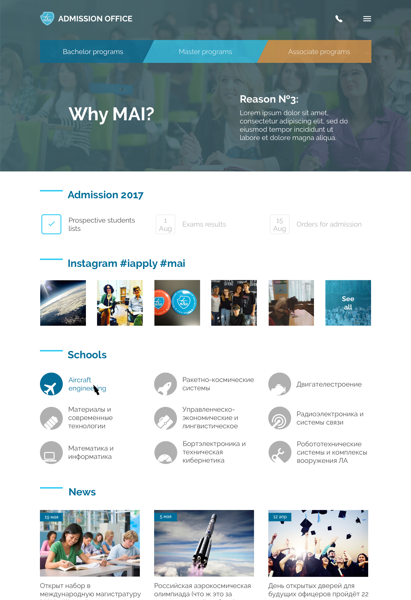
Format: Bootstrap-based responsive website
Task: Sketch easy-to-implement update for admission office website.
Challenge: Minimise disadvantages caused by pre-requisites, i.e. path and content duplications. Simplify the flow to most wanted content: programs and requirements.
Result: All unreadable official documents are packed into a separate section. Useful content from them extracted and added to degree sections it belongs to (Bachelor, Master, Associate). Degrees navigation added to above the fold area. Extremely long main menu packed to the burger. Programs within a degree got filter by requirements.
Partial translation to make some sence:
Buttons
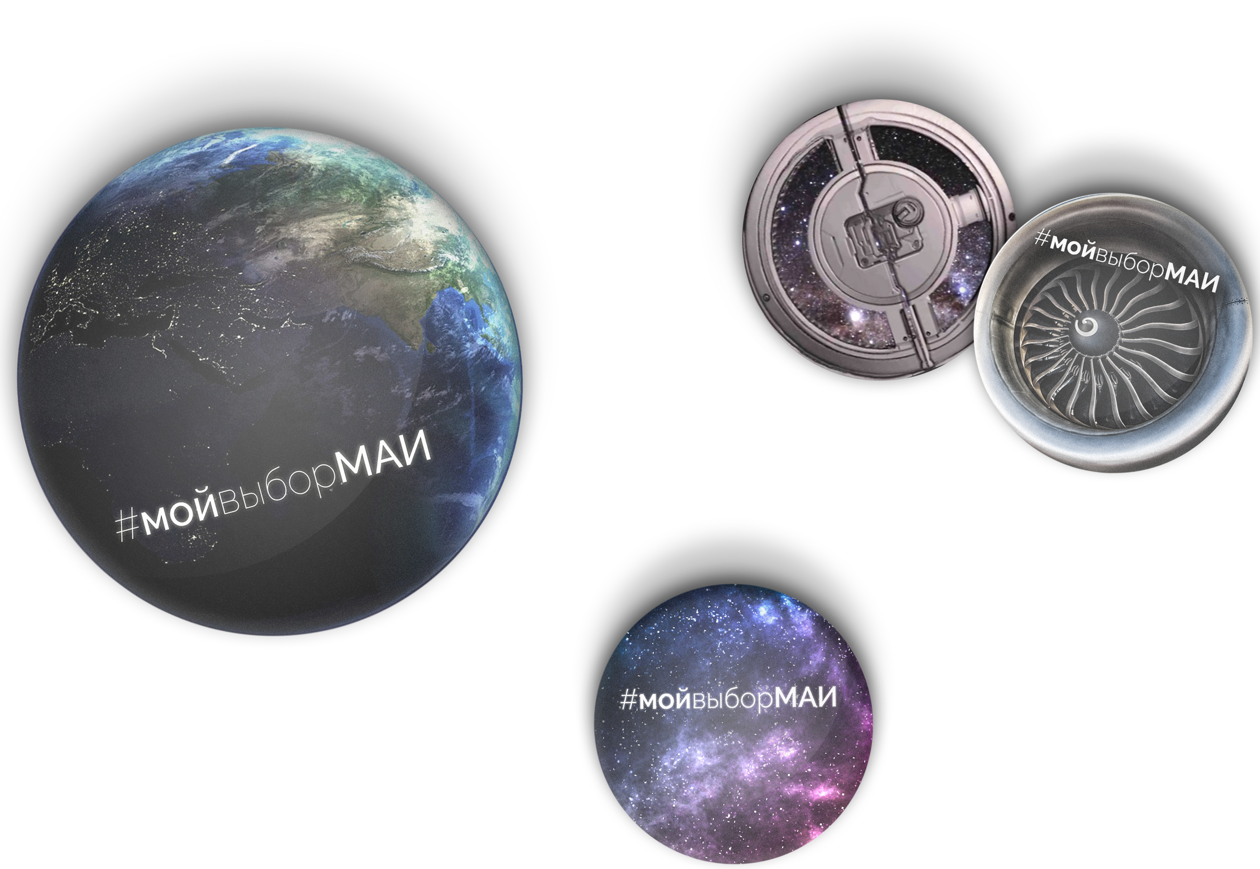
Format: Plastic buttons (pins)
